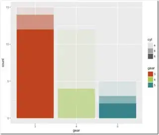
Say I have the following stacked bar chart:
# Load library
library(ggplot2)

# Convert to factors
mtcars$gear <- factor(mtcars$gear)
mtcars$cyl <- factor(mtcars$cyl)

# Plot results
p <- ggplot(data = mtcars, aes(x=gear, fill=cyl) ) + geom_bar()
print(p)
which gives,
In this plot, each group (i.e., cyl) is a different colour and all bars are the same colour scheme. Now, what I'd like to do is have each bar as a single, different colour, but the groups are designated by alpha. For example, bars for gear values of 3, 4, and 5 may be red, blue, and green, respectively, and cyl values are depicted by alpha values of 1, 0.75, and 0.5, respectively. This way the bar for, say, gear equals 3 is all the same colour (red), but the cyls are shown as different shades. Is this possible?
The code below implements the alpha values:
# Function for adding alphas
alpha_bar <- function(x)ifelse(x == 4, 1, ifelse(x == 6, 0.75, ifelse(x == 8, 0.5, NA)))

# Add alphas
mtcars$alpha <- alpha_bar(mtcars$cyl)

# Plot results
p <- ggplot(data = mtcars, aes(x=gear, fill=cyl, alpha = alpha) ) + geom_bar()
print(p)
This gets the alpha values correct. However, if I try to change the colours of each bar using something like this,
p <- p + scale_fill_manual(values = c("red", "blue", "green"))
it changes the colours of the cyl values rather than gear values. Any suggestions?

