I am trying to add group-wise lines on a plot, where the values are calculated from another dataframe.
My data looks like this:
demo_df <- structure(list(Sample_Run = structure(c(3L, 4L, 2L, 1L, 5L, 3L,
1L, 4L, 5L, 2L, 3L, 2L, 1L, 5L, 4L), .Label = c("Sample1", "Sample2",
"Sample3", "Sample4", "Sample5", "Sample6", "Sample7", "Sample8",
"Sample9", "Sample10", "Sample11", "Sample12", "Sample13", "Sample14",
"Sample15", "Sample16", "Sample17", "Sample18", "Sample19", "Sample20"
), class = "factor"), MUT_ID = structure(c(1L, 1L, 1L, 1L, 1L,
3L, 3L, 3L, 3L, 3L, 2L, 2L, 2L, 2L, 2L), .Label = c("AKT1 c.49G>A",
"APC c.4348C>T", "APC c.4666_4667insA", "ATM c.1058_1059delGT",
"BRAF c.1799T>A", "CTNNB1 c.121A>G", "EGFR c.2236_2250del15",
"EGFR c.2310_2311insGGT", "EGFR c.2369C>T", "EGFR c.2573T>G",
"ERBB2 c.2324_2325ins12", "FGFR3 c.746C>G", "FLT3 c.2503G>T",
"GNA11 c.626A>T", "GNAQ c.626A>C", "GNAS c.601C>T", "JAK2 c.1849G>T",
"KIT c.2447A>T", "KRAS c.35G>A", "MPL c.1544G>T", "NPM1 c.863_864insTCTG",
"NRAS c.182A>G", "PDGFRA c.1694_1695insA", "PDGFRA c.2525A>T",
"PIK3CA c.1633G>A", "PIK3CA c.3140A>G", "PIK3CA c.3204_3205insA",
"PTEN c.741_742insA", "PTEN c.800delA", "RET c.2753T>C", "SMAD4 c.1394_1395insT",
"TP53 c.524G>A", "TP53 c.723delC", "TP53 c.743G>A", "TP53 c.818G>A"
), class = "factor"), FREQ = c(0.091, 0.077, 0.09, 0.096, 0.114,
0.081, 0.071, 0.076, 0.084, 0.083, 0.08, 0.082, 0.087, 0.085,
0.094)), .Names = c("Sample_Run", "MUT_ID", "FREQ"), row.names = c(1L,
4L, 5L, 7L, 8L, 46L, 47L, 48L, 50L, 51L, 91L, 93L, 94L, 96L,
97L), class = "data.frame")

demo_sd <- aggregate(demo_df[["FREQ"]], by=list(as.factor(demo_df[["MUT_ID"]])), FUN=sd)
names(demo_sd) <- c("MUT_ID", "sd")

demo_mean <- aggregate(demo_df[["FREQ"]], by=list(as.factor(demo_df[["MUT_ID"]])), FUN=mean)
names(demo_mean) <- c("MUT_ID", "mean")

demo_mean_sd <- merge(x = demo_sd, y = demo_mean)
demo_mean_sd[["sd_interval_upper"]] <- demo_mean_sd[["mean"]] + (2 * demo_mean_sd[["sd"]])
demo_mean_sd[["sd_interval_lower"]] <- demo_mean_sd[["mean"]] - (2 * demo_mean_sd[["sd"]])
output:
> demo_df
   Sample_Run              MUT_ID  FREQ
1     Sample3        AKT1 c.49G>A 0.091
4     Sample4        AKT1 c.49G>A 0.077
5     Sample2        AKT1 c.49G>A 0.090
7     Sample1        AKT1 c.49G>A 0.096
8     Sample5        AKT1 c.49G>A 0.114
46    Sample3 APC c.4666_4667insA 0.081
47    Sample1 APC c.4666_4667insA 0.071
48    Sample4 APC c.4666_4667insA 0.076
50    Sample5 APC c.4666_4667insA 0.084
51    Sample2 APC c.4666_4667insA 0.083
91    Sample3       APC c.4348C>T 0.080
93    Sample2       APC c.4348C>T 0.082
94    Sample1       APC c.4348C>T 0.087
96    Sample5       APC c.4348C>T 0.085
97    Sample4       APC c.4348C>T 0.094

> demo_mean_sd
               MUT_ID          sd   mean sd_interval_upper sd_interval_lower
1        AKT1 c.49G>A 0.013390295 0.0936        0.12038059        0.06681941
2       APC c.4348C>T 0.005412947 0.0856        0.09642589        0.07477411
3 APC c.4666_4667insA 0.005431390 0.0790        0.08986278        0.06813722
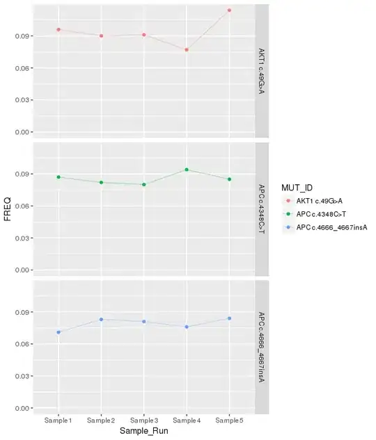
I can make the base plot like this:
library("ggplot2")
ggplot(data =  demo_df,
       aes(y = FREQ, x = Sample_Run, color = MUT_ID, group = MUT_ID) ) +
    geom_point() +
    geom_line(alpha = 0.3) +
    facet_grid(MUT_ID~.) +
    scale_y_continuous(limits = c(0, NA))
Looks like this:
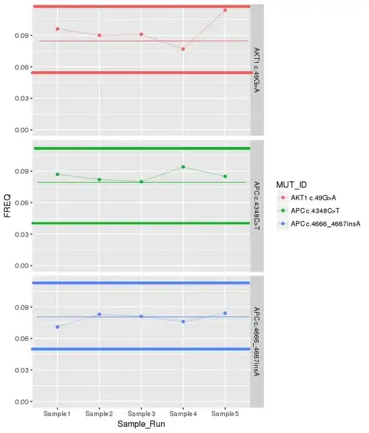
But I need to add lines for the standard deviation, and mean, from the demo_mean_sd dataframe. It should look something like this:
However, I keep hitting problems trying to get the lines to draw on the plot, due to the lack of a common x axis. For example, I tried something like this:
ggplot(data =  demo_df,
       aes(y = FREQ, x = Sample_Run, color = MUT_ID, group = MUT_ID) ) +
    geom_point() +
    geom_line(alpha = 0.3) +
    facet_grid(MUT_ID~.) +
    scale_y_continuous(limits = c(0, NA)) +
    geom_ribbon(data = demo_mean_sd, aes(ymin = sd_interval_lower, ymax = sd_interval_upper))
error:
Error in eval(expr, envir, enclos) : object 'Sample_Run' not found
I have not been able to figure out how to do this with other plot types either due to the faceting.

