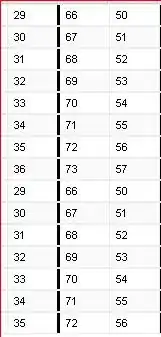
I have the following data (class: data.frame):
Date         S        D
199011  1.023247 1.009845
199012  1.050828 1.015818
199101  1.066754 1.023077
199102  1.147112 1.033462
199103  1.160859 1.042610
199104  1.164412 1.049691
199105  1.204586 1.058778
199106  1.173015 1.063795
199107  1.220449 1.074115
199108  1.210946 1.075537
199109  1.219717 1.076117
199110  1.256516 1.080941
199111  1.220505 1.087333
199112  1.288720 1.100406
199201  1.306862 1.106454
199202  1.304459 1.108409
199203  1.255841 1.111392
199204  1.243667 1.113684
199205  1.286353 1.126754
199206  1.262842 1.131144
199207  1.283566 1.138307
199208  1.255925 1.144240
199209  1.258397 1.149799
199210  1.243018 1.159166
199211  1.257497 1.165859
199212  1.284947 1.173460
199301  1.294014 1.180281
199302  1.313828 1.190518
199303  1.386941 1.202399
199304  1.428233 1.215996
and the following code:
library(tidyverse);
data2 %>%
gather(what, value, S:D) %>%
ggplot(aes(as.factor(Date), value, colour = what,group = what)) +
geom_line(size=0.8)+
labs(x = "Date", y = "Return", title = " Survivorshipbias", color="Legend") + scale_colour_discrete(labels = c("Actual","Simulation"))+ scale_x_discrete(breaks =c(0,1,2), labels=as.character(c("1990","2000","2010"))) + theme_gray() + theme(plot.title = element_text(hjust = 0.5))
I wish to be able to manually set the years (1990, 2000, 2010) as x-axis values. I have tried
scale_x_continuous
but with no luck, since it returns an error saying that it is a discrete variable. I have been able to produce plots where I could manually insert/state the x-axis values, but for some reason, it is not working at this time. I have seen this question, but with no luck in my case.
In addition, does anyone know why the vertical lines have disappeared? Maybe the two things are related?
Thank you in advance, and have a nice weekend.
Edit: The reason for why I scale it as a factor is, if I scale it as a date, my plot looks jagged. 

