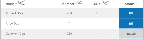
I have a screenshot below which I have replicated in HTML/CSS. The design is exactly the same both for mobile and desktop view. In the design, the angle dropdown font-awesome icons (marked with arrow in the screenshot) are aligned properly with the headings which is not the case in my design in mobile view.
1st Image:
I have created the fiddle for the above screenshot. For some reasons, I am not seeing the mobile view in the fiddle (Is there any way we can enable mobile view in the fiddle?). The snippets of HTML code which I have used in the fiddle is:
<tr>
    <th scope="col">Name <i class="fa fa-angle-down" style="font-size: 15px;" aria-hidden="true"></i></th>
    <th scope="col" class="number">Number <i class="fa fa-angle-down" style="font-size: 15px;" aria-hidden="true"></i></th>
    <th scope="col" class="table2">Table <i class="fa fa-angle-down" style="font-size: 15px;" aria-hidden="true"></i></th>
    <th scope="col" class="status">Status <i class="fa fa-angle-down" style="font-size: 15px;" aria-hidden="true"></i></th>
</tr>
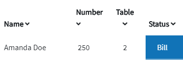
On mobile view (as shown below in the screenshot) on my pc, I am seeing the Number and Table headings over the angle dropdown icon.
2nd Image:
Problem Statement:
I am wondering what changes I need to make in the fiddle so that Number and Table headings are aligned with the angle dropdown font-awesome icon (marked by arrow in the 1st image) in the mobile view.
For some reasons, I am not able to see the mobile view in the fiddle.