0

Using CSS, how can I achieve the following layout?

Notice that the order of the elements is different on mobile vs desktop!

enter image description here

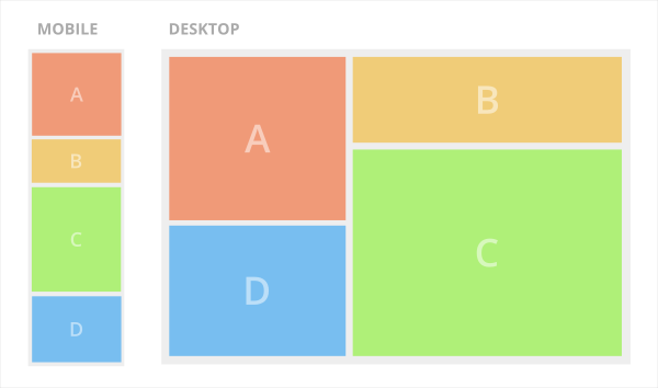
Currently, I am using bootstrap 4. The following code "works" for the desktop version, however, does not work for the mobile version.

<div class="container">
    <div class="row">

        <div class="col-md-4">    
            <div class="a">
                A
            </div>
            <div class="d">
                D
            </div>
        </div>

        <div class="col-md-8">
            <div class="b">
                B
            </div>
            <div class="c">
                C
            </div>
        </div>

    </div>
</div>

How can I achieve the desired layout? I am considering solutions using:

  • Bootstrap 4
  • Flexbox
  • CSS Grid
Ben
  • 15,938
  • 19
  • 92
  • 138

2 Answers2

2

The Bootstrap 4 way to get the order you want, and make columns "fit" together is to disable flexbox and use floats for the desktop layout...

"Fit" masonry layout with floats and reordering

<div class="container">
    <div class="row no-gutters d-block">
        <div class="col-md-4 float-left">    
            <div class="a">
                A
            </div>
        </div>
        <div class="col-md-8 float-left">
            <div class="b">
                B
            </div>
        </div>
        <div class="col-md-8 float-right">
            <div class="c">
                C
            </div>
        </div>
        <div class="col-md-4 float-left">    
            <div class="d">
                D
            </div>
        </div>
    </div>
</div>

Demo https://www.codeply.com/go/U4zuuyfHQV

Same heights layout with flexbox and reordering

   <div class="row text-white no-gutters">
        <div class="col-md-4">
            <div class="a">
                A
            </div>
        </div>
        <div class="col-md-8">
            <div class="b">
                B
            </div>
        </div>
        <div class="col-md-4 order-last order-md-0">
            <div class="d">
                D
            </div>
        </div>
        <div class="col-md-8">
            <div class="c">
                C
            </div>
        </div>
    </div>

Demo https://www.codeply.com/go/U4zuuyfHQV (option 2)


Related: Bootstrap row with columns of different height

Carol Skelly
  • 351,302
  • 90
  • 710
  • 624
  • Thanks, I am looking for a flexbox version now. There was one a few minutes ago, but it was deleted. – Ben Apr 26 '18 at 14:11
  • Flexbox won't work for this because you can't re-order child divs in different parents. That's why you need to use floats in this specific case. – Carol Skelly Apr 26 '18 at 14:14
  • They do not have to be in different parent divs. They can all be in the same parent div if necessary. – Ben Apr 26 '18 at 14:16
  • Exactly, but then they won't "fit" together like the "masonry" pattern shown in the desktop image because flexbox makes columns the same height. – Carol Skelly Apr 26 '18 at 14:18
  • Ok, I see what you're saying. But it just so happens that in this particular case, I don't need A and B to be of different heights on desktop. They can be the same height on desktop. As long as the order is correct, I am happy. At least for now. – Ben Apr 26 '18 at 14:31
  • I answered the original question "bootstrap 4/flexbox", and then it was edited which changed the scope of the original question. – Carol Skelly Apr 29 '18 at 04:22
1

Seeing as you're already using Bootstrap, you can use pushes and pulls to achieve this:

<div class="container">
  <div class="row">
    <div class="a col-md-4">
      A
    </div>
    <div class="b col-md-8">
      B
    </div>
    <div class="c col-md-8 col-md-push-4">
      C
    </div>
    <div class="d col-md-4 col-md-pull-8">
      D
    </div>
  </div>
</div>

See this example: https://codepen.io/bretteast/pen/VxKyLX

And these docs: https://getbootstrap.com/docs/3.3/css/#grid-column-ordering

Brett East
  • 4,022
  • 2
  • 20
  • 31