1

enter image description here

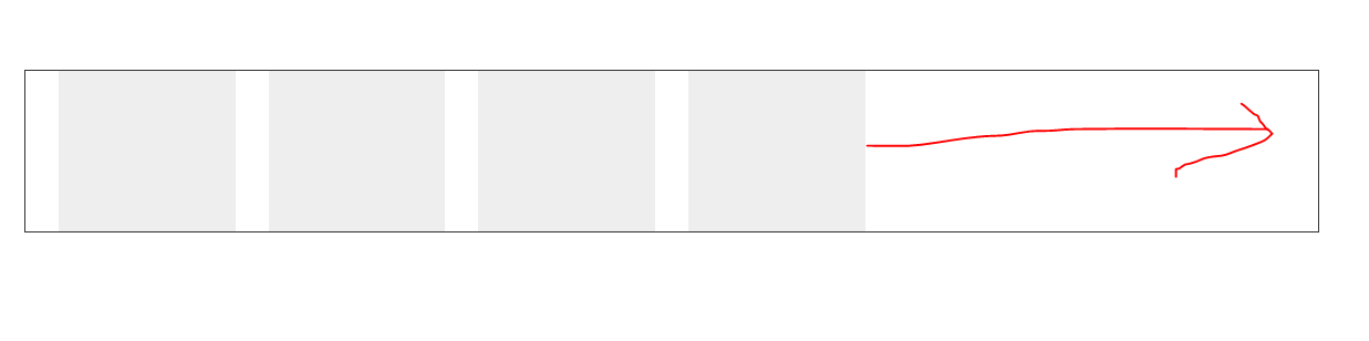
See the blank space I marked with red arrow, I want these divs to be centered. But it's floating to left. I placed all these divs to middleBox div and in middleBox I styled text-align: center but nothing worked.

Help me out guys

My HTML

#middleBoxMargin {
    margin-top: 80px;
  }

#middleBox {
  text-align: center;
}

#groupInsurance {
    background-color: #EEEEEE;
    text-align: center;
  height: 145px;
}

#lifeInsurance {
  background-color: #EEEEEE;
    text-align: center;
  height: 145px;
}

#dentalInsurance {
  background-color: #EEEEEE;
    text-align: center;
  height: 145px;
}

#replacementInsurance {
  background-color: #EEEEEE;
    text-align: center;
  height: 145px;
}
<div class="container">
  <div class="row">
    <div class="col-sm-12" id="middleBoxMargin">
      <div id="middleBox">
       <div class="col-sm-2">
        <div id="groupInsurance"></div>
       </div>
       <div class="col-sm-2">
        <div id="lifeInsurance"></div>
       </div>
       <div class="col-sm-2">
        <div id="dentalInsurance"></div>
       </div>
       <div class="col-sm-2">
        <div id="replacementInsurance"></div>
       </div>
      </div>
    </div>
  </div>
</div>
Sarvan Kumar
  • 926
  • 1
  • 11
  • 27
Jason
  • 415
  • 1
  • 6
  • 16
  • 1
    flex, flex, flex! – Takit Isy Apr 28 '18 at 07:29
  • @TakitIsy Sorry? – Jason Apr 28 '18 at 07:34
  • I added an answer. I don't like using classes and stuff from modules when not necessary. – Takit Isy Apr 28 '18 at 07:40
  • @Anuresh it's not the first time I see you editing questions to simply include snippet of code, you need to stop this or I will flag you to moderator ... Look at the code and the image he provided, did the code show this output? the code is not working in the way the OP mentionned as it's missing includes or more code, so stop transforming code to snippet automatically please – Temani Afif Apr 28 '18 at 08:01
  • @TemaniAfif How does it look now ? – Athul Nath Apr 28 '18 at 08:40
  • @Anuresh run it and see by yourself, do you see something like the image? no, you won't simply because you didn't even do the effort to include the bootstrap library ..you are simply creating snippet to earn reputation, all your edits are like that – Temani Afif Apr 28 '18 at 08:44

4 Answers4

1

Add

display: flex; 
justify-content: center;

#middleBoxMargin {
    margin-top: 80px;
}

#middleBox {
    display: flex;
    justify-content: center;
}

#groupInsurance {
    background-color: #EEEEEE;
    text-align: center;
    height: 145px;
}

#lifeInsurance {
    background-color: #EEEEEE;
    text-align: center;
    height: 145px;
}

#dentalInsurance {
    background-color: #EEEEEE;
    text-align: center;
    height: 145px;
}

#replacementInsurance {
    background-color: #EEEEEE;
    text-align: center;
    height: 145px;
}
<div class="container">
    <div class="row">
        <div class="col-sm-12" id="middleBoxMargin">
            <div id="middleBox">
                <div class="col-sm-2">
                    <div id="groupInsurance"></div>
                </div>
                <div class="col-sm-2">
                    <div id="lifeInsurance"></div>
                </div>
                <div class="col-sm-2">
                    <div id="dentalInsurance"></div>
                </div>
                <div class="col-sm-2">
                    <div id="replacementInsurance"></div>
                </div>
            </div>
        </div>
    </div>
</div>
Nitin Bisht
  • 5,053
  • 4
  • 14
  • 26
zubair khanzada
  • 903
  • 2
  • 9
  • 15
0

If you are using boostrap 4, adding a class justify-content-md-center to the div with row class would do the job. But seems like you are using bootstrap 3, so you can use the offset class. Try updating your code this way.

<div class="container">
  <div class="row">
    <div class="col-sm-12" id="middleBoxMargin">
      <div class="row" id="middleBox">
        <div class="col-sm-2 col-sm-offset-2">
          <div id="groupInsurance"></div>
        </div>
        <div class="col-sm-2">
          <div id="lifeInsurance"></div>
        </div>
        <div class="col-sm-2">
          <div id="dentalInsurance"></div>
        </div>
        <div class="col-sm-2">
          <div id="replacementInsurance"></div>
        </div>
      </div>
    </div>
  </div>
</div>
Aryan Twanju
  • 2,464
  • 1
  • 9
  • 12
0

you can use flex for that

#middleBox {
    display: flex;
    justify-content:center
}

.col {
  padding: 0 15px;
}

.box {
    background-color: #EEEEEE;
    text-align: center;
    height: 100px;
    width: 100px;
}
<div class="container">
  
            <div id="middleBox">
                   <div class="col">
                    <div id="groupInsurance" class="box"></div>
                   </div>
                   <div class="col">
                    <div id="lifeInsurance" class="box"></div>
                   </div> 
                   <div class="col"> 
                    <div id="dentalInsurance" class="box"></div>
                   </div> 
                   <div class="col"> 
                    <div id="replacementInsurance" class="box"></div>
                   </div>
            </div>
            
 </div>

or even better you can use grid

#middleBox {
  display: grid; 
  grid-template-columns: repeat(4, 100px);
  grid-gap: 15px;
  justify-content: center;
}

.box {
    background-color: #EEEEEE;
    text-align: center;
    height: 100px;
    width: 100%;
}
<div class="container">
  
            <div id="middleBox">
                    <div id="groupInsurance" class="box"></div>
                    <div id="lifeInsurance" class="box"></div>
                    <div id="dentalInsurance" class="box"></div> 
                    <div id="replacementInsurance" class="box"></div>
            </div>
            
 </div>
patelarpan
  • 7,188
  • 2
  • 20
  • 25
0

I'll do that kind of things:

div {
  border: 1px solid black;
}

#middleBoxMargin {
  margin-top: 80px;
}

#middleBox {
  display: flex;
  justify-content: center;
}

#middleBox > div {
  background-color: #EEEEEE;
  text-align: center;
  height: 145px;
  width: 20%;
  margin: 5px 10px;
}
<div class="container">
  <div class="row">
    <div class="col-sm-12" id="middleBoxMargin">
      <div id="middleBox">
        <div class="col-sm-2">
          <div id="groupInsurance"></div>
        </div>
        <div class="col-sm-2">
          <div id="lifeInsurance"></div>
        </div>
        <div class="col-sm-2">
          <div id="dentalInsurance"></div>
        </div>
        <div class="col-sm-2">
          <div id="replacementInsurance"></div>
        </div>
      </div>
    </div>
  </div>
</div>

Note that the CSS is shorter, and some of your classes in html useless now.

Takit Isy
  • 9,688
  • 3
  • 23
  • 47