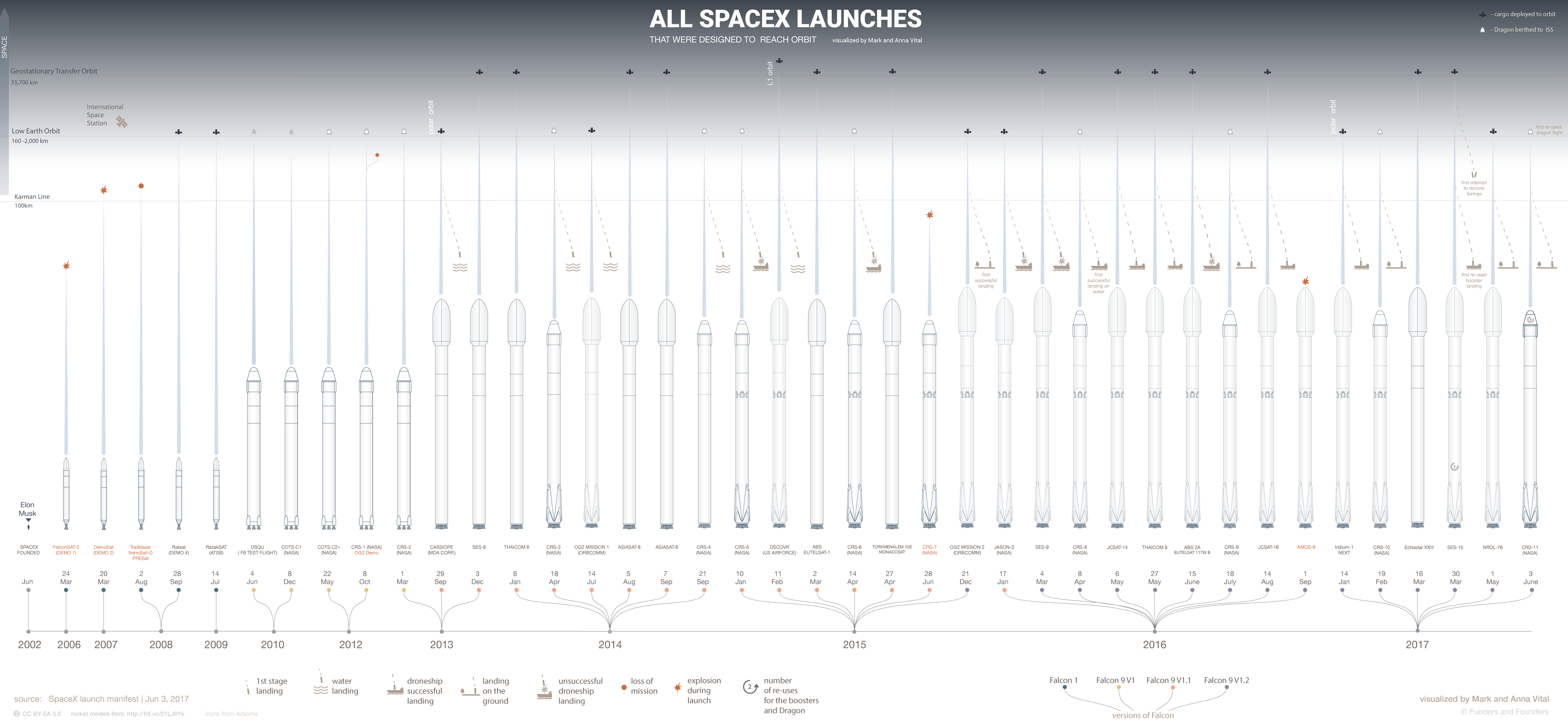
In the image below there is a blue long teardrop above each rocket. I'm trying to figure out how to do that in CSS with border-radius.
Is this possible (with or without border-radius)?
In the image below there is a blue long teardrop above each rocket. I'm trying to figure out how to do that in CSS with border-radius.
Is this possible (with or without border-radius)?
My 2 cents (but I believe it can be done in a better way), but with this way you can modify the line height for every rocket. Basically the top part is a long triangle, and the bottom part is a circle:
.teardrop {
  position: relative;
}

.line {
  width: 0;
  height: 0;
  border-style: solid;
  border-width: 0 5px 150px 5px; /* 150px is the line height */
  border-color: transparent transparent #007bff transparent;
}

.teardrop::after {
  content: '';
  position: absolute;
  bottom: -5px;
  background-color: #007bff;
  border-radius: 50%;
  width: 10px;
  height: 10px;
}
<div class="teardrop">
<div class="line"></div>
</div>Using only one div:
.teardrop {
  position: relative;
  width: 0;
  height: 0;
  border-style: solid;
  border-width: 0 5px 150px 5px; /* 150px is the line height */
  border-color: transparent transparent #007bff transparent;
}

.teardrop::after {
  content: '';
  position: absolute;
  bottom: -155px; /* 150 + height/2 */
  right: -5px; /* width/2 */
  background-color: #007bff;
  border-radius: 50%;
  width: 10px;
  height: 10px;
}
<div class="teardrop"></div>