In an ultra-basic way, that website (that you have removed from your question) would have the container measure the height of your window and attach the height of the window to the header(container) and then absolute position the menu to the bottom of this container (see code for a very rough example)
.container {
background:red;
position:relative;
height:100vh;
}
li {
list-style:none;
float:left;
}
.menu {
position:absolute;
bottom:0;
width:100%;
background:green;
}
<script src="https://ajax.googleapis.com/ajax/libs/jquery/1.8.2/jquery.min.js"></script>
<div class="container">
<div class="menu">
  <ul>
  <li>Link</li>
  <li>Link</li>
  <li>Link</li>
  <li>Link</li>
  </ul>
</div>
</div>
<h1>This is more content</h1>
If you need anything further explaining, let me know.
--- UPDATE ---
Instead of using JavaScript to work out the height of your browser window, simply add height:100vh to the container height. This will match the container height to the browser height, give you the same outcome (just through CSS rather than JavaScript - with the added positive of that this you won't have to assign this to an on resize in case the user resizes their screen). I have updated the code above.
--- FURTHER UPDATE ---
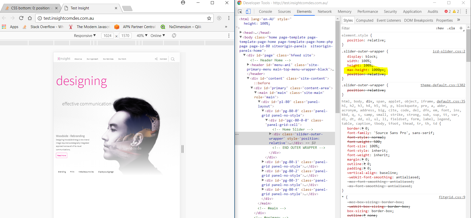
Thanks, by moving .slider-btm out of .slider-outer-wrapper container, this should resolve your issue so that .slider-btm can sit at the bottom of your container which is 100vh.

