0

I created a barchart with ggplot2 geom_bar and want to have two metrics in the bars. I used melt to do so. However, I now need a second y-axis with another scale, because the numbers of the two metrics are too different.

In the following the dataframe and the code I used:

df <- data.frame(categories = c("politics", "local", "economy", "cultural events", 
                                "politics", "local", "economy", "cultural events"), 
               metric = c("page", "page", "page", "page", 
                          "product", "product", "product", "product"), 
               value = c(100L, 50L, 20L, 19L, 
                         950000L, 470000L, 50000L, 1320L))

In the following the code I used to create the plot and the second y-axis:

x <- ggplot(df, aes(x=categories, y=value, fill = metric))
x + geom_bar(stat = "identity", position = "dodge") +
  scale_y_continuous(sec.axis=sec_axis(~. *1000), limits=c(1,1000))

However, now no bars appear in the chart anymore... Does anybody know how to solve this problem?
nississippi
  • 327
  • 2
  • 17
  • 1
    reproducible example data? – Andre Elrico May 09 '18 at 07:54
  • You should think of faceting your variables instead of adding a transformed second y-axis, which won't display the `page`-data as you would like them to appear as the second axis is only a relabeling of the axis and not creating a new layer of the plot with the `page` data. There are no bars in you plot, because you have `limits = c(1, 1000)`. Change it to `limits = c(0, 1000)` – kath May 09 '18 at 08:00
  • Please add the data using `dput` so we can run it on our own sessions, rather than pasting a table. As a first guess, try removing `df$` from inside `aes`. You never need to use `df$` when you refer to variables inside `aes` – Conor Neilson May 09 '18 at 08:01
  • @kath Thanks for the edits and the advice vor the limits.You are right, now I have page-data. But what do you mean with faceting your variables? I have never done this before... – nississippi May 09 '18 at 08:24
  • FWIW... Die dual axis plots, DIE!!! (here's a blog post on why they apparently suck https://blog.datawrapper.de/dualaxis/) – rg255 May 09 '18 at 08:46
  • I also like to refer to [hadley's opinion](https://stackoverflow.com/a/3101876/5892059) in that case :) – kath May 09 '18 at 12:55

2 Answers2

1

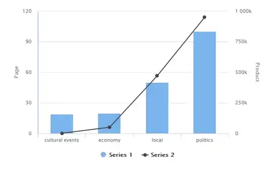
Another approach could be to use highcharter

library(dplyr)
library(tidyr)
library(highcharter)

#convert your data in wide format
df <- df %>% spread(metric, value)

#plot
highchart() %>% 
  hc_xAxis(categories = df$categories) %>%
  hc_yAxis_multiples(
    list(lineWidth = 3, title = list(text = "Page")),
    list(opposite = TRUE, title = list(text = "Product"))
  ) %>% 
  hc_add_series(type = "column", data = df$page) %>% 
  hc_add_series(type = "line", data = df$product, yAxis=1) # replace "line" with "column" to have it in bar format

Output plot is:

enter image description here

Sample data:

df <- structure(list(categories = structure(c(4L, 3L, 2L, 1L, 4L, 3L, 
2L, 1L), .Label = c("cultural events", "economy", "local", "politics"
), class = "factor"), metric = structure(c(1L, 1L, 1L, 1L, 2L, 
2L, 2L, 2L), .Label = c("page", "product"), class = "factor"), 
    value = c(100L, 50L, 20L, 19L, 950000L, 470000L, 50000L, 
    1320L)), .Names = c("categories", "metric", "value"), row.names = c(NA, 
-8L), class = "data.frame")
Prem
  • 11,775
  • 1
  • 19
  • 33
0

Instead of displaying the different bars on the same plot you can stack them together (or facet them):

As @ConorNeilson already mentioned in the comments, you don't have to (and also shouldn't) specify the variables with df$. ggplot knows to look for them in the specified data.frame df.
The free_y argument in the facet_grid-call makes it possible to display different scales on the y-axes.

library(ggplot2)
ggplot(df, aes(x = categories, y = value, fill = metric)) + 
  geom_bar(stat = "identity", position = "dodge") +
  facet_grid(metric~., scales = "free_y")

enter image description here

You could compare the different values on a log10-scale:

ggplot(df, aes(x = categories, y = value, fill = metric)) + 
  geom_bar(stat = "identity", position = "dodge") +
  scale_y_log10(name = "value (log10 scale)", 
                breaks = 10^(0:10), labels = paste0(10, "^", 0:10))

enter image description here

kath
  • 7,624
  • 17
  • 32
  • Ah I misunderstood. I also already thought about a facet_grid. But I somehow want to show the relationship between page and product.... But maybe a facet_grid is the best solution here, since the scales are that different... Thanks for your help! – nississippi May 09 '18 at 08:38
  • Thanks @kath! The second one is great :) – nississippi May 09 '18 at 11:25