2

I am trying to put some divs in a grid by explicitly assigning rows, columns, and sizes to the elements and allowing CSS grid to do column and row sizing work using the following CSS.

display: grid;
grid-auto-columns: min-content;

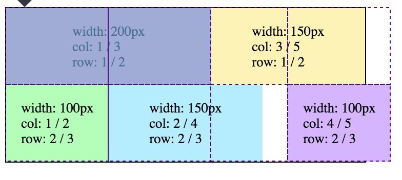
The value min-content is supposed to set columns to be the smallest possible size that fits the content without overflow. However, this is not happening. Even though these elements can all fit in a 350px grid, the third column is too large causing unnecessary whitespace.

Here is an image of what is going on.

Image With Gridlines

And here is the actual code: JSFiddle

function randint(min, max) {
  return Math.floor(Math.random() * (max - min + 1)) + min;
}

const children = document.getElementById('parent').children;
const skip = 360 / children.length;
let value = randint(0, 359);
for (let i = 0; i < children.length; i += 1) {
  const elm = children[i];
  elm.style.backgroundColor = `hsl(${value}, 100%, 85%)`;
  value += skip;
  elm.id = "w" + (i + 1);
  const style = window.getComputedStyle(elm);
  elm.innerHTML = `width: ${elm.offsetWidth}px<br \>
  col: ${style.getPropertyValue('grid-column')}<br \>
  row: ${style.getPropertyValue('grid-row')}`;
}
#parent {
  display: grid;
  grid-auto-columns: min-content;
  border: 1px solid black;
  width: 350px;
  font-size: 10pt;
}

#parent>div {
  display: flex;
  justify-content: center;
  align-items: center;
  height: 75px;
}

#w1 {
  width: 200px;
  grid-column: 1 / 3;
  grid-row: 1 / 2;
}

#w2 {
  width: 150px;
  grid-column: 3 / 5;
  grid-row: 1 / 2;
}

#w3 {
  width: 100px;
  grid-column: 1 / 2;
  grid-row: 2 / 3;
}

#w4 {
  width: 150px;
  grid-column: 2 / 4;
  grid-row: 2 / 3;
}

#w5 {
  width: 100px;
  grid-column: 4 / 5;
  grid-row: 2 / 3;
}
<div id='parent'>
  <div></div>
  <div></div>
  <div></div>
  <div></div>
  <div></div>
</div>
Michael Benjamin
  • 346,931
  • 104
  • 581
  • 701
Barry McNamara
  • 689
  • 9
  • 18

1 Answers1

2

The grid items in the first row create four columns:

#w1 {
  width: 200px;
  grid-column: 1 / 3;
  grid-row: 1 / 2;
}

#w2 {
  width: 150px;
  grid-column: 3 / 5;
  grid-row: 1 / 2;
}

The first item spans two columns (grid-column: 1 / 3).

The second item spans two columns (grid-column: 3 / 5).

So you have a 4-column grid.


Chrome

In Chrome, the lengths of the grid items in the first row are divided equally between columns.

So the first two columns are 100px wide:

enter image description here

And the second two columns are 75px wide:

enter image description here

Now you can see what's happening on the second row. Here's the code:

#w3 {
  width: 100px;
  grid-column: 1 / 2;
  grid-row: 2 / 3;
}

#w4 {
  width: 150px;
  grid-column: 2 / 4;
  grid-row: 2 / 3;
}

#w5 {
  width: 100px;
  grid-column: 4 / 5;
  grid-row: 2 / 3;
}
  • The first item (#w3) is 100px wide. That fits perfectly into the first column created by #w1.

  • The second item (#w4) is 150px wide. 100px fits perfectly into the second column created by #w1. Another 50px extends into the third column, which was created by #w2 and is 75px wide. That leaves a 25px gap, representing leftover space in the third column.

  • The third item (#w5) is 100px wide. But since it starts at the fourth column, which is 75px wide, the remaining 25px overflows the container.

Bottom line: In Chrome, the width of the columns are fixed once the first row is rendered. Grid items in subsequent rows respect the column widths established in the first row.


Firefox

Unlike in Chrome, in Firefox it appears that column widths don't remain fixed after rendering the first row. Column widths are flexible throughout the rendering process.

enter image description here


Edge

Same as Chrome.

Michael Benjamin
  • 346,931
  • 104
  • 581
  • 701
  • Is there a reason for the difference between Chrome and Firefox? – sol May 10 '18 at 00:51
  • My best guess at the moment is just a fallback to: There are multiple rendering differences between Chrome and Firefox. They are different browsers. They have different development teams. That's why developers have to test continuously across browsers. @sol – Michael Benjamin May 10 '18 at 17:54
  • Actually, I don't think it's the first row. If I flip the rows the issue does not get solved. – Barry McNamara May 15 '18 at 21:53
  • Can you post a demo with your flipped rows? Not exactly sure how you altered the set-up. – Michael Benjamin May 15 '18 at 21:59
  • I see what you mean. I don't have time at the moment to research the *Grid Item Placement Algorithm*, but you may want to take a look: https://www.w3.org/TR/css3-grid-layout/#auto-placement-algo – Michael Benjamin May 16 '18 at 20:57