I have a problem with creating grid in flexbox according to following image layout. I spent two days figuring out how to solve it without making position:absoulte hacks. Can someone please help me to sort it out with flex good practise?
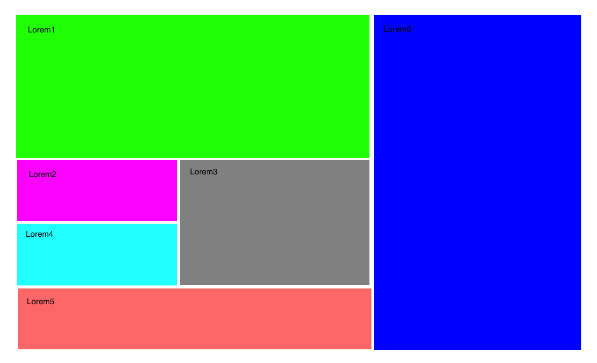
I have a problem with creating grid in flexbox according to following image layout. I spent two days figuring out how to solve it without making position:absoulte hacks. Can someone please help me to sort it out with flex good practise?
I am not a pro concerning flexbox, but Rikin seems right. Grid is way better for layouts like this.
In flexbox, you would have to put flex-container into flex-container, to get the layout you want. Try my code below and you will get the idea. You'd have to figure out the middle column on the left by yourself, though.
Cheers!
HTML
<div class="wrapper">
<div class="col-left">
<div class="col-left-row-1 color green">
  Lorem 1
</div>
<div class="col-left-row-2 color yellow">
  Lorem 2,3,4
</div>
<div class="col-left-row-3 color  red">
  Lorem 5
</div>
</div>
<div class="col-right color blue">
  Lorem 6
</div>
</div>
CSS
.wrapper {
  display: flex;
  height: 500px;
  color: darkblue;
}
.col-right {
  flex-basis: 30%;
}
.col-left {
  flex-basis: 70%;
  display: flex;
  flex-direction: column;
  justify-content: space-between;
}
.red {
  background-color: red;
  flex-grow: 1;
}
.green {
  background-color: green;
  flex-grow: 3;
}
.blue {
  background-color: blue;
}
.yellow {
  background-color: yellow;
  flex-grow: 2;
}
.color {
  padding: 30px;
  margin: 2px;
}