What does my css for fixed-left, fixed-right and content have to be such that the left and right divs are fixed, the content div is max width less the width of the two fixed width div and that the divs don't roll one under the other even if the width of the screen is less than (fixed-left.width + fixed-right.width)?
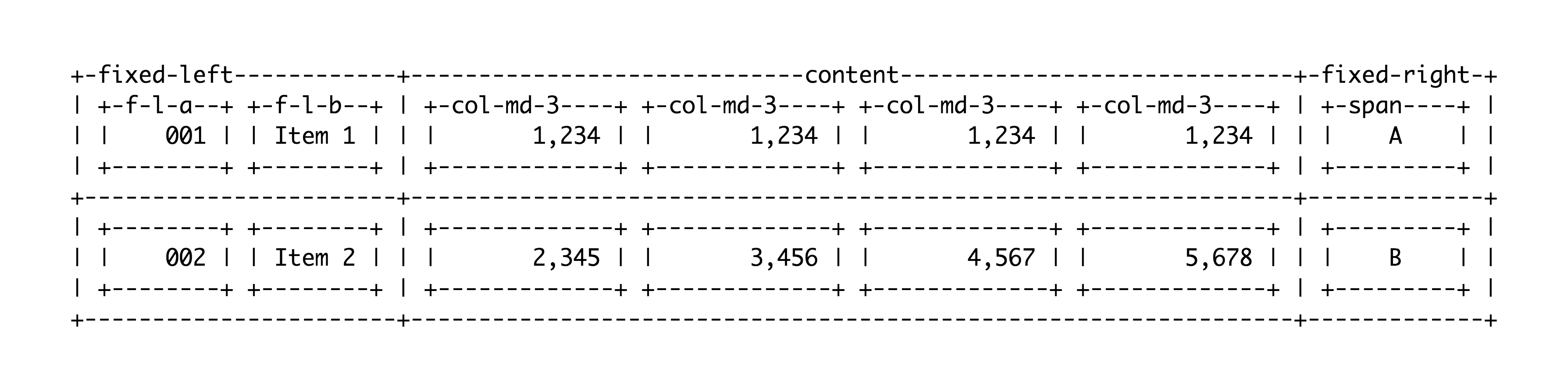
<div class="row" id="row01">
  <div class="fixed-left">
    <div class="fixed-left-a">001</div>
    <div class="fixed-left-b">Item 1</div>
  </div>
  <div class="content">
    <div class="row">
      <div class="col-xs-4 col-md-3">1,234</div>
      <div class="col-xs-4 col-md-3">1,234</div>
      <div class="col-xs-4 col-md-3">1,234</div>
      <div class="col-xs-4 col-md-3">1,234</div>
    </div>
  </div>
  <div class="fixed-right">
    <span>A</span>
  </div>
</div>

<div class="row" id="row02">
  ...
</div>
I want to use bootstrap 3 grid within the main content, but have fixed attributes of every row that don't require the left and right pieces to be variable sized.
Edit:
I want the output to look something like the attached image.