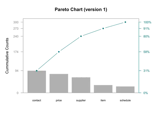
The code below creates a pareto chart using base plotting functions in R. How do I create the same chart with ggplot?
*I do know there are people who will hate plots with two y axis. Please don't include this debate in this post. Thanks
## Creating the d tribble
library(tidyverse)
d <- tribble(
  ~ category, ~defect,
  "price", 80,
  "schedule", 27,
  "supplier", 66,
  "contact", 94,
  "item", 33
)

## Creating new columns
d <- arrange(d, desc(defect)) %>%
  mutate(
    cumsum = cumsum(defect),
    freq = round(defect / sum(defect), 3),
    cum_freq = cumsum(freq)
  )

## Saving Parameters
def_par <- par()

## New margins
par(mar=c(5,5,4,5))

## bar plot, pc will hold x values for bars
pc = barplot(d$defect,
             width = 1, space = 0.2, border = NA, axes = F,
             ylim = c(0, 1.05 * max(d$cumsum, na.rm = T)),
             ylab = "Cummulative Counts" , cex.names = 0.7,
             names.arg = d$category,
             main = "Pareto Chart (version 1)")

## Cumulative counts line
lines(pc, d$cumsum, type = "b", cex = 0.7, pch = 19, col="cyan4")

## Framing plot
box(col = "grey62")

## adding axes
axis(side = 2, at = c(0, d$cumsum), las = 1, col.axis = "grey62", col = "grey62", cex.axis = 0.8)
axis(side = 4, at = c(0, d$cumsum), labels = paste(c(0, round(d$cum_freq * 100)) ,"%",sep=""),
     las = 1, col.axis = "cyan4", col = "cyan4", cex.axis = 0.8)

## restoring default paramenter
par(def_par)

