116

I want to have a row of IconButtons, all next to each other, but there seems to be pretty big padding between the actual icon, and the IconButton limits. I've already set the padding on the button to 0.

This is my component, pretty straightforward:

class ActionButtons extends StatelessWidget {
  @override
    Widget build(BuildContext context) {
      return Container(
        color: Colors.lightBlue,
        margin: const EdgeInsets.all(0.0),
        padding: const EdgeInsets.all(0.0),
        child: Row(
          mainAxisAlignment: MainAxisAlignment.start,
          children: <Widget>[
            IconButton(
              icon: new Icon(ScanrIcons.reg),
              alignment: Alignment.center,
              padding: new EdgeInsets.all(0.0),
              onPressed: () {},
            ),
            IconButton(
              icon: new Icon(Icons.volume_up),
              alignment: Alignment.center,
              padding: new EdgeInsets.all(0.0),
              onPressed: () {},
            )
          ],
        ),
      );
    }
}

enter image description here

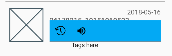
I want to get rid of most of the light blue space, have my icons start earlier on the left, and closer to each other, but I can't find the way to resize the IconButton itself.

I'm almost sure this space is taken by the button itself, 'cause if I change their alignments to centerRight and centerLeft they look like this:

enter image description here

Making the actual icons smaller doesn't help either, the button is still big:

enter image description here

thanks for the help

Pablote
  • 4,745
  • 9
  • 39
  • 46
  • Have you tried making your actual icons larger? It looks like the icon may be centered in, but not filling up, it's space in the icon font glyph. – Deborah May 17 '18 at 11:26
  • 7
    use GestureDetector( onTap: () {}, child: new Icon(Icons.volume_up) ) – Shyju M May 17 '18 at 11:33

11 Answers11

278

Simply pass an empty BoxConstrains to the constraints property and a padding of zero.

IconButton(
    padding: EdgeInsets.zero,
    constraints: BoxConstraints(),
)

You have to pass the empty constrains because, by default, the IconButton widget assumes a minimum size of 48px.

Rodrigo Vieira
  • 3,037
  • 2
  • 7
  • 14
95

Two ways to workaround this issue.

Still Use IconButton

Wrap the IconButton inside a Container which has a width.

For example:

Container(
  padding: const EdgeInsets.all(0.0),
  width: 30.0, // you can adjust the width as you need
  child: IconButton(
  ),
),

Use GestureDetector instead of IconButton

You can also use GestureDetector instead of IconButton, recommended by Shyju Madathil.

GestureDetector( onTap: () {}, child: Icon(Icons.volume_up) ) 
sgon00
  • 4,879
  • 1
  • 43
  • 59
27

It's not so much that there's a padding there. IconButton is a Material Design widget which follows the spec that tappable objects need to be at least 48px on each side. You can click into the IconButton implementation from any IDEs.

You can also semi-trivially take the icon_button.dart source-code and make your own IconButton that doesn't follow the Material Design specs since the whole file is just composing other widgets and is just 200 lines that are mostly comments.

Community
  • 1
  • 1
xster
  • 6,269
  • 9
  • 55
  • 60
14

Wrapping the IconButton in a container simply wont work, instead use ClipRRect and add a material Widget with an Inkwell, just make sure to give the ClipRRect widget enough border Radius .

ClipRRect(
    borderRadius: BorderRadius.circular(50),
    child : Material(
        child : InkWell(
            child : Padding(
                padding : const EdgeInsets.all(5),
                child : Icon(
                    Icons.favorite_border,
                    ),
                ),
            onTap : () {},
            ),
        ),
    )
HMD
  • 2,202
  • 6
  • 24
  • 37
Reagan Realones
  • 221
  • 3
  • 3
5

Instead of removing a padding around an IconButton you could simply use an Icon and wrap it with a GestureDetector or InkWell as

GestureDetector(
   ontap:(){}
   child:Icon(...)
);

Incase you want the ripple/Ink splash effect as the IconButton provides on click wrap it with an InkWell

InkWell(
   splashColor: Colors.red,
   child:Icon(...)
   ontap:(){}
)

though the Ink thrown on the Icon in second approach wont be so accurate as for the IconButton, you may need to do some custom implementation for that.

Mahesh Jamdade
  • 17,235
  • 8
  • 110
  • 131
3

Here's a solution to get rid of any extra padding, using InkWell in place of IconButton:

Widget backButtonContainer = InkWell(
    child: Container(
      child: const Icon(
        Icons.arrow_upward,
        color: Colors.white,
        size: 35.0,
      ),
    ),
    onTap: () {
      Navigator.of(_context).pop();
    });
Gene Bo
  • 11,284
  • 8
  • 90
  • 137
1

I was facing a similar issue trying to render an Icon at the location the user touches the screen. Unfortunately, the Icon class wraps your chosen icon in a SizedBox.

Reading a little of the Icon class source it turns out that each Icon can be treated as text:

Widget iconWidget = RichText(
      overflow: TextOverflow.visible,
      textDirection: textDirection,
      text: TextSpan(
        text: String.fromCharCode(icon.codePoint),
        style: TextStyle(
          inherit: false,
          color: iconColor,
          fontSize: iconSize,
          fontFamily: icon.fontFamily,
          package: icon.fontPackage,
        ),
      ),
    );

So, for instance, if I want to render Icons.details to indicate where my user just pointed, without any margin, I can do something like this:

Widget _pointer = Text(
      String.fromCharCode(Icons.details.codePoint),
      style: TextStyle(
        fontFamily: Icons.details.fontFamily,
        package: Icons.details.fontPackage,
        fontSize: 24.0,
        color: Colors.black
      ),
    );

Dart/Flutter source code is remarkably approachable, I highly recommend digging in a little!

0

A better solution is to use Transform.scale like this:

 Transform.scale(
   scale: 0.5, // set your value here
   child: IconButton(icon: Icon(Icons.smartphone), onPressed: () {}),
 )
CopsOnRoad
  • 237,138
  • 77
  • 654
  • 440
0

You can use ListTile it gives you a default space between text and Icons that would fit your needs

ListTile(
         leading: Icon(Icons.add), //Here Is The Icon You Want To Use
         title: Text('GFG title',textScaleFactor: 1.5,), //Here Is The Text Also
         trailing: Icon(Icons.done),
         ),
Yazan Najjar
  • 1,830
  • 16
  • 10
0

I like the following way:

InkWell(
  borderRadius: BorderRadius.circular(50),
  onTap: () {},
  child: Container(
    padding: const EdgeInsets.all(8),
    child: const Icon(Icons.favorite, color: Colors.red),
  ),
),

enter image description here

linyi102
  • 1
  • 1
-9

To show splash effect (ripple), use InkResponse:

InkResponse(
  Icon(Icons.volume_up),
  onTap: ...,
)

If needed, change icons size or add padding:

InkResponse(
  child: Padding(
    padding: ...,
    child: Icon(Icons.volume_up, size: ...),
  ),
  onTap: ...,
)
Pavel
  • 5,374
  • 4
  • 30
  • 55
  • Nowhere in the question it is asked to show ripple effect! – Ashish Yadav Jan 09 '21 at 12:46
  • @Ashish, IconButton implies having ripple effect. If you don't need ripple effect, you can just use GestureDetector. It's quite simple and shown in the top answer. My solution allows to remove padding but keep IconButton-like ripple – Pavel Jan 10 '21 at 13:23