How do I set the backgroundColor of theAppBar to a gradient?
Asked
Active
Viewed 8.3k times
57
-
for others https://pub.dev/packages/gradientscaffoldwidget – Hussnain Haidar Mar 29 '20 at 10:56
-
3you can use flexibleSpace property from AppBar to achieve gradient background. – darwin Nov 16 '20 at 08:23
-
1Check this out: https://hackernoon.com/flutter-gradient-app-bar-jm8a32fu – Daniel Vilela Dec 21 '20 at 05:41
7 Answers
66
This should work flawlessly:
return Scaffold(
  appBar: AppBar(
    title: Text(widget.title),
    flexibleSpace: Container(
      decoration: const BoxDecoration(
        gradient: LinearGradient(
          begin: Alignment.topCenter,
          end: Alignment.bottomCenter,
          colors: <Color>[Colors.black, Colors.blue]),
      ),
    ),
  ),
);
Riki137
- 2,076
- 2
- 23
- 26
-
This is the correct answer because it doesn't override widget locations of default appbar. With this solution, your existing action buttons and back buttons will continue working. Really flawless! Thanks! – Myo Win Apr 08 '22 at 09:54
-
54
I don't believe you can pass a gradient to an AppBar as it expects a Color rather than a gradient.
You can, however, create your own widget that mimics an AppBar except by using a gradient. Take a look at this example that I've pieced together from the Planets-Flutter tutorial along with the code below it.
import "package:flutter/material.dart";
class Page extends StatelessWidget {
@override
Widget build(BuildContext context) {
return Column(children : <Widget>[GradientAppBar("Custom Gradient App Bar"), Container()],);
}
}
class GradientAppBar extends StatelessWidget {
final String title;
final double barHeight = 50.0;
GradientAppBar(this.title);
@override
Widget build(BuildContext context) {
final double statusbarHeight = MediaQuery
.of(context)
.padding
.top;
return new Container(
padding: EdgeInsets.only(top: statusbarHeight),
height: statusbarHeight + barHeight,
child: Center(
child: Text(
title,
style: TextStyle(fontSize: 20.0, color: Colors.white, fontWeight: FontWeight.bold),
),
),
decoration: BoxDecoration(
gradient: LinearGradient(
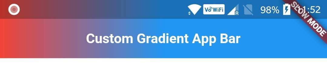
colors: [Colors.red, Colors.blue],
begin: const FractionalOffset(0.0, 0.0),
end: const FractionalOffset(0.5, 0.0),
stops: [0.0, 1.0],
tileMode: TileMode.clamp
),
),
);
}
}
Hope this helps. Let me know if you have any questions.
-
-
9won't this be problematic since all the other default behaviours of appbar will need to be rewritten? Take the back button for navigation for example. Is this assumption correct? – Giacomo Cerquone Oct 16 '18 at 13:19
-
3It seems like using this library is the ultimate solution https://github.com/joostlek/GradientAppBar – Mohamed Mo Kawsara Apr 09 '19 at 21:45
-
How can we hide black transparent layer from status bar as well? – Nilesh Rathore Sep 02 '19 at 12:02
-
It is possible to set GradientAppBar directly to appBar using PreferredSizeWidget. – nivesh shastri Dec 06 '19 at 05:11
-
-
This is not a AppBar. This one is only a Container with gradient background. Real AppBars can open a drawer, default back button functionality , flexible space and bottom for work with TabBar widget ect. – dilshan Nov 25 '22 at 10:16
17
AppBar does not have that feature by default. But you can make an AppBar like widget which will have a gradient background as follow:
  Widget build(BuildContext context) {
    return new Scaffold(
      appBar: new PreferredSize(
        child: new Container(
          padding: new EdgeInsets.only(
            top: MediaQuery.of(context).padding.top
          ),
          child: new Padding(
            padding: const EdgeInsets.only(
              left: 30.0,
              top: 20.0,
              bottom: 20.0
            ),
            child: new Text(
              'Arnold Parge',
              style: new TextStyle(
                fontSize: 20.0,
                fontWeight: FontWeight.w500,
                color: Colors.white
              ),
            ),
          ),
          decoration: new BoxDecoration(
            gradient: new LinearGradient(
              colors: [
                Colors.red,
                Colors.yellow
              ]
            ),
            boxShadow: [
              new BoxShadow(
                color: Colors.grey[500],
                blurRadius: 20.0,
                spreadRadius: 1.0,
              )
            ]
          ),
        ),
        preferredSize: new Size(
          MediaQuery.of(context).size.width,
          150.0
        ),
      ),
      body: new Center(
        child: new Text('Hello'),
      ),
    );
  }
Here boxShadow will give elevated feel.
Arnold Parge
- 6,684
- 2
- 30
- 34
-
6This answer is nice and I upvoted it, however, it DOESN"T support Drawers and other native AppBar functionalities, And this library is GREAT https://github.com/joostlek/GradientAppBar – Mohamed Mo Kawsara Apr 09 '19 at 21:44
-
7It can be done using Appbar only. Follow this link. https://hackernoon.com/flutter-gradient-app-bar-jm8a32fu – Sumit Kumar Feb 23 '21 at 00:40
-
This is not a AppBar. This one is only a Container with gradient background. Real AppBars can work with drawer api, navigation api (for default pop) , flexible space and bottom for work with TabBar widget ect. – dilshan Nov 25 '22 at 10:40
3
Just wrap AppBar in the Widgets Material > Container with grandient, so you can keep the original AppBar's attributes. here is my implementation with necesary attributes.
import 'package:flutter/material.dart';

class CustomAppBar extends StatelessWidget implements PreferredSizeWidget {
  const CustomAppBar({
    Key? key,
    this.title,
    this.leading,
    this.actions,
    this.elevation = 2.0,
  }) : super(key: key);
  final Widget? title;
  final Widget? leading;
  final double elevation;
  final List<Widget>? actions;

  @override
  Widget build(BuildContext context) {
    return Material(
      elevation: elevation,
      child: Container(
        decoration: const BoxDecoration(
          gradient: RadialGradient(
            radius: 2.5,
            stops: [
              0.0,
              0.27,
              1.0,
            ],
            colors: [
              Color(0XFFB71731),
              Color(0XFFB71731),
              Color(0XFFA5004E),
            ],
          ),
        ),
        child: AppBar(
          centerTitle: true,
          leading: leading,
          elevation: 0.0,
          title: title,
          backgroundColor: Colors.transparent,
          actions: actions,
        ),
      ),
    );
  }

  @override
  Size get preferredSize => const Size.fromHeight(kToolbarHeight);
}
then, just use it wherever you want
class MyPage extends StatelessWidget {
  const MyPage ({Key? key}) : super(key: key);

  @override
  Widget build(BuildContext context) {

        return Scaffold(
            appBar: const CustomAppBar(),
            body: Center(child:Text("My App gradient"),
        );
  }
}
mirxtrem apps
- 59
- 3
2
You can decorate using flexibleSpace
appBar: AppBar(
      centerTitle: true,
        title: Text(widget.title),
        flexibleSpace: Container(
          decoration: BoxDecoration(
            gradient: LinearGradient(
              begin: Alignment.topLeft,
                end: Alignment.bottomRight,
                colors: <Color>[
              Colors.red,
              Colors.blue
            ])
         ),
     ),
 ),
Wai Han Ko
- 760
- 5
- 16
1
Set the background and shadow colors to Colors.transparent in a standard AppBar, then wrap a Container(...) around it, using BoxDecoration(gradient: LinearGradient(...)), and bob is, of course, your uncle.
import 'package:flutter/material.dart';
import 'package:pga_app/core/colors.dart';

class CustomAppBar extends StatelessWidget implements PreferredSizeWidget {
  const CustomAppBar({Key? key}) : super(key: key);

  @override
  Widget build(BuildContext context) {
    TextTheme thm = Theme.of(context).textTheme;
    return Container(
      child: AppBar(
        automaticallyImplyLeading: true,
        backgroundColor: Colors.transparent,
        shadowColor: Colors.transparent,
        title: const Text(
          "My Cool App",
          textAlign: TextAlign.center,
        ),
        actions: [
          TextButton(
            child: const Icon(Icons.menu, size: 36, color: COLOR_BUTTON_WHITE),
            onPressed: () {},
          ),
        ],
      ),
      decoration: const BoxDecoration(
        gradient: LinearGradient(
          begin: Alignment.topCenter,
          end: Alignment.bottomCenter,
          stops: [0.0, 1.0],
          colors: [
            COLOR_PANEL_DARK_BLUE,
            COLOR_PANEL_BLUE,
          ],
        ),
      ),
    );
  }

  @override
  Size get preferredSize => Size(900, 56);
}
Forgive my use of undefined (in this post) constants; this was pulled from a production app and the names were changed to protect the innocent.

ChrisH
- 975
- 12
- 21
-
1The other answer didn't work for some reason. This did! Thank you so much I think this is the simplest and most intuitive. Great job, thanks for helping. I would've posted this but I noticed you did first so I gave an upvote. – user3413723 Aug 24 '23 at 13:41
0
@Riki137 answer work like charm. Here's another approach if anyone wanna give it a try.
   _appBar = AppBar();
   return PreferredSize(
     child: ShaderMask(
         child: _appBar,
        shaderCallback: (rect) {
           return ui.Gradient.linear(rect.centerLeft, rect.centerRight,
               [Colors.black, Colors.grey]);
         }),
     preferredSize: _appBar.preferredSize,
  );
Jagraj Singh
- 4,031
- 4
- 15
- 33