5

I have a div with elements aligned as a row, this is the css class for it:

.myRow {
  display: grid;
  grid-template-columns: 0.1fr 0.1fr 2fr 3fr 2fr;
  grid-column-gap: 10px;
  grid-row-gap: 10px;
  justify-content: center;
  padding: 10px;
}
<div class="myRow">
  <div style="color:blue; width: 5px;">aa</div>
  <div style="color:red;">bb</div>
  <div style="color:green;">ccc</div>
  <div style="color:orange;">ddd</div>
  <div style="color:purple;">eee</div>
</div>

I want to be able to remove the first two gaps and keep the rest of the gaps, like how grid-template-columns works.

enter image description here

Is it possible to do this with grid?

Edit: I want it to be like this:

enter image description here

Michael Benjamin
  • 346,931
  • 104
  • 581
  • 701
shinzou
  • 5,850
  • 10
  • 60
  • 124
  • 1
    See similar question: https://stackoverflow.com/questions/45151767/can-grid-row-gap-grip-column-gap-be-overridden-for-a-single-gutter – sol May 24 '18 at 08:46
  • It's not exatcly the same, I want no gaps so the ccc, ddd, eee cells will take the space of those 2 first gaps. @sol – shinzou May 24 '18 at 11:43

2 Answers2

9

Add negative right margin whose value is equal to grid gap

.myRow {
  display: grid;
  grid-template-columns: 0.1fr 0.1fr 2fr 3fr 2fr;
  grid-column-gap: 10px;
  grid-row-gap: 10px;
  justify-content: center;
  padding: 10px;
}

.margin {
  margin-right: -10px
}
<div class="myRow">
  <div class="margin" style="color:blue; width: 5px; ">aa</div>
  <div class="margin" style="color:red;">bb</div>
  <div style="color:green;">ccc</div>
  <div style="color:orange;">ddd</div>
  <div style="color:purple;">eee</div>
</div>
Gautam Naik
  • 8,990
  • 3
  • 27
  • 42
  • That's not what I wanted, I wanted the first 3 gaps between the cells to not be there, but the ccc cell is still in the same place. – shinzou May 24 '18 at 11:41
  • 2
    @shinzou how is this not what you wanted? It matches your image for your desired result. – disinfor May 24 '18 at 21:49
  • upvote for a clever simple solution, would not have thought this would work – keymap Mar 10 '20 at 22:00
2

You cannot set multiple sizes for grid gaps. The column-gap and row-gap properties (previously grid-column-gap and grid-row-gap) accept only a single value.

This issue is covered in detail here:


Pseudo-elements applied to a grid container are considered grid items.

This behavior is explained here:


The order property can be used to re-arrange grid items on the screen.

More details here:


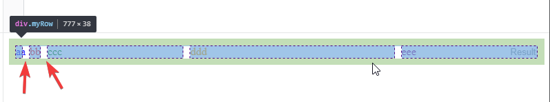
Taken in combination, you can create the column gaps – there are only two – with ::before and ::after pseudo-elements, arrange their placement with the order property, and get rid of the grid-column-gap rule.

.myRow {
  display: grid;
  grid-template-columns: 0.1fr 0.1fr 2fr auto 3fr auto 2fr;
  justify-content: center;
  padding: 10px;
}

.myRow::before {
  content: "";
  width: 10px;
  background-color: white;
}

.myRow::after {
  content: "";
  width: 10px;
  background-color: white;
}

.myRow > :nth-child(1) { order: -3; }
.myRow > :nth-child(2) { order: -2; }
.myRow > :nth-child(3) { order: -1; }
.myRow > :nth-child(5) { order: 1; }

.myRow > div {
  background-color: lightgray;
}
<div class="myRow">
  <div style="color:blue;">aa</div>
  <div style="color:red;">bb</div>
  <div style="color:green;">ccc</div>
  <div style="color:orange;">ddd</div>
  <div style="color:purple;">eee</div>
</div>

Here's a little more about how this works:

Since the default value of the order property is 0, and items are then placed in source order, this is how the browser sees the nth-child pseudo-class code above:

.myRow > :nth-child(1) { order: -3; }
.myRow > :nth-child(2) { order: -2; }
.myRow > :nth-child(3) { order: -1; } /*
.myRow > ::before      { order: 0; }
.myRow > :nth-child(4) { order: 0; }
.myRow > ::after       { order: 0; } */
.myRow > :nth-child(5) { order: 1; }
Michael Benjamin
  • 346,931
  • 104
  • 581
  • 701
  • Clever, but how come before and after are not applied to order < 0 though? – shinzou May 26 '18 at 12:21
  • The before and after selectors aren't applied to the first 3 divs, why? (the before and after selectors are responsible for the gaps) – shinzou May 26 '18 at 22:32
  • The `:nth-child()` selectors apply only to DOM elements. They ignore CSS elements. That's why I had to go around the pseudos. – Michael Benjamin May 26 '18 at 22:49
  • I still don't understand... Why does the red square happen? https://i.imgur.com/gPc237o.png (The first 3 elements are in the DOM) – shinzou May 27 '18 at 08:49