1

I would like to plot a data frame with 4 columns:

Quarters <-  c("Q1","Q2","Q3")
Series1 <- c("1%","2%","3%")
Series2 <- c("4%","5%","6%")
Series3 <- c("1000","2000","3000")

df <- data.frame(Quarters,Series1,Series2,Series3)

Quarters as x-axis, Series1 & Series2 as left y-axis, Series3 as right y-axis and a legend.

I have seen some solutions with ggplot using scale_y_continues, but then the secondary (y) axis has to be a multiple of the primary axis. Which I do not want, as the data will be dynamic and the ratio might not hold through in all instances.

Any solutions how I might go about creating this? Perhaps ggplot is not the way to go?
Zoe
  • 27,060
  • 21
  • 118
  • 148
Aksel Etingu
  • 195
  • 2
  • 15
  • You can add a secondary axis that is a transformation of the primary axis with `sec_axis`: http://ggplot2.tidyverse.org/reference/sec_axis.html But ggplot is philosophically opposed to multiple unrelated axes, so if that's *really* what you want you're going to have to look elsewhere: https://stackoverflow.com/a/3101876 – divibisan May 24 '18 at 14:24

2 Answers2

1

I don't know about ggplot2, but you can use par(new = T) in R to plot a graph on top of another one. If you remove the right axis from the first plot and add it manually on the second one it should look good.

Quarters <-  c(1,2,3)
Series1 <- c(0.01,0.02,0.03)
Series2 <- c(0.04,0.05,0.06)
Series3 <- c(1000,2000,3000)

par(mar = c(5,5,2,5)) # Leaves some space for the second axis

plot(Quarters,Series1,type="l",ylim=c(0,0.1))
lines(Quarters,Series2,col="red")

par(new=T)
plot(Quarters,Series3,type="l",axes=F, xlab=NA, ylab=NA,col="blue") # Removes axis and labels so they don't overlap
axis(side = 4) # Adds secondary axis

Does this work for you? More info here

Zoe
  • 27,060
  • 21
  • 118
  • 148
Fino
  • 1,774
  • 11
  • 21
1

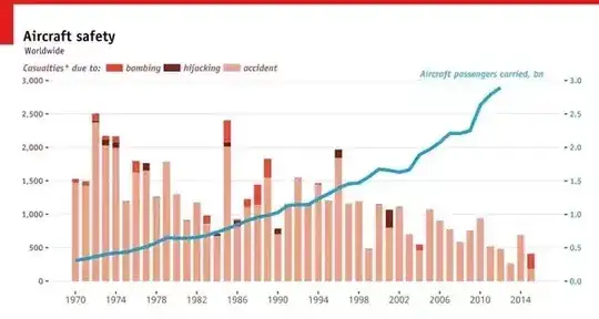
ggplot2 is perfectly fine and deals with dual-axis very well. You would use sec.axis within scale_y_continuous or scale_y_discrete (or really just about any valid scale_y_) call:

  scale_y_continuous(
    "Casualties* due to:",
    sec.axis = sec_axis(~. *0.001, 
                        name="Aircraft passengers carried, bn", 
                        labels = scaleFUN, 
                        breaks = seq(0,3, by=0.5)),
    limits = c(0,3000),
    breaks = seq(0,3000, by=500),
    labels = comma
  ) 

The following creates two axis, one with a break of 0 to 3000, by 500. That's the axis on the left (primary axis). The second one goes by 0 to 3 by 0.5, but there's no reason why it should follow that scale. You can very well have scales that are not multiples of the primary axis.

You can get a plot like the following:

Using the above technique. If it is helpful I put up the full ggplot code to recreate the above plot in this post. Completely done in ggplot2 including the horizontal legend and secondary axis.

Good luck!

Community
  • 1
  • 1
onlyphantom
  • 8,606
  • 4
  • 44
  • 58
  • Thank you very much. Although @Fino has given me what I was looking for, I have to admit ggplot2 is a lot snappier. – Aksel Etingu May 25 '18 at 07:32
  • I'm not sure if this is correct: the [discrete axes](https://www.rdocumentation.org/packages/ggplot2/versions/3.2.1/topics/scale_x_discrete) do not support the `sec.axis` attribute! – Yan Foto Jan 31 '20 at 10:07