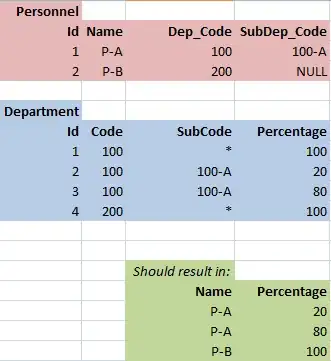
I have a dataset from my simulations where I combine the results from each simulation seed into a bigger list using bl.extend(df['column'].tolist()).
I'm also running several simulation scenarios, so I append each scenario to a list of lists.
Finally, I'm computing the Probability Mass Function (PMF) of each list as follows (from How to plot a PMF of a sample?)
for idx,sublist in enumerate(pmf_list):
        val, cnt = np.unique(sublist, return_counts=True)
        pmf = cnt / float(len(sublist))
        plot_pmf.append(np.column_stack((val, pmf)))
The issue is that I end up with a list of numpy arrays which I don't know how to plot. The minimum code to reproduce the problem is the following:
import numpy as np

list1 = np.empty([2, 2])
list2 = np.empty([2, 2])
list3 = np.empty([2, 2])
bl = [] # big list
bl.append(list1)
bl.append(list2)
bl.append(list3)
print bl
I can plot using plt.hist(bl[0]) but it doesn't give me the right results. See plot attached for the following list.
<type 'numpy.ndarray'>
[[0.00000000e+00 1.91734780e-01]
 [1.00000000e+00 2.94277080e-02]
 [2.00000000e+00 3.28276369e-01]
 [3.00000000e+00 4.43357154e-01]
 [4.00000000e+00 3.54294582e-03]
 [5.00000000e+00 1.57306794e-03]
 [6.00000000e+00 2.00530733e-03]
 [7.00000000e+00 2.95245485e-05]
 [8.00000000e+00 2.24386568e-05]
 [9.00000000e+00 2.83435665e-05]
 [1.00000000e+01 1.18098194e-06]
 [1.20000000e+01 1.18098194e-06]]
Formatting the y-values I get:
0.1944084241
0.0415880165
0.3480178394
0.4031723062
0.0050902199
0.0033411939
0.0040175705
0.0001480127
0.0001031961
0.0001008373
0.0000058969
0.0000011794
0.0000047175
0.0000005897
very different from the y-values on the histogram plot


