I have a basic flexbox layout like this..
body,html {
  height:100%;
  width:100%;

}

#container {
  width:100%;
  background:grey;
  display:flex;
  flex-direction:column;
}

.top {
  background:red;
  flex:1;
  padding:20px;
}

.bottom {
  background:yellow;
  flex:1;
  padding:20px;
}
<div id="container">
<div class="top">
Top Content
</div>
<div class="bottom">
Lorem ipsum dolor sit amet, consectetur adipiscing elit. Ut venenatis, arcu vitae sollicitudin pellentesque, quam libero imperdiet urna, eu rhoncus lorem dolor sed neque. Donec ex risus, pretium ut maximus fringilla, euismod id mi. Phasellus ligula sem, iaculis ut urna eget, efficitur vulputate sem.
</div>
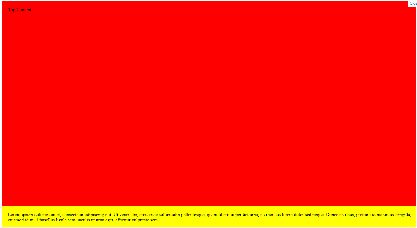
</div>I am trying to make the top div fill the remaining space, the bottom div is dynamic so the height changes depending on the text. My result looks like this..
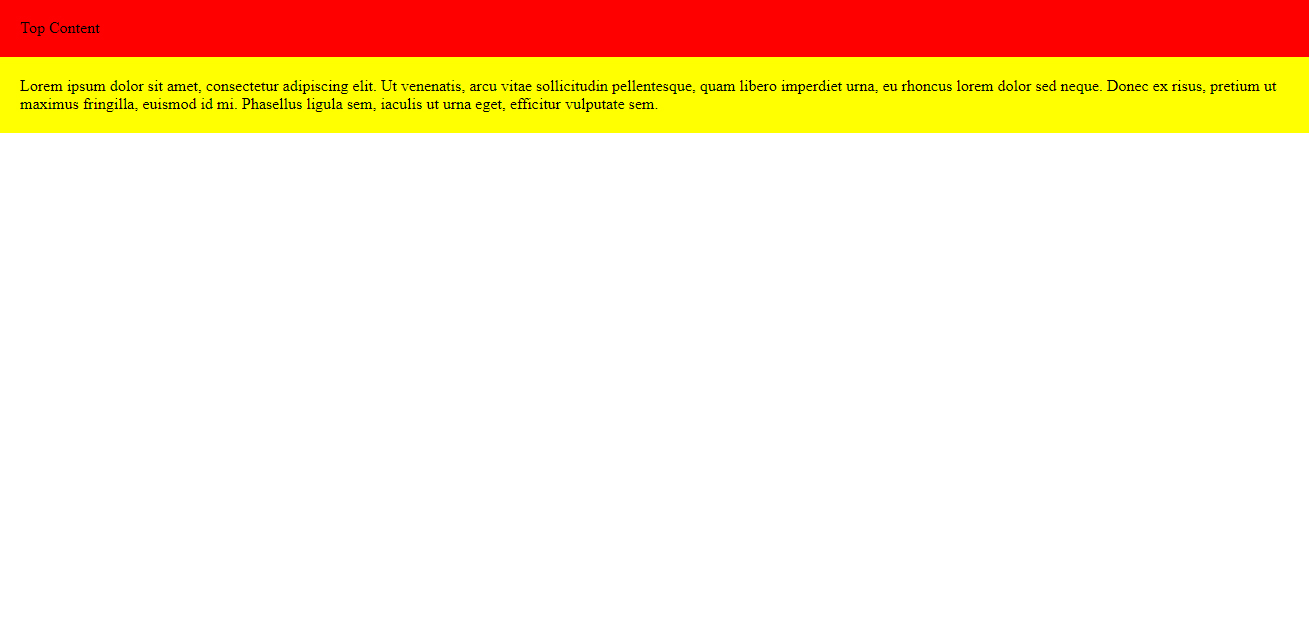
Is flexbox the best thing to use in this situation?