I can't seem to get my responsive font size to work in the email I'm creating. Issues is with outlook, gmail, aol.
Here's the HTML
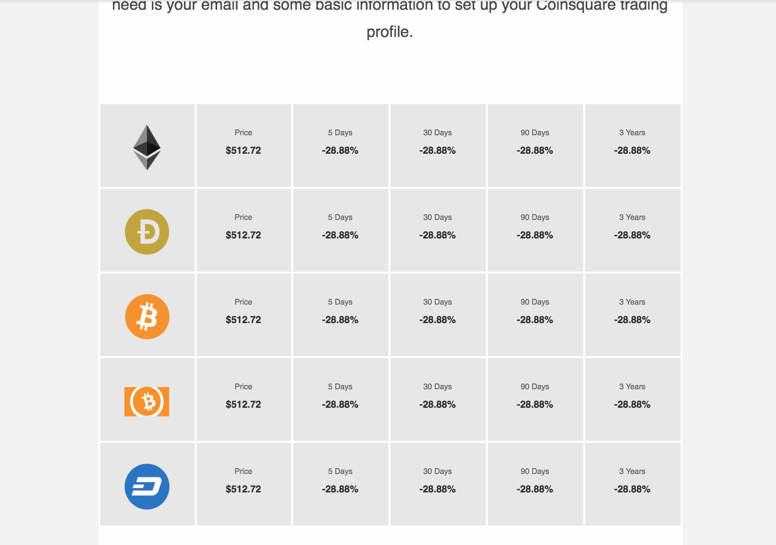
<th class="small-2 large-2 columns" valign="middle" style="Margin: 0 auto; background-color: #E7E7E7; border: 2px solid #ffffff; color: #0a0a0a; font-family: 'Open Sans', sans-serif; font-size: 16px; font-weight: normal; line-height: 1.3; margin: 0 auto; min-height: 85px; padding: 0; padding-bottom: 16px; padding-left: 0 !important; padding-right: 0 !important; padding-top: 20px; text-align: left; width: 80.66667px;">
   <p class="field text-center" style="Margin: 0; Margin-bottom: 10px; color: #666666 !important; font-family: 'Open Sans', sans-serif; font-size: 8px; font-weight: normal; line-height: 1.75; margin: 0; margin-bottom: 2px; padding: 0; text-align: center;">Price</p>
   <p pardot-region="" class="number text-center" style="Margin: 0; Margin-bottom: 10px; color: #333333; font-family: 'Open Sans', sans-serif; font-size: 10px; font-weight: bold; line-height: 1.75; margin: 0; margin-bottom: 10px; padding: 0; text-align: center;">$512.72</p>
</th>
Here's the CSS that I inlined later with the foundation inline tool
.financial-table th p.field {
  color: #666666 !important;
  margin-bottom: 2px;
  font-size: 8px;
}

.financial-table th p.number {
  font-size: 10px;
  color: #333333;
  font-weight: bold;
}

@media only screen and (min-width:500px){

  .financial-table th p.number {
    font-size: 16px !important;
  }
  .financial-table th p.field {
    font-size: 12px !important;
  }
}
What am I doing wrong?