When I was plotting two series of data against eachother, the X axis was inverted unexpectedly. I know this question sounds pretty similar to this other: x-axis inverted unexpectedly by pandas.plot(...) and it actually is, but I want to know if this can be disabled or something, not a workaround. Let me explain myself.
I have a very simple DF that consists on a datetime index and two columns; one has humidity measurements and the other daily weights. Both of them are in descending order because when my sample loses water, it also loses weight and humidity. So my DF looks something like this, where my data is in descending order
But then, when I plot using X = "Peso" (weight), and Y = 'Humedad' (humidity), my X axis goes in ascending order insted of descending order.
My ploting code:
plt.figure(figsize=(12,9))
plt.scatter(data['Peso'],data['Humedad'])
plt.xlabel('Peso (kg)',fontsize=14)
plt.ylabel("Raw Counts",fontsize=14)
plt.xticks(rotation=90,fontsize=10)
plt.grid()
Resulting in this kind of plot, where X axis is inverted
So, I could do two simple types of workaround:
plt.scatter(sorted(data['Peso']),data['Humedad'])
or
plt.scatter(data['Peso'][::-1],data['Humedad'])
Both of them have the same result, they print my data as I wanted, BUT my xticks are still inverted:
So what I did was creating a list with my weight values in order to insert it as it follows:
semin=data['Peso']
semin=semin.tolist()
And then adding it to my plt.xticks like this
plt.xticks(semin,rotation=90,fontsize=10)
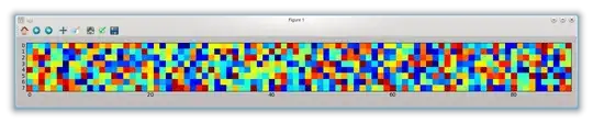
It "kind off" worked, overlaping some of the xticks as you can see in the image below:

I know I can solve this with [Locs] and general xticks information, but I really wanted to know if it's possible to just ask Pandas to follow the natural data descending order or anything similiar and avoiding all of this xticks stuff?
I've checked this too: https://github.com/pandas-dev/pandas/issues/10118 and I tried by doing the set_index suggestion:
plt.figure(figsize=(12,9))
data.set_index('Peso').Humedad.plot()
plt.xlabel('Peso (kg)',fontsize=14)
plt.ylabel("Raw Counts",fontsize=14)
plt.xticks(rotation=90,fontsize=10)
plt.grid()
And it went almost perfect, except that I needed it in scatter...

So I tried some stuff to "scatter it"
1. Putting the marker type:
data.set_index('Peso').Humedad.plot(marker='o')
Got a marker + line graph:

2. Changing .plot for .scatter to the plot:
data.set_index('Peso').Humedad.scatter()
Got this error:
AttributeError: 'Series' object has no attribute 'scatter'
3. Using both
data.set_index('Peso').Humedad.plot.scatter()
Got this one:
AttributeError: 'SeriesPlotMethods' object has no attribute 'scatter'
4. Making this giant question. Please help.
And that's all, sorry if I'm missing something or if my post is too long. I'm open to suggestions, corrections or anything you're willing to tell me.
Thanks!