The Below is my code of a Masonry UI, I am using with pure CSS
This works well if there are more than 4 cards but if I use it with below 4 cards the column-count: 3; does not work well.
body{
  height:1000px;
}

ul {
    list-style: none;
    -moz-column-count: 3;
    -webkit-column-count: 3;
    column-count: 3;
    -moz-column-gap: 1em;
    -webkit-column-gap: 1em;
    column-gap: 1em;
    padding: 0px 4px 4px 4px;
    margin-top: -10px;
    display: inline-block;
    width: 100%;
    margin: 0px;

}

li {
    width: 100%;
    display: inline-block;
    box-shadow: none;
    background: transparent;
    box-sizing: border-box;
    -moz-box-sizing: border-box;
    -webkit-box-sizing: border-box;
    margin: 2%;
}

li div {
    border-radius: 3px;
    background-color: #f4faff;
    box-shadow: 0px 0px 4px rgba(0, 0, 0, 0.84);
    margin-top: 1em;
    cursor: pointer;
}

li div img{
    height: auto;
    width: 100%;
    vertical-align: middle;
    border: 0;
}
<ul>
<li><div><img src="https://encrypted-tbn0.gstatic.com/images?q=tbn:ANd9GcQs7OT7p9xBXn090AjKYgX4eV6vr-kHsmbIfcSFh__PoXgdNtb5gg" alt=""></div></li>
<li><div><img src="https://encrypted-tbn0.gstatic.com/images?q=tbn:ANd9GcQs7OT7p9xBXn090AjKYgX4eV6vr-kHsmbIfcSFh__PoXgdNtb5gg" alt=""></div></li>
<li><div><img src="https://encrypted-tbn0.gstatic.com/images?q=tbn:ANd9GcQs7OT7p9xBXn090AjKYgX4eV6vr-kHsmbIfcSFh__PoXgdNtb5gg" alt=""></div></li>
<li><div><img src="https://encrypted-tbn0.gstatic.com/images?q=tbn:ANd9GcQs7OT7p9xBXn090AjKYgX4eV6vr-kHsmbIfcSFh__PoXgdNtb5gg" alt=""></div></li>
</ul>
<br><br><br>
BUT THIS WORKS IF THERE IS MORE THAN 4 IMAGES
<ul>
<li><div><img src="https://encrypted-tbn0.gstatic.com/images?q=tbn:ANd9GcQs7OT7p9xBXn090AjKYgX4eV6vr-kHsmbIfcSFh__PoXgdNtb5gg" alt=""></div></li>
<li><div><img src="https://encrypted-tbn0.gstatic.com/images?q=tbn:ANd9GcQs7OT7p9xBXn090AjKYgX4eV6vr-kHsmbIfcSFh__PoXgdNtb5gg" alt=""></div></li>
<li><div><img src="https://encrypted-tbn0.gstatic.com/images?q=tbn:ANd9GcQs7OT7p9xBXn090AjKYgX4eV6vr-kHsmbIfcSFh__PoXgdNtb5gg" alt=""></div></li>
<li><div><img src="https://encrypted-tbn0.gstatic.com/images?q=tbn:ANd9GcQs7OT7p9xBXn090AjKYgX4eV6vr-kHsmbIfcSFh__PoXgdNtb5gg" alt=""></div></li>
<li><div><img src="https://encrypted-tbn0.gstatic.com/images?q=tbn:ANd9GcQs7OT7p9xBXn090AjKYgX4eV6vr-kHsmbIfcSFh__PoXgdNtb5gg" alt=""></div></li>
<li><div><img src="https://encrypted-tbn0.gstatic.com/images?q=tbn:ANd9GcQs7OT7p9xBXn090AjKYgX4eV6vr-kHsmbIfcSFh__PoXgdNtb5gg" alt=""></div></li>
</ul>Tried Soluition:
body{
  height:500px;
}

ul {
    list-style: none;
    -moz-column-count: 3;
    -webkit-column-count: 3;
    column-count: 3;
    -moz-column-gap: 1em;
    -webkit-column-gap: 1em;
    column-gap: 1em;
    padding: 0px 4px 4px 4px;
    margin-top: -10px;
    display: inline-block;
    width: 100%;
    overflow:visible;

}

li {
    width: 100%;
    display: inline-block;
    float:left;
    background: transparent;
    box-sizing: border-box;
    -moz-box-sizing: border-box;
    -webkit-box-sizing: border-box;
    margin: 2%;
}

li div {
    border-radius: 3px;
    background-color: #f4faff;
    box-shadow: 0px 0px 4px rgba(0, 0, 0, 0.84);
    margin-top: 1em;
    cursor: pointer;
}

li div img{
    height: auto;
    width: 100%;
    vertical-align: middle;
    border: 0;
}
<ul>
<li><div><img src="https://encrypted-tbn0.gstatic.com/images?q=tbn:ANd9GcQs7OT7p9xBXn090AjKYgX4eV6vr-kHsmbIfcSFh__PoXgdNtb5gg" alt=""></div></li>
<li><div><img src="https://encrypted-tbn0.gstatic.com/images?q=tbn:ANd9GcQs7OT7p9xBXn090AjKYgX4eV6vr-kHsmbIfcSFh__PoXgdNtb5gg" alt=""></div></li>
<li><div><img src="https://encrypted-tbn0.gstatic.com/images?q=tbn:ANd9GcQs7OT7p9xBXn090AjKYgX4eV6vr-kHsmbIfcSFh__PoXgdNtb5gg" alt=""></div></li>
<li><div><img src="https://encrypted-tbn0.gstatic.com/images?q=tbn:ANd9GcQs7OT7p9xBXn090AjKYgX4eV6vr-kHsmbIfcSFh__PoXgdNtb5gg" alt=""></div></li>
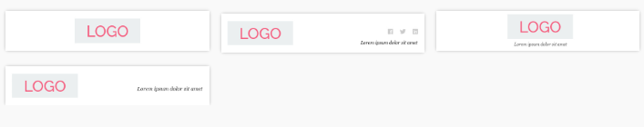
</ul>I have used float: left; to the above solutions <li> and it works in this case but in my real view it crops down the last img's box-shadow check the below screenshot.
Any solutions will be highly helpfull.