I have a simple flexbox set up where items have a fixed width and nicely wrap to the next row when needed:

However, when the parent element width is small enough and elements appear all in a single column, the whitespace to the right of the elements can look quite awkward:
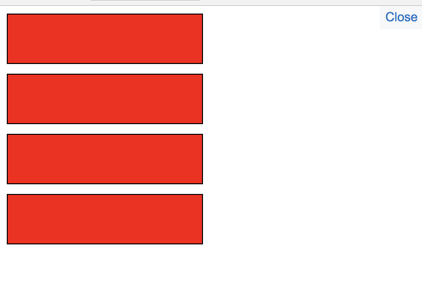
Is there a simple way to keep the behavior in the first screenshot, but have elements fill the full width of the parent element when in a single "column"? I can't use media queries as far as I know because I need things to be relative to a specific parent element and not the whole screen width. Things would look like this ideally in the one column case:

Sample code below:
.cont {
  display: flex;
  flex-wrap: wrap;
  overflow: auto;
}

.item {
  flex: 0 1 auto;
  width: 200px;
  height: 50px;
  border: 1px solid black;
  background: red;
  margin-right: 10px;
  margin-bottom: 10px;
}
<div class="cont">
<div class="item"></div>
<div class="item"></div>
<div class="item"></div>
<div class="item"></div>
</div>