65

I have a simple geom_point plot, in which the x variable is ordinal, taking 5 values (coded 1:5).

In the plot I would like to replace it with 5 corresponding text labels. Is it possible to do it in ggplot?

zx8754
  • 52,746
  • 12
  • 114
  • 209
gappy
  • 10,095
  • 14
  • 54
  • 73

4 Answers4

59

You should be able to do this with scale_x_discrete.

library(ggplot2)
df <- data.frame(x = 1:5, y = sample(1:10, 5, TRUE))

qplot(factor(x),y, data = df) + 
scale_x_discrete(breaks = 1:5, labels=c("foo","bar","baz","phi","fum")) +
xlab(NULL)
Chase
  • 67,710
  • 18
  • 144
  • 161
  • 2
    @gappy - the key here is to convert your x-axis to a factor. The solution that @prasad and I provided does this in the ggplot call itself (the `factor(x)` and `ordered(x)` bit), while @Gavin's handles it in a preprocessing step. The end result of all three answers is that the `x-axis` is treated as a factor before plotting. – Chase Feb 24 '11 at 16:46
  • 2
    @gappy your data *are* what R would consider a factor - at least from the brief description you give. Can the data take a value of 1.5 say? If they can what label should those data points get? If your data *are* ordinal, then you should tell R this and store as / coerce to a factor (`factor()`) or ordered factor (`ordered()`). If you do, it will do the right thing in many cases. See my answer - the correct plot is drawn if you tell R that the data are a factor. The answers of @Chase and @Prasad coerce as part of the plot and allow of run-time customisation of the labels. – Gavin Simpson Feb 24 '11 at 19:45
  • @Gavin - run-time customization of labels...very nice way to summarize what the three of us danced around in the last 6 comments. – Chase Feb 24 '11 at 22:19
  • not always scale_x_discrete works, instead scale_x_continuous should utilised – Al14 Dec 17 '16 at 22:00
12

scale_x_discrete should do it:

x <- sample(1:5, 20, T)
y <- rnorm(20) + x

df <- data.frame(x = ordered(x), y = y)

ggplot(df,aes(x,y)) + geom_point() + 
   scale_x_discrete(breaks = 1:5, labels = letters[1:5])
Prasad Chalasani
  • 19,912
  • 7
  • 51
  • 73
  • not being a big ggplot user, isn't `scale_x_discrete` implied if `x` is a factor? If so, is there an advantage to calling it directly rather then getting the factor labels correct in the data? I could ask the same of @Chase as (s)he has supplied the same answer? – Gavin Simpson Feb 23 '11 at 21:29
  • @Gavin you're right -- `scale_x_discrete` is only used to override the default factor labels. I guess it's useful if you have one data-frame, and you want to plot it differently in different situations (i.e. use different labels each time), so that way you don't have to change the data-frame each time. – Prasad Chalasani Feb 23 '11 at 21:55
  • @Gavin & @Prasad - I understood the OPs question to mean that he had numeric values that he wanted to represent as categorical, or ordinal in this case. Interesting that Prasad & I essentailly developed the same answer. Is there a preference for `ordered()` over `factor()`? – Chase Feb 23 '11 at 22:39
  • @Chase I get that - all three of our answers do the same thing (AFAICT) just from two different viewpoints. My preference would be to alter the data to be stored correctly hence my answer; was just wondering about the pros/cons of `scale_x_discrete()`. – Gavin Simpson Feb 23 '11 at 23:47
3

Here is a reproducible example I think encapsulates your Q (?):

require(ggplot2)
dat <- data.frame(X = sample(1:5, 100, replace = TRUE),
                  Y = rnorm(100))

It isn't immediately clear what data you have, but if you mean something like this:

(p1 <- ggplot(dat, aes(x = X, y = Y)) + geom_point())

Then I think you want a stripchart, which can be achieved in ggplot via a factor

dat2 <- within(dat, X <- factor(X, labels = letters[1:5]))
(p2 <- ggplot(dat2, aes(x = X, y = Y)) + geom_point())

If this isn't what you mean, can you edit your Q to provide an example?

Gavin Simpson
  • 170,508
  • 25
  • 396
  • 453
0

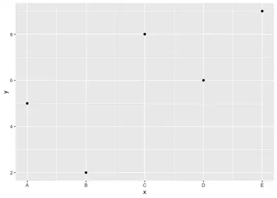
Another option using scale_x_continuous where the breaks and labels are specified on a numerical continuous axis. Here is some reproducible code:

library(ggplot2)
df <- data.frame(x = 1:5, y = sample(1:10, 5, TRUE))
ggplot(df, aes(x = x, y = y)) +
  geom_point() +
  scale_x_continuous(breaks = c(1:5), labels = c("A", "B", "C", "D", "E"))

Created on 2023-02-03 with reprex v2.0.2

Quinten
  • 35,235
  • 5
  • 20
  • 53