6

I have a grid, that has been design with fixed width and height. See image below.

enter image description here

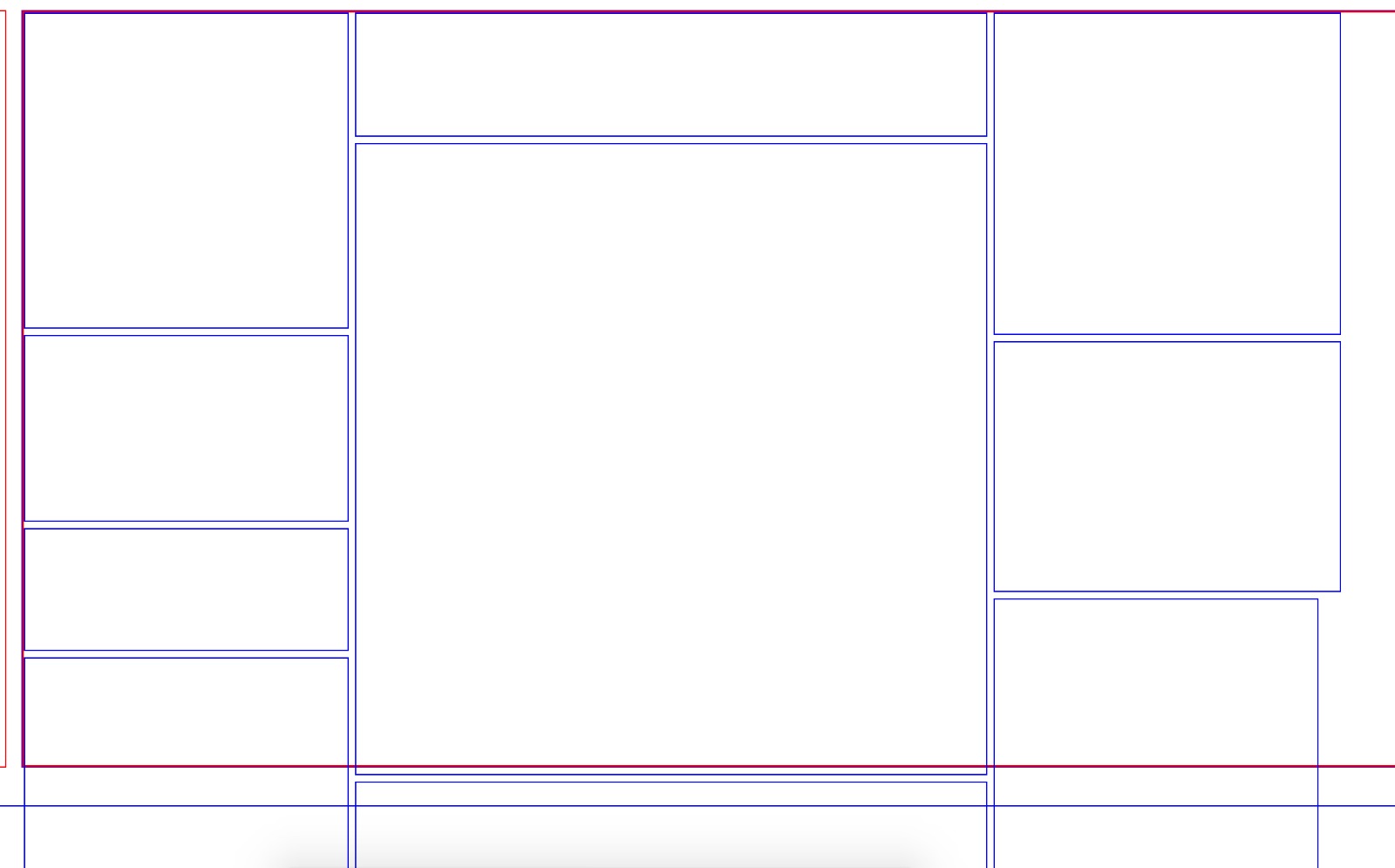
This grid, must work on all screen sizes, while keeping the items in the grid in the same positions.

My code currently resizes these items based off the original width/height of the design and fits them within the new width/height.

Although they do not get positioned correctly in the example below, the calculation does work.

The difficulty I have, is that I need the centre grid tile, which is 504x504, to be static and the others to adjust with this taken into account.

Currently all items, including the centre one adjust, I just want to stop the centre one from adjusting and the others to remove/add the difference to their width/height.

This is a tricky on to explain, let me know if I can add any more details.

const initalWidth = 1043;
const initialHeight = 708;

const resize = (baseDimension, newDimension, itemDimension) => {
  const diff = ((baseDimension - newDimension) / baseDimension) * 100;

  return (Math.ceil(diff) / 100) * itemDimension;
}


const update = () => {
  const newWidth = jQuery(document).width();
  const newHeight = jQuery(document).height();

  jQuery('.grid').css({
    width: newWidth,
    height: newHeight
  })
  
  jQuery('.grid-item').each((i, item) => {
    const itemWidth = jQuery(item).data('width');
    const itemHeight = jQuery(item).data('height');

    const widthDiff = resize(initalWidth, newWidth, itemWidth);
    const heightDiff = resize(initialHeight, newHeight, itemHeight);
   

    jQuery(item).width(Math.floor((itemWidth - widthDiff)));
    jQuery(item).height(Math.floor((itemHeight - heightDiff)));
  })
}

jQuery(document).ready(() => {
 // Run once
  update()
  
  // Run on resize
  jQuery(window).resize(update);
});
.grid{
  border: 1px solid blue;
  width: 100%;
  height: 100%;
}

.grid-item{
  background-color: red;
  float: left;
}
<script src="https://ajax.googleapis.com/ajax/libs/jquery/2.1.1/jquery.min.js"></script>
<div class="grid">
  <div class="grid-item" data-width="257" data-height="249" style="background-color: red;"></div>
  <div class="grid-item" data-width="502" data-height="97" style="background-color: blue;"></div>
  <div class="grid-item" data-width="504" data-height="504" style="background-color: yellow;"></div>
  <div class="grid-item" data-width="275" data-height="254" style="background-color: brown;"></div>
  <div class="grid-item" data-width="275" data-height="254" style="background-color: pink;"></div>
  <div class="grid-item" data-width="275" data-height="198" style="background-color: orange;"></div>
  <div class="grid-item" data-width="275" data-height="247" style="background-color: purple;"></div>
  <div class="grid-item" data-width="502" data-height="97" style="background-color: green;"></div>
</div>
CharliePrynn
  • 3,034
  • 5
  • 40
  • 68
  • 3
    "The difficult I have, is that I need the centre grid tile, which is 504x504, to be static and the others to adjust with this taken into account." So the 504x504 tile must remain at that exact width and height? What happens if the screen size is < 504? Should the tiles above and below the fixed one also maintain the same width to preserve the vertical gutters? (The grid in your spec has consistent vertical gutters, whereas your sample code does not). – Damon Jun 28 '18 at 19:10
  • I presume that this has to be JS driven, right? Being able to leverage CSS grid might allow this... – Alexander Nied Jul 03 '18 at 16:48

6 Answers6

4

(Another attempt, This time I think I got what you want)

The base dimension is 1200x600

If the answer cannot be accepted I would like a reason why so

*{
  padding: 0;
  margin: 0;
  box-sizing: border-box;
}

.wrapper{
  display: flex;
  width: 100%;
  height: 100%;
}
.wrapper .column{
  display: flex;
  flex-direction: column;
  flex-grow: var(--flex-grow,0);
}
.wrapper .column .item{
  flex-grow: var(--flex-grow,0);
}
.wrapper .column .item.main{
  width: 200px;
  height: 200px;
  min-width: 200px;
  min-height: 200px;
}

.wrapper .column:first-child .item{ margin-left: 0; }
.wrapper .column:last-child .item{ margin-right: 0; }
.wrapper .column .item:first-child{ margin-top: 0; }
.wrapper .column .item:last-child{ margin-bottom: 0; }

/*----------------------------------*/
/* Only for demo styles */

@import "http://fonts.googleapis.com/css?family=Roboto";

html,body{
  height: 100%;
}

body{ 
  font-family: "Roboto";
  display: flex;
  justify-content: center;
  align-items: center;
}

.wrapper{
  resize: both;
  overflow: hidden;
}

.wrapper .column .item{
  display: flex;
  justify-content: center;
  align-items: center;
  text-align: center;
  border: 1px solid blue;
  margin: 4px;
}
<div class="wrapper">
  <div class="column left" style="--flex-grow: 400">
    <div class="item" style="--flex-grow: 200">400x200</div>
    <div class="item" style="--flex-grow: 400">400x400</div>
  </div>
  <div class="column center">
    <div class="item" style="--flex-grow: 200">200x200</div>
    <div class="item main">
      <div>
        <b>Main Item</b><br>
        200x200
      </div>
    </div>
    <div class="item" style="--flex-grow: 200">200x200</div>
  </div>
  <div class="column right" style="--flex-grow: 600">
    <div class="item" style="--flex-grow: 300">600x300</div>
    <div class="item" style="--flex-grow: 300">600x300</div>
  </div>
</div>

(snippet best viewed in full page)

Codepen of the same : https://codepen.io/devanshj/pen/xzBVwo

Devansh J
  • 4,006
  • 11
  • 23
  • It's a mistery for me why somebody offers a bounty on his question, and then doesn't follow with the answers - either accepting them or posting a comment saying why the answer is not suitable .... – vals Jul 05 '18 at 10:00
  • @vals ikr!! Same happened with me [here](https://stackoverflow.com/a/51136858/9591609)... The OP didn't accept my answer and the other answer which was not really answering the question (read undeserving) got half of the bounty because his answer had 1 more upvote than me... :( – Devansh J Jul 05 '18 at 12:47
  • No problem mate I +1'd you cuz you deserve it – Alexandre Elshobokshy Jul 05 '18 at 14:04
1

I'm not quite sure I understand your question. I solved how to prevent the yellow tile from resizing on page but I'm not quite sure how you want the tiles positioned. If you could colour the tiles in the first image and show a couple examples of the grid layout at different window sizes it would help me greatly. Also please specify what you mean by "... and the others to remove/add the difference to their width/height."

edit: okay i think I understand what you're asking. I made two 'global' variables yellowX and yellowY that hold the widthDiff and widthHeight that would have been applied to the yellow tile.

then I changed how you write to tiles to compensate for the resize

jQuery(item).width(Math.floor((itemWidth - widthDiff -yellowX/2)));
jQuery(item).height(Math.floor((itemHeight - heightDiff -yellowY/2))); 

here is my updated code that prevents the yellow tile from resizing and compensates for it, hope this helps:

<!Doctype html>
<html>
    <head>
        <title>Stack Bounty</title>

        <script src="https://ajax.googleapis.com/ajax/libs/jquery/2.1.1/jquery.min.js"></script>
    </head>
    <body>
        <script>
            //these vars show how much the yellow tile would have resized by if
            //it were constant
            var yellowX = 0;
            var yellowY = 0;

            const initalWidth = 1043;
            const initialHeight = 708;

            const resize = (baseDimension, newDimension, itemDimension) => {
            const diff = ((baseDimension - newDimension) / baseDimension) * 100;

      return (Math.ceil(diff) / 100) * itemDimension;
    }


    /*Updates the size of the tiles on window resize*/
    const update = () => {
      const newWidth = jQuery(window).width();
      const newHeight = jQuery(window).height();


        //set the dimensions of the grid
      jQuery('.grid').css({
        width: newWidth,
        height: newHeight
      })


        //itterate through each grid item
      jQuery('.grid-item').each((i, item) => {


          //edit by Wade King: if item is the yellow tile, don't resize
          if(jQuery(item).attr("class") == "grid-item const-item"){
              //set width and height of tile
              const itemWidth = 504;
              const itemHeight = 504
              jQuery(item).width(itemWidth);
              jQuery(item).height(itemHeight);

              //update how much the yellow tile should have resized by
              yellowX = resize(initalWidth, newWidth, itemWidth);
              yellowY = resize(initialHeight, newHeight, itemHeight);

          }else{
              //get the item width and height
            const itemWidth = jQuery(item).data('width');
            const itemHeight = jQuery(item).data('height');
              //calculate the decreace in dimensions
             const widthDiff = resize(initalWidth, newWidth, itemWidth);
            const heightDiff = resize(initialHeight, newHeight, itemHeight);

              //edit: apply the decrease in width and height and compensate for the yellow tile not resizing
            jQuery(item).width(Math.floor((itemWidth - widthDiff -yellowX/2)));
            jQuery(item).height(Math.floor((itemHeight - heightDiff -yellowY/2))); 
          }
          //end edit

      });
    }

    jQuery(document).ready(() => {
        // Run once
      update()

      // Run on resize
      jQuery(window).resize(update);
    });
        </script>

        <style>
    <!-- language: lang-css -->

    .grid{
        border: 1px solid blue;
        width: 100%;
        height: 100%;
    }

    .grid-item{
        background-color: red;
        float: left;
    }


        </style>


    <div class="grid">
        <!--edit by Wade King: added id names for future positioning and 
        and layout as well as a class 'const-item' to prevent resizing-->

      <div id = "red" class="grid-item" data-width="257" data-height="249" style="background-color: red;"></div>

      <div id = "blue" class="grid-item" data-width="502" data-height="97" style="background-color: blue;"></div>


      <div id = "yellow" class="grid-item const-item" data-width="504" data-height="504" style="background-color: yellow;"></div>


      <div id = "brown" class="grid-item" data-width="275" data-height="254" style="background-color: brown;"></div>


      <div id = "pink" class="grid-item" data-width="275" data-height="254" style="background-color: pink;"></div>


      <div id = "orange" class="grid-item" data-width="275" data-height="198" style="background-color: orange;"></div>


      <div id = "purple" class="grid-item" data-width="275" data-height="247" style="background-color: purple;"></div>


      <div id = "green" class="grid-item" data-width="502" data-height="97" style="background-color: green;"></div>

    </div>

    </body>
</html>
wade king
  • 353
  • 4
  • 14
  • Hi Wade, thanks for you response. I see your edits stop the yellow item resizing, which is correct. but I need the other elements to take that new calculation into account when they resize. E.g if the yellow circle "should've" resized horizontally the width of the other items should minus this amount. Its a hard problem to explain! – CharliePrynn Jun 29 '18 at 08:08
1

How about using units other than px.

https://www.w3schools.com/cssref/css_units.asp

vw Relative to 1% of the width of the viewport*

vh Relative to 1% of the height of the viewport*

Viewport = the browser window size. If the viewport is 50cm wide, 1vw = 0.5cm.

.outer {
  background: red;
  width: 100vw;
}
.inner.col {
  display: inline-block;
  vertical-align: top;
}

.col-west {
  width: 20vw;
}
.col-middle {
  width: 50vw;
}
.col-east {
  width: 20vw;
}

.col-west > .row-1 {
  background: blue;
  height: 20vh;
}
.col-west > .row-2 {
  background: black;
  height: 40vh;
}
.col-west > .row-3 {
  background: white;
  height: 40vh;
}

.col-middle > .row-1 {
  background: silver;
  height: 10vh;
}
.col-middle > .row-2 {
  background: white;
  height: 30vh;
}
.col-middle > .row-3 {
  background: green;
  height: 60vh;
}
.col-east > .row-1 {
  background: yellow;
  height: 30vh;
}
<div class='outer'>
  <div class='inner col col-west'>
    <div class='inner row row-1'>
    
    </div><div class='inner row row-1'>
    
    </div><div class='inner row row-2'>
    
    </div><div class='inner row row-3'>
    
    </div>
  </div><div class='inner col col-middle'>
    <div class='inner row row-1'>
    
    </div><div class='inner row row-1'>
    
    </div><div class='inner row row-2'>
    
    </div><div class='inner row row-3'>
    
    </div>
  </div><div class='inner col col-east'>
    <div class='inner row row-1'>
    
    </div><div class='inner row row-1'>
    
    </div><div class='inner row row-2'>
    
    </div><div class='inner row row-3'>
    
    </div>
  </div>
 
</div>
user3003238
  • 1,517
  • 10
  • 17
1

Anywhere close to your requirements?

This is just a prototype. If you want the elements aside jump between header and content or content and footer this is possible aswell. (takes just a little more time)

body {
  margin: 0px;
  padding: 0px;
}

div {
  min-height: 10px;
}

.wrapper {
  margin: 0px;
  min-width: 106px;
  min-height: 150px;
  display: flex;
  flex-direction: row;
  resize: both;
  overflow: hidden;
  border: 1px dotted grey;
}

.left, .right {
  flex: 1 0 auto;
  flex-direction: column;
  background-color: #FFF;
}

.center {
  display: flex;
  flex-direction: column;
  background-color: #DDD;
}

.center .head,
.center .foot {
  border: 1px solid green;
  flex: 1 1 auto;
}

.center .content {
  width: 100px;
  height: 100px;
  background-color: #FA0;
  border: 1px solid red;
  flex: 0 0  auto;
}

.col1, .col2, .col3 {
  height: 30px;
  border: 1px solid blue;
}

.col1 { height: 50px; }
.col2 { height: 40px; }
.col2 { height: 70px; }
<div class='wrapper'>
  <div class='left'>
    <div class='col1'></div>
    <div class='col2'></div>
    <div class='col3'></div>
  </div>
  <div class='center'>
    <div class='head'>Header</div>
    <div class='content'>
      FIXED TO 100x100
    </div>
    <div class='foot'>Footer</div>
  </div>
  <div class='right'>
    <div class='col1'></div>
    <div class='col2'></div>
    <div class='col3'></div>
  </div>
</div>
<div style='text-align: right; padding-right: 10px; padding-top: 5px;'><b>Drag bottom right corner to resize! ↗</b></div>
SirPilan
  • 4,649
  • 2
  • 13
  • 26
1

Demo and code :

https://codepen.io/devanshj/pen/QxYMjd (snippet of the same below)

A CSS-only solution with flexbox

Not exactly grid that you want but you can make it work for you by modifying it

How to use :

  1. Change --grow-ratio via style to change the ratio in which space is divided b/w left and right columns after main item is placed
  2. Add class .has-aspect-ratio on .item and wrap it's content inside a .inner and add --aspect-ratio css variable via style
  3. Use --gutter css variable to change gutters
  4. Use --item-padding css variable to change item padding

PS: Let me know if this is not what you want or not exactly what you are looking for. I will improve it.

@import "http://fonts.googleapis.com/css?family=Roboto";

*{
  padding: 0;
  margin: 0;
  box-sizing: border-box;
}

html,body{
  height: 100%;
}

body{
  font-family: "Roboto";
}


.main-wrapper{
  display: flex;
  --gutter: 20px;
  --item-padding: 10px;
}

/* Flex stuff */
.main-wrapper .column{
  display: flex;
  flex-direction: column;
}
.main-wrapper .column{
  flex-grow: var(--grow-ratio,0);
}


/* Gutters */
.main-wrapper .column.right{
  padding-left: var(--gutter);
}
.main-wrapper .column.left{
  padding-right: var(--gutter);
}
.main-wrapper .item{
  margin-bottom: var(--gutter);
}
.main-wrapper .item:last-child{
  margin-bottom: 0;
}

/* Item */
.main-wrapper .item{
  padding: var(--item-padding);
  background-color: #555;
  color: #fff;
}
.main-wrapper .item.has-aspect-ratio{
  padding-top: calc(100% * var(--aspect-ratio));
  position: relative;
}
.main-wrapper .item.has-aspect-ratio .inner{
  position: absolute;
  top: 0;
  right: 0;
  bottom: 0;
  left: 0;
  padding: var(--item-padding);
}

/* Main Item */
.main-wrapper .item.main{
  width: 500px;
  height: 500px;
}
<div class="main-wrapper">
  <div class="column left" style="--grow-ratio: 1">
    <div class="item">Item</div>
    <div class="item has-aspect-ratio" style="--aspect-ratio: 1;">
      <div class="inner">Item<br>Always in 1:1 aspect ratio</div>
    </div>
  </div>
  <div class="column center">
    <div class="item main">
      Main Item<br>
      Always 500&times;500<br><br>
      
      Left and right columns are in 1:1.5 ratio.
    </div>
    <div class="item">Item</div>
  </div>
  <div class="column right" style="--grow-ratio: 1.5">
    <div class="item">Item</div>
    <div class="item has-aspect-ratio" style="--aspect-ratio: 0.7">
      <div class="inner">
        Item<br>Always in 1:0.7 aspect ratio</div>
      </div>
    </div>
  </div>
</div>
Devansh J
  • 4,006
  • 11
  • 23
0

I think I'd solve it with css.

Use media queries, so that when you get close to 504px width to do something else then when the window is wider. In css you can also give objects a width with calc(50% - 504px);

Jonathan
  • 1,355
  • 14
  • 22