0

I'm working with Bootstrap 4 and I've been searching for a solution to my ordering issue, but can't seem to get it right or find one in the archives. Here's the situation...

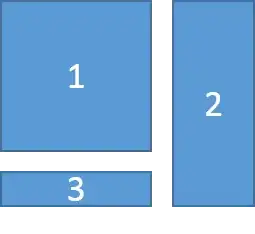
On a desktop, I need the following layout:

3 Boxes in Desktop

Then on a mobile device, the layout should look like:

3 Boxes in Mobile

Box 1 is given a class of "col-md-8", and Box 2 is given the class "col-md-4". But for the life of me, I can't figure out how to properly place Box 3 (or the proper class) to get it to appear correctly in both layouts. Anyone have any thoughts?

I appreciate the help in advance!

EDIT (2018/6/26): Here's the resulting code that works:

<main id="body" role="maincontent">
    <div class="container">
        <h1>Page Title</h1>
        <div class="row d-flex d-md-block clearfix">
            <div class="col-md-8 main_content float-left">
                <p>Lorem ipsum dolor sit amet</p>
            </div>
            <div class="col-md-4 highlight float-right">
                <p>Second Item</p>
            </div>
            <div class="col-md-4 float-left">
                <p>Lorem ipsum dolor sit amet</p>
            </div>
        </div>
    </div>
</main>
Mark
  • 43
  • 5

3 Answers3

1

This has already been answered in similar questions such as: One tall div next to two shorter divs on Desktop and stacked on Mobile with Bootstrap 4

Since BS4 uses flexbox, disable the flexbox using d-md-block, and use float- to make the 2nd column pull right on md screens...

<div class="container">
    <div class="row d-flex d-md-block">
        <div class="col-md-8 float-left">
            1
        </div>
        <div class="col-md-4 float-right">
            2
        </div>
        <div class="col-md-8">
            3
        </div>
    </div>
</div>

https://www.codeply.com/go/4HZq18NKln

Carol Skelly
  • 351,302
  • 90
  • 710
  • 624
  • Using a slightly (slightly) modified version of the above, I was able to get the desired layout on both desktop and mobile. – Mark Jun 26 '18 at 17:18
0

For mobile devices try using media queries and grid classes small. For instance, box1 col-sm-4 you can reference this guide https://getbootstrap.com/docs/4.0/layout/grid/

`something {
padding: 5px;
@include media-breakpoint-up(sm) { 
    padding: 20px;
}
@include media-breakpoint-up(md) { 
    padding: 40px;
}

For ordering, you can use ordering property and here is the mdn ref https://developer.mozilla.org/en-US/docs/Web/CSS/CSS_Flexible_Box_Layout/Ordering_Flex_Items

You can reference this post Using media breakpoints in Bootstrap 4-alpha

Hope that will help you.

Salma Elshahawy
  • 1,112
  • 2
  • 11
  • 21
0

Assume phone screen width is 425px based on Google Chrome. Copy and paste the code and open in your browser to see the actual result.

<!DOCTYPE html>
<html>
    <head>
        <meta charset="utf-8" />
        <meta http-equiv="X-UA-Compatible" content="IE=edge">
        <title>Page Title</title>
        <meta name="viewport" content="width=device-width, initial-scale=1">
        <!-- Bootstrap CSS -->
        <link rel="stylesheet" href="https://maxcdn.bootstrapcdn.com/bootstrap/4.0.0/css/bootstrap.min.css" integrity="sha384-Gn5384xqQ1aoWXA+058RXPxPg6fy4IWvTNh0E263XmFcJlSAwiGgFAW/dAiS6JXm" crossorigin="anonymous">
        <style>
            h1 {
                color: #fff;
            }
            .left, .right {
                height: 800px;
            }
            .one {
                height: 500px;
                background-color: red;
            }
            .two {
                height: 100%;
                background-color: green;
            }
            .three {
                margin-top: 0.5em;
                height: 275px;
                background-color: blue;
            }
            @media screen and (max-width: 425px) {
                .two {
                    width: 50%;
                    position: absolute;
                    left: 25%;
                    top: -285px;
                }
                .three {
                    margin-top: 51em;
                }
            }
        </style>
    </head>
    <body>
            
        <div class="row p-0 m-0">
            <div class="left col-md-8 col-sm-12 p-2">
                <div class="row p-0 m-0">
                    <div class="one col-12"><h1>One</h1></div>
                    <div class="three col-12"><h1>Three</h1></div>
                </div>
            </div>
            <div class="right col-md-4 col-sm-12 p-2">
                <div class="two"><h1>Two</h1></div>
            </div>
        </div>
           
        <script src="https://code.jquery.com/jquery-3.2.1.slim.min.js" integrity="sha384-KJ3o2DKtIkvYIK3UENzmM7KCkRr/rE9/Qpg6aAZGJwFDMVNA/GpGFF93hXpG5KkN" crossorigin="anonymous"></script>
        <script src="https://cdnjs.cloudflare.com/ajax/libs/popper.js/1.12.9/umd/popper.min.js" integrity="sha384-ApNbgh9B+Y1QKtv3Rn7W3mgPxhU9K/ScQsAP7hUibX39j7fakFPskvXusvfa0b4Q" crossorigin="anonymous"></script>
        <script src="https://maxcdn.bootstrapcdn.com/bootstrap/4.0.0/js/bootstrap.bundle.js"></script>
        <script>

        </script>
    </body>
</html>
Viet
  • 6,513
  • 12
  • 42
  • 74