0

Im trying to achieve the following:

enter image description here

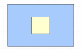
Where the blue box is of variable height and the yellow box is always of height 50% of the blue box.

Its fairly simple using flex

<div style="display:flex;align-items:center">
    <div id="yellow" style="height:50%">
    </div>
</div>

The problem is that im trying to keep the inner box a specific ratio, in this case square. How do i approach this?


Bonus points:

  • How do i generally specify a ratio? Is there a solution that works not only for 1:1 but any x:y?
  • How would i do that without using flexbox while potentially still aiming for a)?

Extra information: The blue box is always wider than higher, think a button.

Temani Afif
  • 245,468
  • 26
  • 309
  • 415
Return-1
  • 2,329
  • 3
  • 21
  • 56

5 Answers5

3

I don't think there is a way to define the width using the height (even if we can do the opposite using some trick like padding) but an idea is to rely on a square image that you make invisible in order to keep the ratio. Then the content should be positionned:

#blue {
  display: flex;
  align-items: center;
  justify-content:center;
  height:80vh;
  background: blue;
}

#yellow {
  height: 50%;
  background: yellow;
  position:relative;
}
img {
 max-height:100%;
 visibility:hidden;
}
#yellow .content {
  position:absolute;
  top:0;
  right:0;
  left:0;
  bottom:0;
}
<div id="blue" >
  <div id="yellow" >
    <img src="https://picsum.photos/500/500?image=1069" >
    <div class="content">Some content here</div>
  </div>
</div>

But in case the height of the blue is a fixed value, better rely on CSS variable like this:

#blue {
  display: flex;
  align-items: center;
  justify-content:center;
  --h:80vh;
  height:var(--h);
  background: blue;
}

#yellow {
  height: calc(var(--h) / 2);
  width:calc(var(--h) / 2);
  background: yellow;
  position:relative;
}
<div id="blue" >
  <div id="yellow" >
    <div class="content">Some content here</div>
  </div>
</div>
Temani Afif
  • 245,468
  • 26
  • 309
  • 415
  • thats kind of both genious and a waste at the same time haha (due to the extra resource call ) . i see. i could do with defining the width instead of the height though as long as i can keep it square, is there anywhere you can point me to about the trick you mentioned with padding? First time im hearing about it. – Return-1 Jun 26 '18 at 11:34
  • @GeorgeAvgoustis I update with another example ;) but you can refer to this : https://stackoverflow.com/questions/1495407/maintain-the-aspect-ratio-of-a-div-with-css – Temani Afif Jun 26 '18 at 11:37
2

A similar answer to the one provided by Temani Afif, but using an svg instead of an image (so no need to the extra request).

Also, it's easier to adapt it to arbitrary aspect ratios

.container {
  height: 150px;
  background-color: lightblue;
  display: flex;
  align-items: center;
  justify-content: center;
  margin: 10px;
}

.aspectRatio {
  display: grid;
  background-color: yellow;
  height: 50%;
}
.aspectRatio svg {
  height: 100%;
  border: solid 1px red;
  animation: resize 1s infinite;
}
.aspectRatio > * {
  grid-area: 1 / 1 / 2 / 2;
}

@keyframes resize {
  from {height: 100%;}
  to {height: 99.9%;}
}
<div class="container">
  <div class="aspectRatio">
    <svg viewBox="0 0 1 1"></svg>
    <div class="inner">square</div>
  </div>
</div>
<div class="container">
  <div class="aspectRatio">
    <svg viewBox="0 0 4 3"></svg>
    <div class="inner">ratio 4/3</div>
  </div>
</div>
vals
  • 61,425
  • 11
  • 89
  • 138
  • nice one ;) but the animation is for what? – Temani Afif Jun 26 '18 at 13:51
  • @TemaniAfif I have never know why, but it's needed. If you don't do it, sometimes on resize the sizes don't adapt. Try it on your answer. resize / make full page several times and once in a while you won't get a square. - the reflow doesn't calculate ok. It's an old trick, but I have never seen an explanation on why it does work – vals Jun 26 '18 at 14:20
  • ah you also noticed this :p ... yes I see this issue but it's a bit random and a bit difficult to notice if you don't play with the resize, so I never bothered my self searching why ;) ... So let's keep the silence until someone ask why :p – Temani Afif Jun 26 '18 at 14:24
0

See if this can help you,

.outer {
    background-color: lightblue;
    height: 100px; /* Change as per your requirement */
    display: flex;
    align-items: center;
    justify-content: center;
    max-width: 200px; /* You can Remove this */
}
.inner {
    background-color: lightyellow;
    height: 50%;
    width: 50px;
}
<div style="" class="outer">

<div id="yellow" class="inner">
</div>

</div>
Zuber
  • 3,393
  • 1
  • 19
  • 34
  • This works and its how i've set it up right now but isnt dynamic, it assumes a fixed height in the outer. Im trying to figure out if theres a solution that works for any X height – Return-1 Jun 26 '18 at 11:30
  • i think this will work dynamically @GeorgeAvgoustis – Zuber Jun 26 '18 at 11:31
0

If you rotate by 90deg, it's possible :)

  • variable width and height of the parent (and ratio)
  • child is always 50% as tall as its parent
  • and a square

It'll surimpose to other content if it wants to because of the transform though.

Codepen

.flex {
  display: table-cell; /* allows "vertical" centering (not possible with flex/grid here because of the padding-top trick on child) */
  width: 12rem;
  height: 20rem;
  vertical-align: middle; /* "vertical" centering */
  transform: rotate(90deg) translateY(-50%); /* vertical becomes horizontal */
  background-color: lightblue;
}

.flex.large {
  height: 35rem;
}

.item {
  width: 50%;
  height: 0;
  margin-left: 25%; /* "horizontal" centering */
  padding-top: 50%; /* padding-top trick for a square */
  background-color: lightyellow;
}
<div class="flex">
  <div class="item"></div>
</div>

<hr>

<div class="flex large">
  <div class="item"></div>
</div>
FelipeAls
  • 21,711
  • 8
  • 54
  • 74
-1

Try this if it can help you.(with out flex)

     .outerdiv 
     {
     background-color: lightblue;
     height: 100px;
     display: grid;
     align-items: center;
     }
     .innerdiv 
     {
     background-color: lightyellow;
     height: 50%;
     width: 50px;
     margin:0 auto;
     }
     <div style="" class="outerdiv"> 
     <div id="yellow" class="innerdiv"></div>
     </div>
Bibek
  • 47
  • 1
  • 2