2

I am looking for a CSS rule which can create a CSS animation for a button's colored gradient background.

I am just trying to play with it and did this: https://codepen.io/prashant-nadsoftdev/pen/bKzOrB.

.custom-btn {
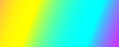
  background: linear-gradient(105deg, #f6d365, #fda085, #f6d365, #ff2400, #e81d1d, #e8b71d, #e3e81d, #1de840, #1ddde8, #2b1de8, #dd00f3, #dd00f3);
  background-size: 200% 200%;
  -webkit-animation: rainbow 5s ease infinite;
  -z-animation: rainbow 5s ease infinite;
  -o-animation: rainbow 5s ease infinite;
  animation: rainbow 5s ease infinite alternate;
  border: 0;
  padding: 25px;
  font-size: 40px;
  color: #fff;
}
@-webkit-keyframes rainbow {
  0%{background-position:0% 100%}
  100%{background-position:100% 0%}
}
@-moz-keyframes rainbow {
  0%{background-position:0% 100%}
  100%{background-position:100% 0%}
}
@-o-keyframes rainbow {
  0%{background-position:0% 100%}
  100%{background-position:100% 0%}
}
@keyframes rainbow { 
  0%{background-position:0% 100%}
  100%{background-position:100% 0%}
}
<body style="text-align:center;">
  <button class="custom-btn">My Button</button>
</body>

I need the colors to go one after other in one direction only (left to right). The code I have is close but I still need two things in that:

  1. The direction is wrong (need exact opposite direction on color change).
  2. It should not stop. After the last color it should take the first color and then continue.
Mel
  • 5,837
  • 10
  • 37
  • 42
CodeThing
  • 2,580
  • 2
  • 12
  • 25

1 Answers1

4

To get a gradient animation to repeat infinitely in one direction, the main thing you need to do is adjust the color stops in your gradient:

  1. Repeat your gradient stops twice. (This makes the end of your gradient look like the start, allowing for a smooth transition between each repetition of your animation.)
  2. Repeat your first gradient stop again at the end. (This makes the last stop blend in with the first.)

You'll also need to tweak your keyframes to get them going in the direction you want (see the code below).

.custom-btn {
  background: linear-gradient(105deg,
    /* Base gradient stops */
    #f6d365, #fda085, #f6d365, #ff2400, #e81d1d, #e8b71d, #e3e81d, #1de840, #1ddde8, #2b1de8, #dd00f3, #dd00f3,
    /* Repeat your base gradient stops */
    #f6d365, #fda085, #f6d365, #ff2400, #e81d1d, #e8b71d, #e3e81d, #1de840, #1ddde8, #2b1de8, #dd00f3, #dd00f3,
    /* Repeat your first gradient stop */
    #f6d365);
  
  background-size: 200% 200%;
  animation: rainbow 5s linear infinite;
  border: 0;
  padding: 25px;
  font-size: 40px;
  color: #fff;
}

@keyframes rainbow {
    0% { background-position: 100% 100% }
  100% { background-position: 0% 0% }
}
<body style="text-align:center;">
  <button class="custom-btn">My Button</button>
</body>
mfluehr
  • 2,832
  • 2
  • 23
  • 31
  • Perfect! this is what i am looking for. – CodeThing Jul 02 '18 at 14:44
  • What is i want to increase the background size for it. It is currently 200%, When i increased it to 600% it looks like it is breaking after the loop. https://codepen.io/prashant-nadsoftdev/pen/WymWrQ – CodeThing Jul 03 '18 at 09:55
  • And also for background-size of 1200%, basically i noticed if we go beyond 200% then it just breaks the loop. – CodeThing Jul 03 '18 at 14:39
  • One quirk of this answer is that it only holds an exact repeat of currently visible colors "offscreen" so the left and right of the button must be fading through the same bit at all times. I solved for a 3 color (two+an intermediate), with the following changes.`background-size: 340% 340%;` and `{background-position: 70% 70% }`. The idea being that we make the bg bigger so that some of our colors are not on the button at the start, and we restart the animation before we go all the way through our bg so the restart happens when the colors are aligned with the how it looked at start. – TheAtomicOption Jan 28 '19 at 19:22