I've tried to find similar posts about this but failed to do so. What I'm trying to do is set up a parallax background that has a moderate zoom upon scrolling. I have the parallax down, that was simple enough, but the zoom on scroll is causing me difficulties.
    if ($(".zoomImage").length == 0)
    {
        console.warn("You're attempting to set hero images without an existing class. '.heroImage'");
        return;
    }

    $(document).scroll(function(){
        var scrollpos = $(this).scrollTop();
        var screenHeight = $(window).height();
        var screenWidth = $(window).width();

        $(".zoomImage").each(function(){
            var offset = $(this).offset().top;

            // Only modify when top is at top of browser on screen.
            if (offset < scrollpos && scrollpos < offset + screenHeight)
            {
                var heroEffectPerc = 100 + 25 * (scrollpos - offset) / (screenHeight * 1.0);

                $(this).css("background-size",  heroEffectPerc + "% auto");
            }
        });
    });
This is where I'm doing the zoom for the image, the parallax is done in pure CSS as represented below. The issue I'm having is figuring out the mathematics to make sure that the image doesn't escape the edge of its parent when the screen gets excessively wide or tall and still achieve the same effect. 1: 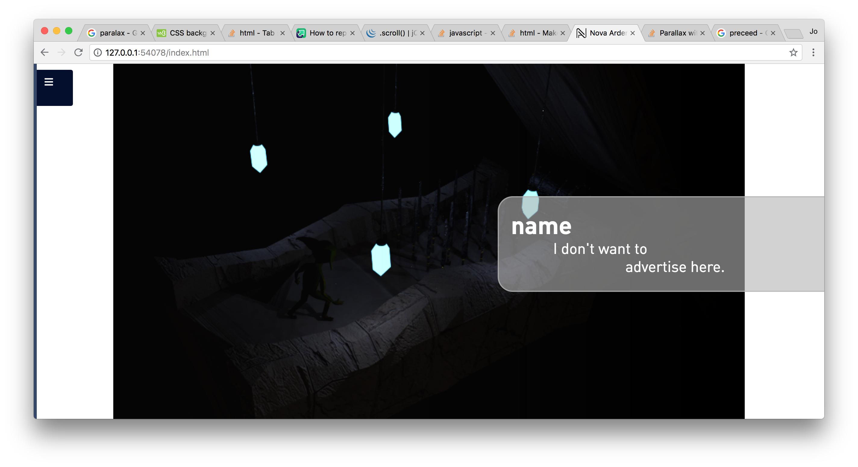
CSS:
pageCanvas
{
    position: relative;

    background-repeat: no-repeat;
    background-position: center;
    background-size: auto 100%;
    background-color: white;

    display: block;

    left: 0;
    top: 0;

    width: 100%;
    height: 100vh;

}

pageCanvas.parallax
{
    background-attachment: fixed;
}
.
<pageCanvas class="parallax zoomImage" style="background-image: url('./Images/DisplayBackground.png');">
    <banner>
        <header>
            Company name
        </header>
        <description>
            I don't want to<br><span style="margin-left: 200px;">advertise here.</span>
        </description>
    </banner>
</pageCanvas>
I've tried to get it working, but either have an issue with one of the following: White background shows on too wide. White background shows on too tall. Image stretching.
Do I need to bring in the images origin ratio with this or something? If I figure out a solution prior to an answer given, I'll post it.