1

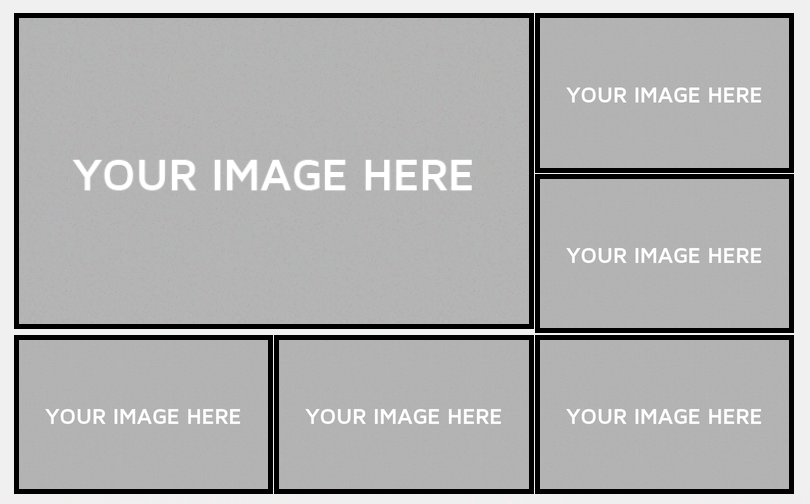
I am making a WordPress theme, and making a layout with CSS grid. And I can't think a reason why there is extra gap between the first image and those at the bottom.

enter image description here

UPDATE: added snippet, changed grip-gap to 1% because, 1px isin't somehow working

.wrapper {
    display: grid;
    grid-template-columns: 33.3% 33.3% 33.3%;
    grid-template-rows: 33.3% 33.3% 33.3%;
    margin: auto;
    width: 80%;
    grid-gap: 1%;
}

.item img{
    width: 100%;
    padding: 4px;
    background-color: black;
    display: block;
}

.item:first-of-type{
    grid-column: 1/3;
    grid-row: 1/3;
}
<div class="wrapper">
  <div class="item"><img src="http://static1.squarespace.com/static/5898e29c725e25e7132d5a5a/58aa11bc9656ca13c4524c68/58aa11e99656ca13c45253e2/1487540713345/600x400-Image-Placeholder.jpg?format=original" alt=""></div>
  <div class="item"><img src="http://static1.squarespace.com/static/5898e29c725e25e7132d5a5a/58aa11bc9656ca13c4524c68/58aa11e99656ca13c45253e2/1487540713345/600x400-Image-Placeholder.jpg?format=original" alt=""></div>
  <div class="item"><img src="http://static1.squarespace.com/static/5898e29c725e25e7132d5a5a/58aa11bc9656ca13c4524c68/58aa11e99656ca13c45253e2/1487540713345/600x400-Image-Placeholder.jpg?format=original" alt=""></div>
  <div class="item"><img src="http://static1.squarespace.com/static/5898e29c725e25e7132d5a5a/58aa11bc9656ca13c4524c68/58aa11e99656ca13c45253e2/1487540713345/600x400-Image-Placeholder.jpg?format=original" alt=""></div>
  <div class="item"><img src="http://static1.squarespace.com/static/5898e29c725e25e7132d5a5a/58aa11bc9656ca13c4524c68/58aa11e99656ca13c45253e2/1487540713345/600x400-Image-Placeholder.jpg?format=original" alt=""></div>
  <div class="item"><img src="http://static1.squarespace.com/static/5898e29c725e25e7132d5a5a/58aa11bc9656ca13c4524c68/58aa11e99656ca13c45253e2/1487540713345/600x400-Image-Placeholder.jpg?format=original" alt=""></div>
</div>
Temani Afif
  • 245,468
  • 26
  • 309
  • 415
  • Under your ``first-of-type`` try setting your gap to 0px and see how it behaves. As Cale said, though, its harder for us to play with the PHP, but if you get a snippet of the rendered HTML we can check it out. – CodeSpent Jul 06 '18 at 19:25
  • @cale_b that picture is from web front-end. But why is that? If I delete .box:first-of-type{ grid-column: 1/3; grid-row: 1/3; } it looks fine. when gap is 0 , that gap stil exist – whothatisShake Jul 06 '18 at 19:28
  • @whothatisShake if you inspect element on the page itself, it'll give you the rendered HTML that you can copy and paste in place of your PHP. :) We do not have access to the same content that you do, so it limits what we can really work with. Post up the HTML and one of us should be able to tell you what's happening! – CodeSpent Jul 06 '18 at 19:41
  • If I were to guess, based on what you've said, it seems that by stretching the first image to the 3rd row line, its not reaching the end of the gap, its reaching the beginning of the gap which exists on both sides. – CodeSpent Jul 06 '18 at 19:43
  • `box-sizing:border-box` is what you are missing on the img element – Temani Afif Jul 06 '18 at 19:48
  • possible duplicate: https://stackoverflow.com/q/46616289/3597276 – Michael Benjamin Jul 06 '18 at 20:40

2 Answers2

0

The issue isn't in your Grid layout itself, but rather how you're specifying padding on the image. If you remove your line padding:4px; you'll see everything aligns perfectly. This is because you're targeting the image within the item rather than the item itself.

You can see here: https://codepen.io/codespent/pen/ZRddPN

You can simply set the padding on your item instead to ensure everything flows as you want.

.item {
padding: 4px;
}

Hope this helps, definitely consider playing around with that pen a bit too just to see how different things behave.

.wrapper {
  display: grid;
  grid-template-columns: 33.3% 33.3% 33.3%;
  grid-template-rows: 33.3% 33.3% 33.3%;
  margin: auto;
  width: 80%;
  grid-gap: 1px;
}

.item img {
  width: 100%;
  height: 100%;
  /*padding: 4px;  Issue created here */
  background-color: black;
  display: block;
}


/* Lets set the padding on the container instead of the child */

.item {
  padding: 4px;
}

.item:first-of-type {
  grid-column: 1/3;
  grid-row: 1/3;
}
<div class="wrapper">
  <div class="item"><img src="http://static1.squarespace.com/static/5898e29c725e25e7132d5a5a/58aa11bc9656ca13c4524c68/58aa11e99656ca13c45253e2/1487540713345/600x400-Image-Placeholder.jpg?format=original" alt=""></div>
  <div class="item"><img src="http://static1.squarespace.com/static/5898e29c725e25e7132d5a5a/58aa11bc9656ca13c4524c68/58aa11e99656ca13c45253e2/1487540713345/600x400-Image-Placeholder.jpg?format=original" alt=""></div>
  <div class="item"><img src="http://static1.squarespace.com/static/5898e29c725e25e7132d5a5a/58aa11bc9656ca13c4524c68/58aa11e99656ca13c45253e2/1487540713345/600x400-Image-Placeholder.jpg?format=original" alt=""></div>
  <div class="item"><img src="http://static1.squarespace.com/static/5898e29c725e25e7132d5a5a/58aa11bc9656ca13c4524c68/58aa11e99656ca13c45253e2/1487540713345/600x400-Image-Placeholder.jpg?format=original" alt=""></div>
  <div class="item"><img src="http://static1.squarespace.com/static/5898e29c725e25e7132d5a5a/58aa11bc9656ca13c4524c68/58aa11e99656ca13c45253e2/1487540713345/600x400-Image-Placeholder.jpg?format=original" alt=""></div>
  <div class="item"><img src="http://static1.squarespace.com/static/5898e29c725e25e7132d5a5a/58aa11bc9656ca13c4524c68/58aa11e99656ca13c45253e2/1487540713345/600x400-Image-Placeholder.jpg?format=original" alt=""></div>
</div>
CodeSpent
  • 1,684
  • 4
  • 23
  • 46
0

So, i fixed my code with help of @CodeSpent. I added "border" to image with padding to item, not item img. Also change grid-column and grid-row gaps.

.wrapper {
    display: grid;
    grid-template-columns: 33.3% 33.3% 33.3%;
    grid-template-rows: 33.3% 33.3% 33.3%;
    margin: auto;
    width: 80%;
    grid-column-gap: 22px;
    grid-row-gap: 10px;
}

.item{
    padding: 4px;
    background-color: black;
}

.item img{
    width: 100%;
    display: flex;
    
}

.item:first-of-type{
    grid-column: 1/3;
    grid-row: 1/3;
}
<div class="wrapper">
  <div class="item"><img src="http://static1.squarespace.com/static/5898e29c725e25e7132d5a5a/58aa11bc9656ca13c4524c68/58aa11e99656ca13c45253e2/1487540713345/600x400-Image-Placeholder.jpg?format=original" alt=""></div>
  <div class="item"><img src="http://static1.squarespace.com/static/5898e29c725e25e7132d5a5a/58aa11bc9656ca13c4524c68/58aa11e99656ca13c45253e2/1487540713345/600x400-Image-Placeholder.jpg?format=original" alt=""></div>
  <div class="item"><img src="http://static1.squarespace.com/static/5898e29c725e25e7132d5a5a/58aa11bc9656ca13c4524c68/58aa11e99656ca13c45253e2/1487540713345/600x400-Image-Placeholder.jpg?format=original" alt=""></div>
  <div class="item"><img src="http://static1.squarespace.com/static/5898e29c725e25e7132d5a5a/58aa11bc9656ca13c4524c68/58aa11e99656ca13c45253e2/1487540713345/600x400-Image-Placeholder.jpg?format=original" alt=""></div>
  <div class="item"><img src="http://static1.squarespace.com/static/5898e29c725e25e7132d5a5a/58aa11bc9656ca13c4524c68/58aa11e99656ca13c45253e2/1487540713345/600x400-Image-Placeholder.jpg?format=original" alt=""></div>
  <div class="item"><img src="http://static1.squarespace.com/static/5898e29c725e25e7132d5a5a/58aa11bc9656ca13c4524c68/58aa11e99656ca13c45253e2/1487540713345/600x400-Image-Placeholder.jpg?format=original" alt=""></div>
</div>
  • This is a duplicate of my answer, but also be sure to define your ``height`` property as well. :) – CodeSpent Jul 06 '18 at 20:54
  • @CodeSpent Sorry, I forgot to mention you.. Also just changing the padding didin't solve the problem, that extra gap stil was there, changing the gap in wrapper class, fixed that problem. Thank you very much for your help :) – whothatisShake Jul 06 '18 at 21:29
  • See [my CodePen here](https://codepen.io/codespent/pen/ZRddPN). I hadn't included the height in my snippet in my answer originally, but adjusted in an edit. Your gap was fine if you wanted even gap. Your image just wasn't occupying the entire height of its container and that's why it appeared you had a gap there. – CodeSpent Jul 06 '18 at 21:32
  • In your current solution your borders are uneven as your imgs have no height assigned to them. – CodeSpent Jul 06 '18 at 21:34