2

I'm using flexbox to make my footer stick to the bottom, and for the most part it's working. My problem is, I need the content to be within a specified width, that I set with max-width and center with margin-left:auto; and margin-right:auto;. When I activate flexbox, the contents are squished by the margin-left and margin-right rules, and do not take up the space defined by max-width. I would like to know why this is happening and how to get my footer to look how I want it to look.

Here is how I want my footer to look: enter image description here
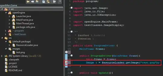
And here is how flexbox is affecting it: enter image description here
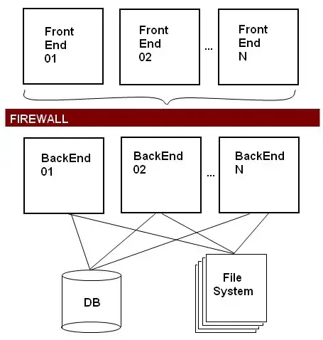
body {
  display: flex;
  flex-direction: column;
  min-height: 100%;
}

div#content {
  flex: 1 0 auto;
}

footer {
  flex: 0 0 auto;
  max-width: 67.5rem;
  margin-left: auto;
  margin-right: auto;
  padding-left: 1.25rem;
  padding-right: 1.25rem;
  padding-bottom: 1.875rem;
  padding-top: 3.5rem;
}
<body>
  <header>...</header>
  <div id="content">...</div>
  <footer>
    <span id="left">left text</span>
    <span id="mid">right text url@mail</span>
    <span id="icons">...</span>
  </footer>
</body>

If I change max-width to width then it works, but then when I test it in my browser using the device-mobile setting to see how it would look on a mobile device, the width property makes the footer too big and messes up the content. If I take out the margin-left and margin-right properties, then my footer looks like this: enter image description here
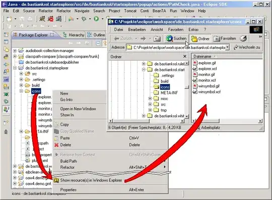
As you can see it's no longer centered. I can't use the flex-basis property because that only affects the height of the footer. Please help.

Edit

Here is a snippet with margin-left and margin-right taken out and replaced with display:flex; and justify-content:space-around;. Be sure to click "Full page" to view with a larger viewport.

body {
  display: flex;
  flex-direction: column;
  min-height: 100%;
}

div#content {
  flex: 1 0 auto;
}

footer {
  flex: 0 0 auto;
  max-width: 67.5rem;
  padding-left: 1.25rem;
  padding-right: 1.25rem;
  padding-bottom: 1.875rem;
  padding-top: 3.5rem;
  display: flex;
  justify-content: space-around;
}
<body>
  <header>...</header>
  <div id="content">...</div>
  <footer>
    <span id="left">left text</span>
    <span id="mid">right text url@mail</span>
    <span id="icons">...</span>
  </footer>
</body>
Michael
  • 835
  • 2
  • 10
  • 24

2 Answers2

2

This can be done easily with justify-content: space-between;, but looking at your code I feel you may misunderstand a bit how Flexbox itself works. You want your footer to act as a flex container so you can manipulate the child spans as well.

Consider checking out freeCodeCamp's Flexbox Challenges to get a better idea how Flexbox works.

EDIT: CodePen now reflects what OP was meaning to immitate.

Here's a CodePen to play around with.

What this does is makes your footer both a child and container.

  1. First your body becomes a container to allow the main content to grow to fill the space pushing your footer to the bottom of the page. The flex-direction is set to column to flow vertically.
  2. You create a wrapper for your footer, because currently your footer is in the body container which is set to flex-direction:column; where in this case, you want the direction to be row to style horizontally. By default display:flex; will assume you wanted row so direction doesn't need declared. We then justify-content to the center so no matter the width the footer itself will be centered.
  3. You treat your <footer> as both a child and container. As a child we tell it not to grow or shrink and set the basis to auto. As a container, we tell it to distribute space-between its children which allows a consistently equal amount of space between the left & right spans.

body {
  display: flex;
  height: 100%;
  flex-direction: column;
}

.main {
  flex: 1 0 auto;
  border: 1px solid #000;
}

.wrapper {
  display: flex;
  justify-content: center;
}

footer {
  flex: 0 0 auto;
  display: flex;
  margin: 1em;
  width: 80%;
  border: 1px solid #000;
  justify-content: space-between;
}
<body>
  <div class="main">
    <h1>Hello Flex</h1>
    <p>This is Flexbox</p>
    <h1>Hello Flex</h1>
    <p>This is Flexbox</p>

  </div>
</body>
<div class="wrapper">
  <footer>
    <span id="left">left text</span>
    <span id="mid">right text url@mail</span>
  </footer>
</div>
CodeSpent
  • 1,684
  • 4
  • 23
  • 46
  • Also note I did not include icons just because I don't have your icons so it'd look kind of silly, but consider just changing the right span to a div and including your text and icons there for a bit more control should you want that div to be a flex container too so you can ensure they all have uniform size and spacing. :) – CodeSpent Jul 06 '18 at 22:52
  • For whatever reason, if the `
    ` tag is a child of a flex container, `justify-content` does nothing if `margin` is set, otherwise the flex item is moved all the way to the left.
    – Michael Jul 06 '18 at 22:57
  • Your ``
    `` element you want to be a flex container, not an item. The spans within the ``
    `` are your items.
    – CodeSpent Jul 06 '18 at 22:59
  • Then how do I make it stick to the bottom of my page? – Michael Jul 06 '18 at 23:00
  • The bottom of your page or the bottom of the window (shown at all times at the bottom of the view)? – CodeSpent Jul 06 '18 at 23:02
  • Bottom of my page. I was using fixed heights, but that isn't the best practice. That's why I started learning about flexbox. – Michael Jul 06 '18 at 23:07
  • So long as your footer is the last element in your document's flow, it'll be at the bottom of the page. If there's space between, you may use explicit heights, or position the footer absolute with ``bottom:0;``. Its very contextual. – CodeSpent Jul 06 '18 at 23:10
  • There are prerequisites. To use ``bottom:0;`` it must be absolutely positioned. I think you'd very much benefit from the [freeCodeCamp CSS courses](http://freecodecamp.org) to help better understand what these properties mean. – CodeSpent Jul 06 '18 at 23:47
  • I know how to use bottom. My point is that I'm transitioning away from using fixed heights for a sticky footer because it's ill-advised. This means that I shouldn't set the position of my `
    ` element to be absolute. [Sticky Footer, Five Ways](https://css-tricks.com/couple-takes-sticky-footer/)
    – Michael Jul 06 '18 at 23:53
  • As far as using explicit heights, I'm not sure what information you're getting. If the idea is absolutely must use flexbox, then your footer should be a container and a child, I'll update my answer. – CodeSpent Jul 07 '18 at 00:04
  • Yeah that's nice if you want the footer to be spread out on the page. But if you want the width property to be set to something smaller, then the footer content gets moved to the left. Also, I played around with setting the position to absolute and the bottom, left, and right properties to 0. It works fine until you run into a situation where the page is larger than expected. This is the shortcoming of setting fixed heights and absolute positions. Real web-design needs to account for the flexibility of content changes, which is why using flexbox is a good solution. – Michael Jul 07 '18 at 00:21
  • https://codepen.io/codespent/pen/mKNdOE - to which you'd just need to wrap your content in a flex container which the direction as ``row`` rather than column then justify the content to the center. I agree flexbox is a "good solution", but hacking padding to perform native flexbox features isn't. – CodeSpent Jul 07 '18 at 00:34
  • If you inspect that you'll see full fluidity without the need for any hacking or complex calculations. That's what flexbox is meant to resolve, not necessarily be used alongside. – CodeSpent Jul 07 '18 at 00:36
  • 1
    Ohhh, I see. I needed to use a wrapper this whole time. Thank you! This is the solution I've been looking for. I'm about to try it on my code, I'll let you know if it works. – Michael Jul 07 '18 at 01:00
  • Not a problem. It can definitely get a bit confusing at first, but I recommend just taking a full crash course on flexbox because most of the time you're probably overthinking it. You don't know what you don't know until you know, so taking a crash course can help with understanding these little techniques and most importantly WHY they work. – CodeSpent Jul 07 '18 at 01:01
  • Yep this worked! Can you update your solution to reflect your latest solution to include the wrapper? Then I can accept it as the solution. – Michael Jul 07 '18 at 01:23
0

I gave up trying to get this to center with flexbox. Instead I used the calc function to calculate the padding-left and padding-right of my <footer> tag. Here is what I came up with (I'm using 47.5rem instead of 67.5rem because I think it's easier to see the behavior).

body {
  display: flex;
  flex-direction: column;
  min-height: 100%;
}

div#content {
  flex: 1 0 auto;
}

footer {
  flex: 0 0 auto;
  display: flex;
  align-items: center;
  padding-left: calc(((100vw - 47.5rem)/2) + 1.25rem);
  padding-right: calc(((100vw - 47.5rem)/2) + 1.25rem);
  padding-bottom: 1.875rem;
  padding-top: 3.5rem;
}
#left {
  flex: 1;
  order: 1;
}
#mid {
  flex: 0 0 auto;
  order: 2;
}
#icons {
  order: 3;
}
<body>
  <header>...</header>
  <div id="content">...</div>
  <footer>
    <span id="left">left text</span>
    <span id="mid">right text url@mail</span>
    <span id="icons">...</span>
  </footer>
</body>
Michael
  • 835
  • 2
  • 10
  • 24