How to center an element of a child of a flex container absolutely-positioned?
The container is already set to justify-content:center, but since the child is absolutely positioned, that doesn't affect it and it doesn't center.
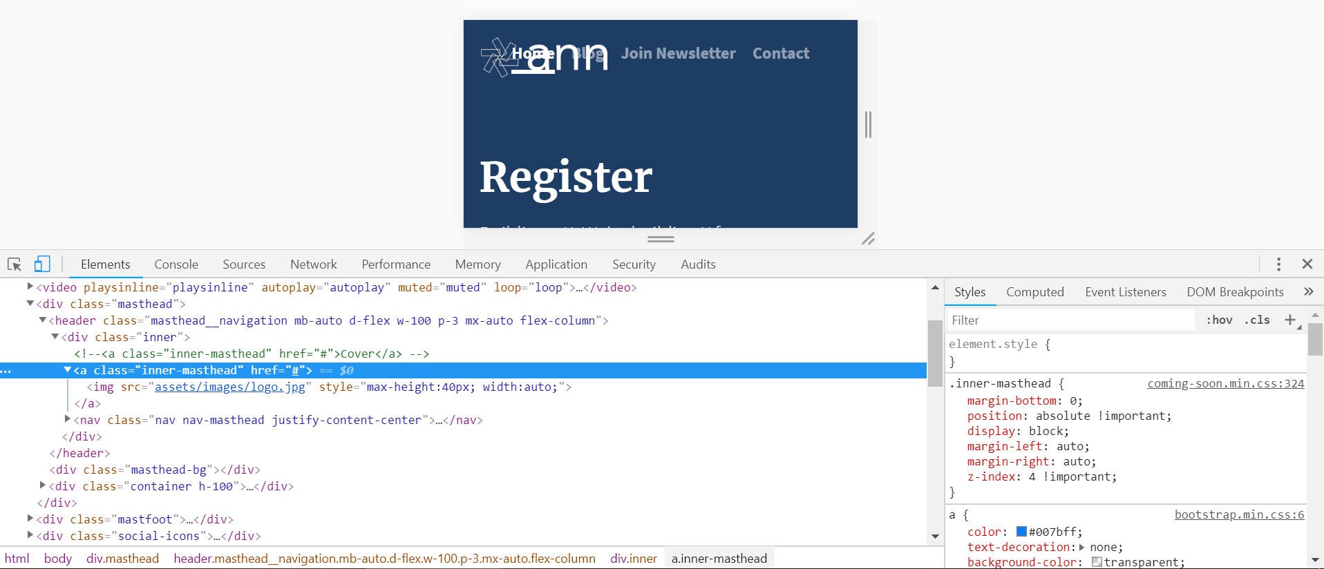
The logo (issue at hand is with the logo) is being 'absolutely positioned' as to be able to apply z-index, so I can have it clickable (before it would get lost among the several layers and I wouldn't see it or be able to click it).
I'm attaching images to explain my point (please bear with me as I can't embed images - not enough stackoverflow karma for that). Relevant code below.
- Situation now, the logo doesn't center above the navigation menu, on mobile
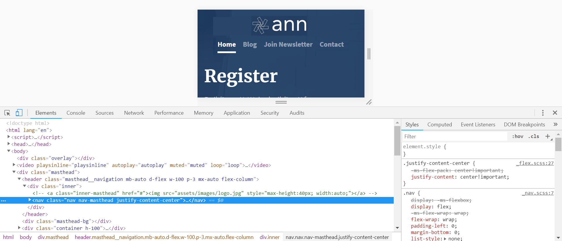
- All ok on desktop, given on large screens I'm forcing a
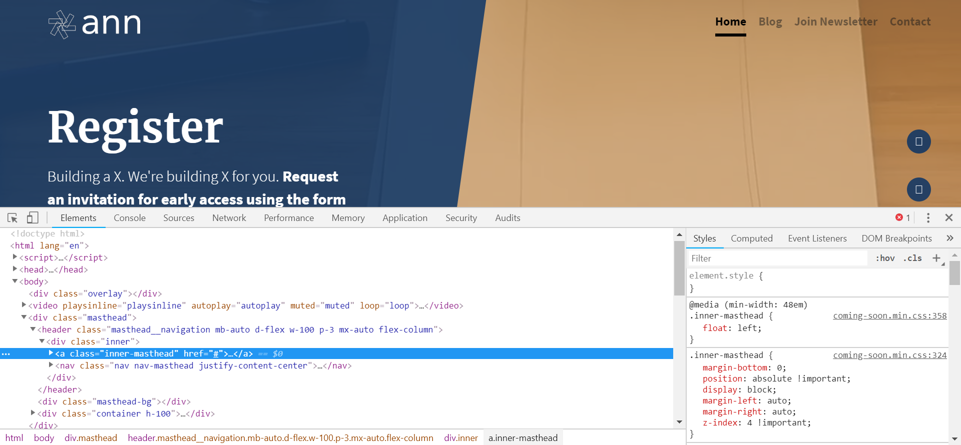
float: leftto implement the design - The intended result (I've manipulated the screenshot to show the intended final result). How to achieve this?
This is what I've tried:
- Played with flex box centering until I realized that wouldn't work for absolutely positioned child elements
- Used,
display: block;margin-left: auto;margin-right: auto; but this didn't make any difference
How do I get to center the logo above the navigation bar on the mobile view? And be easy on me, I'm a beginner :-)
Relevant HTML:
<header class="masthead__navigation mb-auto d-flex w-100 p-3 mx-auto flex-column">
      <div class="inner">
        <a class="inner-masthead" href="#"><img src="assets/images/logo.jpg" style="max-height:40px; width:auto;"></a>
        <nav class="nav nav-masthead justify-content-center">
          <a class="nav-link active" href="#">Home</a>
          <a class="nav-link" href="#">Blog</a>
          <a class="nav-link" href="#">Join Newsletter</a>
          <a class="nav-link" href="#">Contact</a>
        </nav>
      </div>
    </header>
Relevant CSS:
@media (min-width:768px) {

    .masthead__navigation {
                padding-right: 2.5rem !important;
                padding-left: 4rem !important
    }

    .nav-masthead .nav-link {
                color: #262626 !important;
              color: rgba(26, 26, 26, .5) !important;
    }

    .nav-masthead .nav-link:hover,
    .nav-masthead .nav-link:focus {
            border-bottom-color: rgba(26, 26, 26, .5) !important;
    }

    .nav-masthead .active {
              color: #000 !important;
              border-bottom-color: #000 !important;
    }
}

.masthead__navigation {
        margin-bottom: 2rem;
        padding-bottom: 0 !important;
        width: 100vw !important;
        position: absolute !important
}

.inner-masthead {
    margin-bottom: 0;
        position: absolute !important;
        display: block;
      margin-left: auto;
      margin-right: auto;
        z-index: 4 !important
}

.nav-masthead .nav-link {
          padding: .25rem 0;
          font-weight: 700;
            color: #999;
          color: rgba(255, 255, 255, .5);
          background-color: transparent;
          border-bottom: .25rem solid transparent;
            z-index: 4 !important
}

.nav-masthead .nav-link:hover,
.nav-masthead .nav-link:focus {
          border-bottom-color: rgba(255, 255, 255, .5);
}

.nav-masthead .nav-link + .nav-link {
          margin-left: 1rem;
}

.nav-masthead .active {
          color: #fff;
          border-bottom-color: #fff;
}

@media (min-width: 48em) {
    .inner-masthead {
        float: left;
    }
    .nav-masthead {
        float: right;
    }
}