4

I am assuming this question has been answered many times over, but unfortunately after couple hours of searching I am still not able to solve it.

Can someone tell the best way to keep text position in relation to a sibling div/image on window resize?

Please find fiddle attached:

.wrapper img  {
  position: absolute;
  left: 50%;
  top: 50%;
  transform: translate(-50%, -50%);
  z-index: 0;
}

.text-box {
  z-index: 1;
  position: relative;
  top: 20px;
  left: 20px;
}
<div class="wrapper">
  <div class="text-box">
    <p>lorem ipsum</p>
    <p>lorem ipsum</p>
  </div>
  <a href="https://placeholder.com"><img src="http://via.placeholder.com/770x690"></a>
</div>
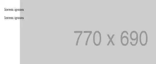
https://jsfiddle.net/ye5q4o2L/4/

enter image description here enter image description here

Lucky500
  • 677
  • 5
  • 17
  • 31
  • Check my answer below..I have adjusted html layout and styles in proper way. try it. – VSM Aug 06 '18 at 11:07

7 Answers7

2

You could try something like this, it may help with what you're trying to achieve.

It does not set the position based on it's sibling, rather it is relative to the parent whose size is being determined by the children.

html,
body,
.wrapper {
  /* stopping overflow - just for example */
  height:100%;
  text-align: center;
}

.wrapper .img-wrapper  {
  position: absolute;
  left: 50%;
  top: 50%;
  transform: translate(-50%, -50%);
  z-index: 0;
}

.wrapper img {
  z-index:1;
  
  /* stopping overflow - just for example */
  max-height:100%;
  width:auto;
  max-width:100%;
}

.text-box {
  z-index: 2;
  position: absolute;
  top: 20px;
  left: 20px;
}

.img-wrapper a {
 /* Set to block to capture the whole img element */
  display:block;
}
<div class="wrapper">
  <div class="img-wrapper">
    <div class="text-box">
      <p>lorem ipsum</p>
      <p>lorem ipsum</p>
    </div>
    <a href="https://placeholder.com">
      <img src="http://via.placeholder.com/770x690">
    </a>
  </div>
</div>

https://jsfiddle.net/ye5q4o2L/10/

Rylee
  • 1,481
  • 1
  • 6
  • 9
  • Thanks Rylee, that still not quite what I was hoping for, but thanks for the answer. I just added an additional media query, until I figure this one out. – Lucky500 Jul 31 '18 at 12:48
2

Since the image has a known width/height you can use them to define the width/height of the text container and then it will be easy to achieve:

.wrapper img,
.text-box{
  position: absolute;
  left: 50%;
  top: 50%;
  transform: translate(-50%, -50%);
  z-index: 0;
}

.text-box {
  width:770px;
  height:690px;
  z-index: 1;
}
<div class="wrapper">
  <div class="text-box">
    <p>lorem ipsum</p>
    <p>lorem ipsum</p>
  </div>
  <a href="https://placeholder.com"><img src="http://via.placeholder.com/770x690"></a>
</div>
Temani Afif
  • 245,468
  • 26
  • 309
  • 415
1

Solution without specify width, height.

JSfiddle: https://jsfiddle.net/hardyrajput/knzL4bqu/3/

HTML:

<div class="wrapper">
  <div class="text-box">
    <p>lorem ipsum</p>
    <p>lorem ipsum</p>
  </div>
  <a href="https://placeholder.com"><img src="http://via.placeholder.com/770x690"></a>
</div>

CSS

* {
  padding: 0;
  margin: 0;
}
.wrapper {
    display: block;
    position: relative;
}
.wrapper .text-box {
    position: absolute;
    top: 50%;
    left: 50%;
    transform: translate(-50%, -50%);
}
.wrapper a {
    display: block;
}
.wrapper img {
    max-width: 100%;
    display: block;
}
Hardik Solanki
  • 325
  • 1
  • 6
0

If you know the size of the sibling in advance, you can do this:

* {
  box-sizing: border-box; /* For padding */
}

.wrapper img {
  position: absolute;
  left: 50%;
  top: 50%;
  transform: translate(-50%, -50%);
  z-index: 0;
}

.text-box {
  z-index: 1;
  position: absolute;
  top: 50%;
  left: 50%;
  transform: translate(-50%, -50%);
  width: 770px;
  height: 690px;
  max-width: 100%;
  max-height: 100%;
  padding: 20px;
}
<div class="wrapper">
  <div class="text-box">
    <p>lorem ipsum</p>
    <p>lorem ipsum</p>
  </div>
  <a href="https://placeholder.com"><img src="http://via.placeholder.com/770x690"></a>
</div>
Xander
  • 1,606
  • 15
  • 30
0

    .wrapper {
      text-align:center;
    }
    
    .bg {
      position: relative;
      display:inline-block;
      margin: 0 auto;
    }
    
    .bg img  {
      width:100%;
    }
    
    .text-box {
      position: absolute;
      z-index: 1;
      top: 20px;
      left: 20px;
    } 
    <div class="wrapper">
      <div class="bg">
        <div class="text-box">
          <p>lorem ipsum</p>
          <p>lorem ipsum</p>
       </div>
        <a href="https://placeholder.com"><img src="http://via.placeholder.com/770x690"></a>
      </div>
    </div> 

jsfiddle - https://jsfiddle.net/Sampath_Madhuranga/ye5q4o2L/33/

Try this. This works fine... Let me know if you have any problem.

VSM
  • 1,765
  • 8
  • 18
0

You can try something like this:

.wrapper{
  text-align: center;
}
.imgWrapper {
  display: inline-block;
  position: relative;
}
.text-box {
  z-index: 1;
  position: absolute;
  top: 20px;
  left: 20px;
}
<div class="wrapper">
  <div class="imgWrapper">
    <div class="text-box">
      <p>lorem ipsum</p>
      <p>lorem ipsum</p>
    </div>
    <a href="https://placeholder.com"><img src="http://via.placeholder.com/770x690"></a>
  </div>
</div>

The display of .imgWrapper is inline-block so it will take the size of the image, and the text-box position is absolute so it will be relative to its parent .imgwrapper.

Ahmed Salama
  • 2,795
  • 1
  • 11
  • 15
0

See this one. Here i added width:100%; in .wrapper img class.

If you need to set height. Then you can set height:100%;(Optional).

https://jsfiddle.net/xczrptw8/

.wrapper img  {
position: absolute;
left: 50%;
top: 50%;
width:100%;
transform: translate(-50%, -50%);
z-index: 0;
}

.text-box {
 z-index: 1;
 position: relative;
top: 20px;
left: 20px;
}
Sakkeer A
  • 1,060
  • 1
  • 16
  • 39