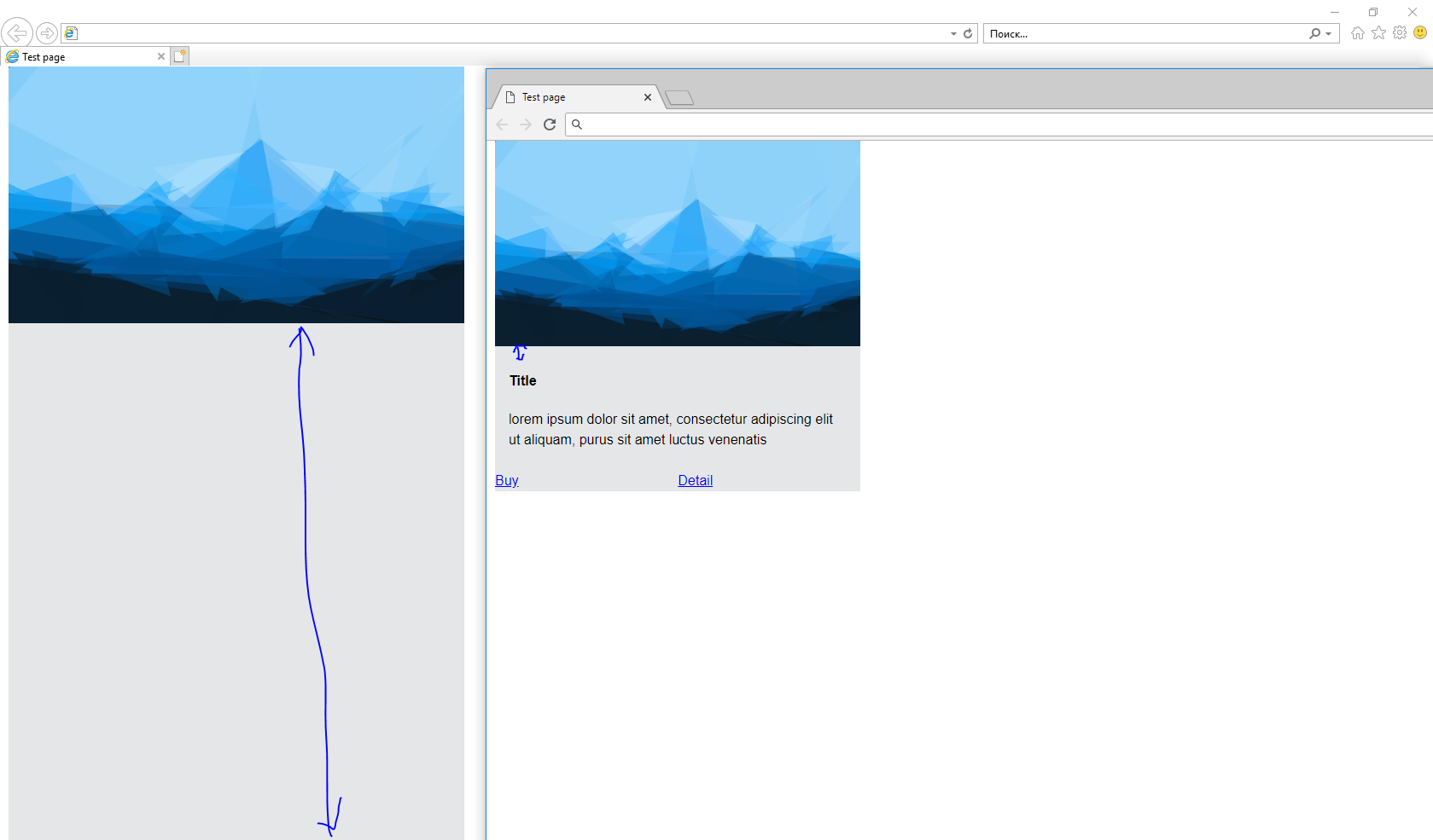
Is there any hack to remove the huge distance between the picture and the title in ie11? Now in ie11 I have got a huge distance. How fix this in ie11? Thank you...................................................................................................................................................................................................
*,
::after,
::before {
  box-sizing: inherit; }

html {
  box-sizing: border-box;
  font-family: "Helvetica Neue", Helvetica, Roboto, Arial, sans-serif;
  font-size: 16px;
  line-height: 1.5;
  text-align: left; }

body {
  margin: 0; }

.wrapper {
 display: flex;
 flex-direction: column;
}

img {
  max-width: 100%;
  vertical-align: middle; }

.main-content {
    position: relative;
    margin-right: 10px;
    margin-left: 10px;
    flex: 1 1 0%;
    width: 100%;
    max-width: calc(100% - 20px - 0.02px);
    order: 1;
    /*min-height: 640px;
 height: 640px;*/
}

.card {
  display: flex;
  flex-direction: column;
  background: #e4e6e8;
}

.card {
  position: relative;
  margin-right: 10px;
  margin-left: 10px;
  flex: 0 0 calc(100% - 20px - 0.02px);
  width: 100%;
  max-width: calc(100% - 20px - 0.02px);
  margin-bottom: 20px;
}

@media (min-width: 992px) {
    .card {
     flex: 0 0 auto;
     width: 100%;
     max-width: calc(33.33333% - 20px - 0.02px);
 }
}

.card-head img {
  max-width: 100%;
}
.card-head a {
  display: block;
}
.card-body {
  flex-grow: 1;
  margin: .5em 1em;
}
.card-foot {
  display: flex;
  flex-wrap: wrap;
  margin-right: -0.5px;
  margin-left: -0.5px;
}
.card-foot > * {
  position: relative;
  margin-right: 0.5px;
  margin-left: 0.5px;
  flex: 1 1 0%;
  width: 100%;
  max-width: calc(100% - 1px - 0.02px);
}
.cardList {
  display: flex;
  flex-wrap: wrap;
  margin-right: -10px;
  margin-left: -10px;
  margin-bottom: calc(3rem - 20px);
  min-height: 640px;
  height: 640px;
}
<div class="main-content">
<div class="cardList">
<div class="card">
<div class="card-head">
<a href="detail.html"><img src="https://bainuo.github.io/1.svg" alt=""></a>
</div>
<div class="card-body">
<h4 class="card-title">Title</h4>
<p>lorem ipsum dolor sit amet, consectetur adipiscing elit ut aliquam, purus sit amet luctus venenatis</p>
</div>
<div class="card-foot">
<a href="#">Buy</a>
<a href="#">Detail</a>
</div>
</div>
</div>
</div>