This is officially my first question I've asked. I spent nearly a day trying to figure this out, so if anyone could help me I would really appreciate it! :D
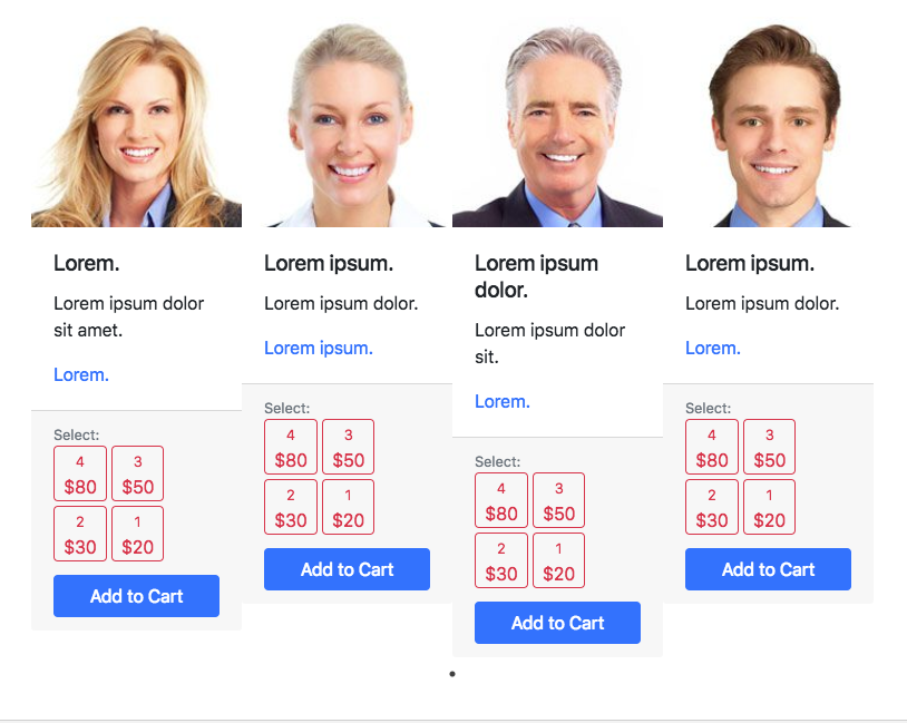
Anyway, I'm trying to use Slick's carousel with Bootstrap, and whenever I use the class 'slick-slider' where I need class 'card-group' also, the alignment of the bottom 'Add to Cart' button and above buttons don't align properly.
<div class='slick-slider card-group'>
This is a code snippet of the card-group and cards:
<section id="slick-slider" class="py-5 med-1">

    <div class='slick-slider card-group'>

      <div class="card border-0" style="width: 18rem;">
        <img class="card-img-top" src="static/img/person1.jpg" alt="Card image cap">
        <div class="card-body d-flex flex-column">
          <h5 class="card-title sm-1">Lorem.</h5>
          <p class="card-text sm-2">Lorem ipsum dolor sit amet.</p>
          <p class="card-text text-primary sm-3">Lorem.</p>
        </div>
        <div class="card-footer d-flex flex-column mt-auto">
          <p class="text-muted small mb-0">Select:</p>
          <div class="clearfix mb-2">
            <button type="button" class="btn btn-outline-danger px-2 py-0 mb-1"><span class="small">4</span><br>$80</button>
              <button type="button" class="btn btn-outline-danger px-2 py-0 mb-1"><span class="small">3</span><br>$50</button>
              <button type="button" class="btn btn-outline-danger px-2 py-0 mb-1"><span class="small">2</span><br>$30</button>
              <button type="button" class="btn btn-outline-danger px-2 py-0 mb-1"><span class="small">1</span><br>$20</button>
          </div>
          <a href="#" class="btn btn-primary">Add to Cart</a>
        </div>
      </div>

      <div class="card border-0" style="width: 18rem;">
        <img class="card-img-top" src="static/img/person2.jpg" alt="Card image cap">
        <div class="card-body d-flex flex-column">
          <h5 class="card-title sm-1">Lorem ipsum.</h5>
          <p class="card-text sm-2">Lorem ipsum dolor.</p>
          <p class="card-text text-primary sm-3">Lorem ipsum.</p>
        </div>
        <div class="card-footer d-flex flex-column mt-auto">
          <p class="text-muted small mb-0">Select:</p>
          <div class="clearfix mb-2">
            <button type="button" class="btn btn-outline-danger px-2 py-0 mb-1"><span class="small">4</span><br>$80</button>
              <button type="button" class="btn btn-outline-danger px-2 py-0 mb-1"><span class="small">3</span><br>$50</button>
              <button type="button" class="btn btn-outline-danger px-2 py-0 mb-1"><span class="small">2</span><br>$30</button>
              <button type="button" class="btn btn-outline-danger px-2 py-0 mb-1"><span class="small">1</span><br>$20</button>
          </div>
          <a href="#" class="btn btn-primary">Add to Cart</a>
        </div>

      </div>
      <div class="card border-0" style="width: 18rem;">
        <img class="card-img-top" src="static/img/person3.jpg" alt="Card image cap">
        <div class="card-body d-flex flex-column">
          <h5 class="card-title sm-1">Lorem ipsum dolor.</h5>
          <p class="card-text sm-2">Lorem ipsum dolor sit.</p>
          <p class="card-text text-primary sm-3">Lorem.</p>
        </div>
        <div class="card-footer d-flex flex-column mt-auto">
          <p class="text-muted small mb-0">Select:</p>
          <div class="clearfix mb-2">
            <button type="button" class="btn btn-outline-danger px-2 py-0 mb-1"><span class="small">4</span><br>$80</button>
              <button type="button" class="btn btn-outline-danger px-2 py-0 mb-1"><span class="small">3</span><br>$50</button>
              <button type="button" class="btn btn-outline-danger px-2 py-0 mb-1"><span class="small">2</span><br>$30</button>
              <button type="button" class="btn btn-outline-danger px-2 py-0 mb-1"><span class="small">1</span><br>$20</button>
          </div>
          <a href="#" class="btn btn-primary">Add to Cart</a>
        </div>
      </div>
      <div class="card border-0" style="width: 18rem;">
        <img class="card-img-top" src="static/img/person4.jpg" alt="Card image cap">
        <div class="card-body d-flex flex-column">
          <h5 class="card-title sm-1">Lorem ipsum.</h5>
          <p class="card-text sm-2">Lorem ipsum dolor.</p>
          <p class="card-text text-primary sm-3">Lorem.</p>
        </div>
        <div class="card-footer d-flex flex-column mt-auto">
          <p class="text-muted small mb-0">Select:</p>
          <div class="clearfix mb-2">
            <button type="button" class="btn btn-outline-danger px-2 py-0 mb-1"><span class="small">4</span><br>$80</button>
              <button type="button" class="btn btn-outline-danger px-2 py-0 mb-1"><span class="small">3</span><br>$50</button>
              <button type="button" class="btn btn-outline-danger px-2 py-0 mb-1"><span class="small">2</span><br>$30</button>
              <button type="button" class="btn btn-outline-danger px-2 py-0 mb-1"><span class="small">1</span><br>$20</button>
          </div>
          <a href="#" class="btn btn-primary">Add to Cart</a>
        </div>

      </div>


    </div>


</section>
Below, are the pics with slick-slider class, and without (both with card-group).
What I'm trying to achieve with Slick:
pic link

What keeps happening that I don't want:
pic2 link
Thanks in advance!