1

I am having problem fixing my content in the center both vertically and horizontally. And my container-fluid doesn't cover footer when I inspect in the developer tools. I have looked across other stacks but still can't figure it out. Here is my codepen. https://codepen.io/anon/pen/yqdbWd

What I want is to remove the sidebar since its a single page with few contents. I have included the screenshots of my issue.enter image description here 
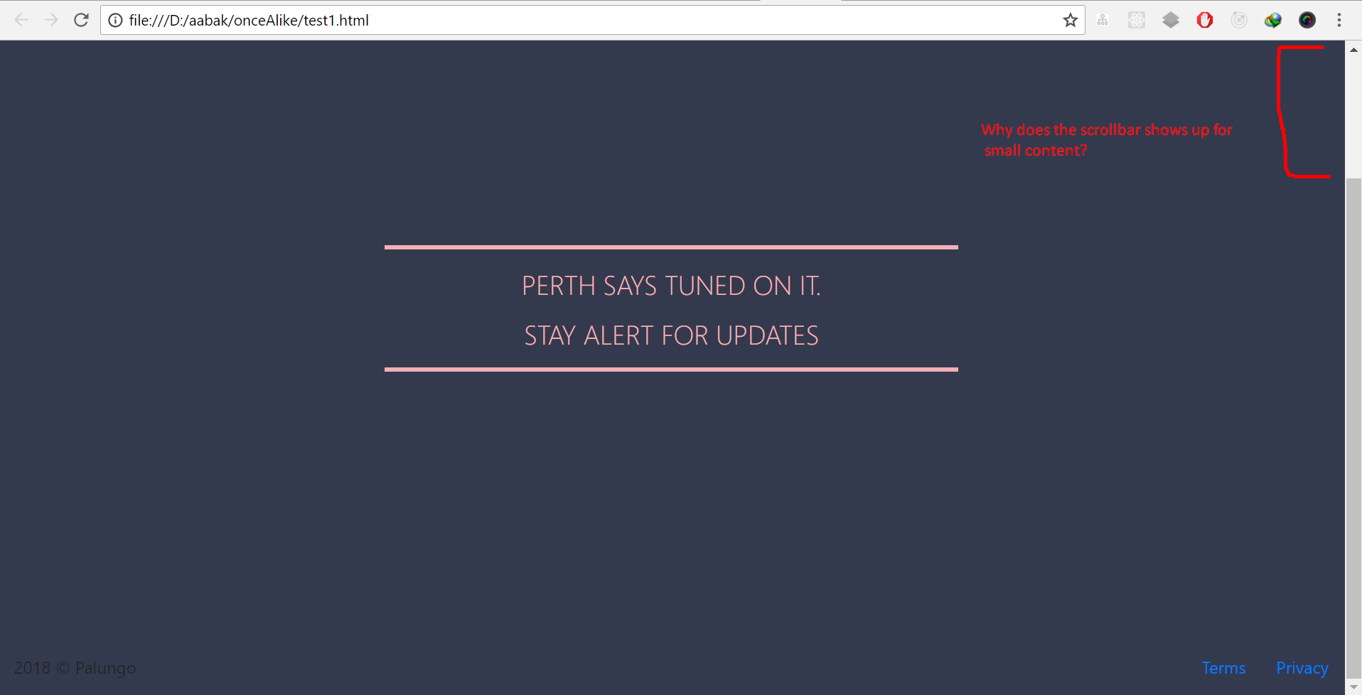
And my container-fluid doesn't take up the whole page.enter image description here Lastly, I want to know if there is way to shorten the length of my hr line like this much.enter image description here

And here is the code I have done so far.

HTML

<body>
<div class="container-fluid h-100">
        <nav class="navbar navbar-light rounded">
    <a class="navbar-brand" href="#">
      <svg class="d-block" width="36" height="36" viewbox="0 0 612 612" xmlns="http://www.w3.org/2000/svg" focusable="false"><title>Bootstrap</title><path fill="currentColor" d="M510 8a94.3 94.3 0 0 1 94 94v408a94.3 94.3 0 0 1-94 94H102a94.3 94.3 0 0 1-94-94V102a94.3 94.3 0 0 1 94-94h408m0-8H102C45.9 0 0 45.9 0 102v408c0 56.1 45.9 102 102 102h408c56.1 0 102-45.9 102-102V102C612 45.9 566.1 0 510 0z"/><path fill="currentColor" d="M196.77 471.5V154.43h124.15c54.27 0 91 31.64 91 79.1 0 33-24.17 63.72-54.71 69.21v1.76c43.07 5.49 70.75 35.82 70.75 78 0 55.81-40 89-107.45 89zm39.55-180.4h63.28c46.8 0 72.29-18.68 72.29-53 0-31.42-21.53-48.78-60-48.78h-75.57zm78.22 145.46c47.68 0 72.73-19.34 72.73-56s-25.93-55.37-76.46-55.37h-74.49v111.4z"/></svg>
    </a>
    <ul class="nav justify-content-end">
      <li class="nav-item">
        <a class="nav-link active" href="#">Updates</a>
      </li>
    </ul>
  </nav>
  <div class="row align-items-center h-100">
      <div class="col-6 mx-auto">
          <div class="jumbotron text-center">
              <hr class="text-border" />
              <p class="lead">Perth says tuned on it.</p>
              <p class="lead">Stay Alert For Updates</p>
              <hr class="text-border" />
          </div>
      </div>
  </div>

   <footer class="mt-auto">
    <p class="float-left">2018 © Palungo</p>
      <div class="float-right">
        <ul class="list-inline">
          <li class="list-inline-item"><a href="#">Terms</a></li>
          <li class="list-inline-item"><a href="#">Privacy</a></li>
        </ul>
      </div>
  </footer>

</div>

And here is the CSS

   body,html {
      height: 100%;
      background:#333A4D;
   }
   .navbar{
      margin: 10px;
      background: #333A4D;
      padding: 20px;
    }
   .nav-link{
      font-size: 25px;
      line-height: 32px;
      color: #F3B0B6;
   }
  .list-inline-item{ margin-left: 1rem; }
  .jumbotron{ background: none; }
  .text-border{
     display: block;
     height: 1px;
     border: 0;
     border-top: 4px solid #F3B0B6;
    }
   .lead{
     text-transform: uppercase;
     color: #F3B0B6;
     font-size: 25px;
     line-height: 31px;
    }
    @media (min-width: 48em) {
     .navbar-brand{
       float: left;
     }
   .nav{
     float: right;
    }
  }
Narwen
  • 150
  • 7
  • Please narrow this down to a single question. There's a scrollbar because you have a 100% height row with a nav and footer outside it. The row takes up 100% height of the viewport so there needs to be room for the nav and footer too. – Carol Skelly Aug 16 '18 at 12:30
  • But I do have footer inside container-fluid. So, how come container-fluid not cover the footer when I hover it in inspection tool. – Narwen Aug 16 '18 at 12:38
  • Because it has scrolled lower than the viewport because the jumbotron row is also 100% viewport height – Carol Skelly Aug 16 '18 at 12:41

2 Answers2

1

You added height: 100%; to your main section which will make it as large as the screen but the header pushed your main section down which is why the scrollbar appeared.

Then I added position: absolute; to your footer to make it stick to the bottom and added display: flex; with some few tricks to replace the float: left & float: right.

Also to shorten the lines I replaced <div class="col-4 mx-auto"> with <div class="col-6 mx-auto"> if you want to shorten it even more use <div class="col-3 mx-auto"> or even a lower value.

body,
html {
  height: 100%;
  background: #333A4D;
}

.navbar {
  margin: 10px;
  background: #333A4D;
  padding: 20px;
  margin-top: 0px;
}

.nav-link {
  font-size: 25px;
  line-height: 32px;
  color: #F3B0B6;
}

.nav-item {
  margin-left: 1rem;
}

.list-inline-item {
  margin-left: 1rem;
}

.jumbotron {
  background: none;
}

.text-border {
  display: block;
  height: 1px;
  border: 0;
  border-top: 4px solid #F3B0B6;
}

.lead {
  text-transform: uppercase;
  color: #F3B0B6;
  font-size: 25px;
  line-height: 31px;
}

@media (min-width: 48em) {
  .navbar-brand {
    float: left;
  }
  .nav {
    float: right;
  }
}

.footer {
  width: 100%;
  position: absolute;
  bottom: 0;
  left: 0;
  padding: 0 40px;
  display: flex;
  justify-content: space-between;
}

.centered-content {
  position: absolute;
  top: 0;
  left: 0;
  width: 100%;
  height: 100%;
  display: flex;
  justify-content: center;
}
<link rel="stylesheet" href="https://stackpath.bootstrapcdn.com/bootstrap/4.1.3/css/bootstrap.min.css">
<script src="https://code.jquery.com/jquery-3.3.1.slim.min.js"></script>
<script src="https://stackpath.bootstrapcdn.com/bootstrap/4.1.3/js/bootstrap.min.js"></script>

<body>
  <div class="container-fluid h-100">
    <nav class="navbar navbar-light rounded">
      <a class="navbar-brand" href="#">
        <svg class="d-block" width="36" height="36" viewbox="0 0 612 612" xmlns="http://www.w3.org/2000/svg" focusable="false"><title>Bootstrap</title><path fill="currentColor" d="M510 8a94.3 94.3 0 0 1 94 94v408a94.3 94.3 0 0 1-94 94H102a94.3 94.3 0 0 1-94-94V102a94.3 94.3 0 0 1 94-94h408m0-8H102C45.9 0 0 45.9 0 102v408c0 56.1 45.9 102 102 102h408c56.1 0 102-45.9 102-102V102C612 45.9 566.1 0 510 0z"/><path fill="currentColor" d="M196.77 471.5V154.43h124.15c54.27 0 91 31.64 91 79.1 0 33-24.17 63.72-54.71 69.21v1.76c43.07 5.49 70.75 35.82 70.75 78 0 55.81-40 89-107.45 89zm39.55-180.4h63.28c46.8 0 72.29-18.68 72.29-53 0-31.42-21.53-48.78-60-48.78h-75.57zm78.22 145.46c47.68 0 72.73-19.34 72.73-56s-25.93-55.37-76.46-55.37h-74.49v111.4z"/></svg>
      </a>
      <ul class="nav justify-content-end">
        <li class="nav-item">
          <a class="nav-link active" href="#">Updates</a>
        </li>
      </ul>
    </nav>
    <div class="row align-items-center centered-content">
      <div class="col-4 mx-auto">
        <div class="jumbotron text-center">
          <hr class="text-border" />
          <p class="lead">Perth says tuned on it.</p>
          <p class="lead">Stay Alert For Updates</p>
          <hr class="text-border" />
        </div>
      </div>
    </div>

    <footer class="footer mt-auto">
      <p>2018 © Palungo</p>
      <div>
        <ul class="list-inline">
          <li class="list-inline-item"><a href="#">Terms</a></li>
          <li class="list-inline-item"><a href="#">Privacy</a></li>
        </ul>
      </div>
    </footer>

  </div>
</body>
Jason Aller
  • 3,541
  • 28
  • 38
  • 38
Tom Thomson
  • 422
  • 1
  • 5
  • 14
  • Thanks but the content is still not in the center of the page. I want it exactly in the center. Can u guide me to make it vertically in center. Here is what it looks in my browser: http://prntscr.com/kjbycq – Narwen Aug 16 '18 at 12:37
  • Thanks a lot for the help.! – Narwen Aug 16 '18 at 12:44
1

Instead of using height:100% on the jumbotron .row, make it's container-fluid flexbox column (d-flex flex-column) and then flex-grow-1 on the jumbotron .row so that is fills the remaining height between the nav and footer. This will eliminate the scrollbar.

   <div class="container-fluid h-100 d-flex flex-column">
      <nav class="navbar navbar-light fixed-top">
        ..
      </nav>
      <div class="row align-items-center flex-grow-1">
          <div class="col-6 mx-auto">
              <div class="jumbotron text-center mb-0">
                  <hr class="text-border" />
                  <p class="lead">Perth says tuned on it.</p>
                  <p class="lead">Stay Alert For Updates</p>
                  <hr class="text-border" />
              </div>
          </div>
      </div>
      <footer class="mt-auto">
        ..
      </footer>
    </div>

https://codepen.io/anon/pen/wxLqMK

As far as centering the jumbotron on the page, make the navbar fixed-top so that it's not pushing down the jumbotron content and making it off-center. Also remove the bottom margin on the jumbotron (mb-0). Here is a generic Bootstrap 4 example


Related: Bootstrap 4 Navbar and content fill height flexbox

Flex fill height nav row footer jumbotron

Carol Skelly
  • 351,302
  • 90
  • 710
  • 624