How does one get a <section></section> to grow to fit its content with CSS Grid layout?
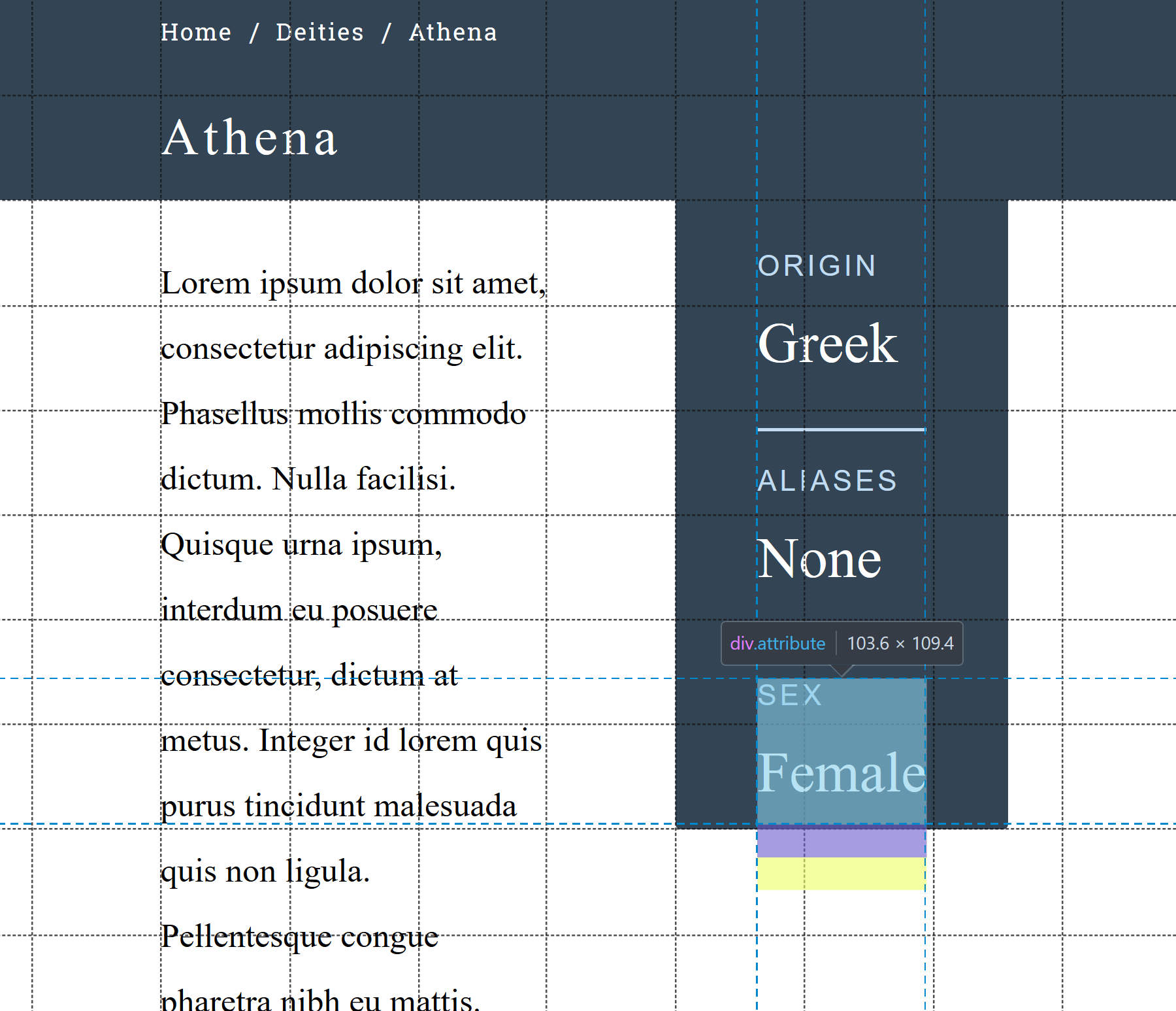
The dark blue section on the right should end where the yellow highlight is. In other words, it should wrap around its content. I'm not sure how I can get it to do that.
I have created a Codepen.
Here's the HTML:
<div class="deity-details">
  <header>
    <div class="breadcrumbs">
      <a asp-controller="Home" asp-action="Index" class="breadcrumb__item">Home</a> /
      <a href="#" class="breadcrumb__item">Deities</a> /
      <a asp-controller="Deity" asp-action="Details" asp-route-slug="@Model.Slug" class="breadcrumb__item">@Model.Name</a>
    </div>
    <h1 class="deity-name h1__white">@Model.Name</h1>
  </header>

  <section class="deity-description">
    @Html.Raw(Model.Description)
  </section>

  <section class="deity-meta">
    <div class="attributes">
      <div class="attribute">
        <label class="attribute-label">Origin</label>
        <h4 class="attribute-value">@Model.Origin</h4>
      </div>
      <div class="attribute">
        <label class="attribute-label">Aliases</label>
        <h4 class="attribute-value">@Model.Aliases</h4>
      </div>
      <div class="attribute">
        <label class="attribute-label">Sex</label>
        <h4 class="attribute-value">@Model.Sex</h4>
      </div>
    </div>
  </section>
</div>
And here's the SCSS:
.deity-details {
  height: 100vh;
  display: grid;
  grid-template-columns: repeat(10, 1fr);
  grid-template-rows: repeat(10, 1fr);
}

header {
  grid-column: 1 / span 10;
  grid-row: 1 / span 2;
  display: grid;
  grid-template-columns: repeat(10, 1fr);
  grid-template-rows: 50px 1fr;
  background: $dark-navy;
}

.breadcrumbs,
.deity-name {
  grid-column: 3 / span 6;
}

.breadcrumbs {
  display: flex;
  align-items: center;
  color: $white;
  font-family: "Roboto Slab", sans-serif;
}

.breadcrumb__item {
  color: $white;
  font-family: "Roboto Slab", sans-serif;
  letter-spacing: 1px;
  margin: 0 10px 0 10px;
  font-size: 0.9rem;
}

.breadcrumb__item:first-child {
  margin-left: 0
}

.deity-name {
  display: flex;
  align-items: center;
  letter-spacing: 3px;
}

.deity-description {
  grid-column: 3 / span 3;
  grid-row: 3 / span 8;
  padding: 30px 0 0 0;
}

.deity-meta {
  grid-column: 7 / span 2;
  grid-row: 3 / span 6;
  background: $dark-navy;
  border-bottom-left-radius: $border-radius;
  border-bottom-right-radius: $border-radius;
  padding: 30px 50px 0 50px;
}

.attribute {
  margin: 0 0 20px 0;
  border-bottom: 2px solid $light-blue;
  padding: 0 0 20px 0;
}

.attribute:last-child {
  border: none;
}

.attribute-label {
  display: block;
  font-family: "Abel", sans-serif;
  color: $light-blue;
  font-size: 1.1rem;
  text-transform: uppercase;
  margin: 0 0 5px 0;
  letter-spacing: 2px;
}

.attribute-value {
  color: $white;
  font-size: 2.2rem;
  font-family: "Playfair Display", serif;
  line-height: 4rem;
}