48

I've seen a few questions like this in my search, but either the question didn't get answered properly or no answer was given. So, I'll ask again.

<style>
.parent { overflow-y:scroll; overflow-x:visible; width:100px; }
.child { position:relative; }
.child-menu { position:absolute; top:0px; left:-100px; display:inline-block; }
</style>

  <div class="parent">
  <!-- Lots of the following divs -->
  <div class="child">
    Text Line
    <div class="child-menu">some pop out stuff</div>
  </div>
</div>

Alright, that's just an example. But basically, what I'm trying to accomplish is have the .child classes be scrollable on the y axis...scroll up and down. But I want the x-axis....the child-menu's to be visible outside the .parent container.

Does that make sense? So what is happening is that when the page renders, the browser is interpreting the overflow as auto altogether and not respecting the separate axis. Am I doing something wrong or are the browsers just not up to CSS3 spec yet on this? Mostly only tested on Chrome.
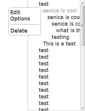
 enter image description here

Senica Gonzalez
  • 7,996
  • 16
  • 66
  • 108

3 Answers3

38

I figured it out!

The parent should be overflow:auto; The .child should be position:relative; The .child-menu should be position:fixed; with NO top or left positioning. If you do this, it will keep it it inline with the content.

If you need to move the child-menu use margins and not top or left. Example margin-left:-100px;

EDIT

As it seems people still use this, please note that you will have to use javascript to move the fixed items as the page scrolls.

Senica Gonzalez
  • 7,996
  • 16
  • 66
  • 108
  • 2
    doesn't this not work when you scroll? It seems to me that scrolling will scroll .child, but not .child-menu. If that is the case, then this doesn't seem like a reasonable solution. – dchapman Feb 24 '14 at 17:47
  • 1
    You know, I can't remember. I imagine you are correct. The times I've used this have been for single page apps where that wasn't a problem. Reasonable? There is no other answer, so for those that NEED this functionality, yes it's very reasonable. You can always move the div as you scroll. – Senica Gonzalez Feb 25 '14 at 15:12
  • 18
    Just to save anyone the time if they see this answer in the future, this *does not* cause the popout to scroll while the sidebar scrolls. So if you use something like this you'll have to use JS to track the scrolling. – Andrew Jun 12 '14 at 16:33
5

It solved here! They use css and JS.

.child:hover .child-menu { display: block; }

 .parent { overflow-y:auto; overflow-x:hidden; width:100px; height:150px  }
    .child { position:static; }
    .child-menu { position:absolute; display:inline-block; display: none; }

https://css-tricks.com/popping-hidden-overflow/

https://jsfiddle.net/68fBE/2/

blondo
  • 59
  • 1
  • 1
  • I don't think this really solves the problem. It only works because .parent is the full width of the page. The pop out does not overhang the boundaries of the parent container, but rather the parent container simply grows to accommodate the pop out. – Matt Korostoff Aug 28 '19 at 18:33
-1
.parent { 
   overflow-y: auto; 
   width: 100px; 
}

.child-menu {
   display: block;
   position: fixed;
   top: auto;
   left: auto;
}
Nandita Sharma
  • 13,287
  • 2
  • 22
  • 35
rajatkn
  • 21
  • 1
  • 4
  • 3
    Please avoid code only answers. Try to explain how/why your code solves the problem posted by OP. It will help future visitors. – Pratik Bhavsar Jan 23 '20 at 06:05