0

I've got a question which hopefully someone will be able to help out with. So I am trying to create a diamond div shape which will itself, be a link:

Diamonds in wanted structure

Creating these a separate divs with for instance and image for the diamond with a link around it won't work in this situation due to the overflow on to the other blocks.

So my first though was to create a div and use transform in CSS to get this desired effect:

enter image description here

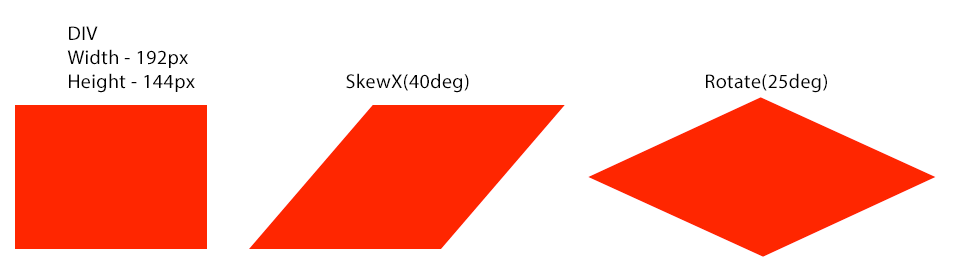
However, when trying to create this, get got the following:

.test {
 width: 192px;
 height: 144px;
 transform: skewX(-40deg) rotate(25deg);
 display: block;
 background-color: red;
 top:50px;
 left:50px;
 position:absolute;
}
<div class="test"></div>

By running this, you can see that within the transform attribute, both rotate and skew cannot work together as it seems the skew is affected by the rotate.

Has anyone else come across the same sort of thing when trying to create custom shapes like this? Is there another way (either CSS or Javascript) where I could get the desired effect?

Any help would be greatly appreciated. If anyone needs any further information, please let me know.

Thanks very much :)

Temani Afif
  • 245,468
  • 26
  • 309
  • 415
M. Ferguson
  • 1,331
  • 1
  • 10
  • 15

2 Answers2

2

As I explained in another answer (Simulating transform-origin using translate). The multiplication is done from left to right but the visual effect is from right to left:

.test {
 width: 192px;
 height: 144px;
 transform:rotate(25deg)  skewX(-40deg) ;
 display: block;
 background-color: red;
 top:50px;
 left:50px;
 position:absolute;
}
<div class="test"></div>

By the way, here is some alternatives to achieve a similar shape without transform.

With gradient:

.box {
  width:200px;
  height:100px;
  background:
    linear-gradient(to top right, red 49%,transparent 50%) top right,
    linear-gradient(to top left, red 49%,transparent 50%) top left,
    linear-gradient(to bottom right, red 49%,transparent 50%) bottom right,
    linear-gradient(to bottom left, red 49%,transparent 50%) bottom left;
  background-size:50% 50%;
  background-repeat:no-repeat;
}
<div class="box">
</div>

With clip-path:

.box {
  width: 200px;
  height: 100px;
  background: red;
  -webkit-clip-path: polygon(50% 0%, 100% 50%, 50% 100%, 0% 50%);
  clip-path: polygon(50% 0%, 100% 50%, 50% 100%, 0% 50%);
}
<div class="box">
</div>

With SVG:

<svg viewBox="0 0 200 100" width='200'>
<polygon points="0 50,100 0,200 50,100 100" fill=red />
</svg>
Temani Afif
  • 245,468
  • 26
  • 309
  • 415
1

You need to declare the rotate before the skew.

Transform is very specific in what order its transformations are done.