
You've seen iterations of this type of progress bar on sites like paypal. How does one go about setting this up using CSS and jquery? I have 4 pages and each page is a step... so 4 steps.
You've seen iterations of this type of progress bar on sites like paypal. How does one go about setting this up using CSS and jquery? I have 4 pages and each page is a step... so 4 steps.
I have searched for a solution that will visualize process steps in my web application. I have found the following excellent write-up by Stephen A Thomas:
Tracking Progress in Pure CSS (Original Link now dead)
In his approach Thomas even gets away with just using CSS - no Javascript! In an essence the following CSS code from his article does the trick for me:
    <style>

    <!-- Progress with steps -->

    ol.progtrckr {
        margin: 0;
        padding: 0;
        list-style-type: none;
    }

    ol.progtrckr li {
        display: inline-block;
        text-align: center;
        line-height: 3em;
    }

    ol.progtrckr[data-progtrckr-steps="2"] li { width: 49%; }
    ol.progtrckr[data-progtrckr-steps="3"] li { width: 33%; }
    ol.progtrckr[data-progtrckr-steps="4"] li { width: 24%; }
    ol.progtrckr[data-progtrckr-steps="5"] li { width: 19%; }
    ol.progtrckr[data-progtrckr-steps="6"] li { width: 16%; }
    ol.progtrckr[data-progtrckr-steps="7"] li { width: 14%; }
    ol.progtrckr[data-progtrckr-steps="8"] li { width: 12%; }
    ol.progtrckr[data-progtrckr-steps="9"] li { width: 11%; }

    ol.progtrckr li.progtrckr-done {
        color: black;
        border-bottom: 4px solid yellowgreen;
    }
    ol.progtrckr li.progtrckr-todo {
        color: silver;
        border-bottom: 4px solid silver;
    }

    ol.progtrckr li:after {
        content: "\00a0\00a0";
    }
    ol.progtrckr li:before {
        position: relative;
        bottom: -2.5em;
        float: left;
        left: 50%;
        line-height: 1em;
    }
    ol.progtrckr li.progtrckr-done:before {
        content: "\2713";
        color: white;
        background-color: yellowgreen;
        height: 1.2em;
        width: 1.2em;
        line-height: 1.2em;
        border: none;
        border-radius: 1.2em;
    }
    ol.progtrckr li.progtrckr-todo:before {
        content: "\039F";
        color: silver;
        background-color: white;
        font-size: 1.5em;
        bottom: -1.6em;
    }

</style>
As well as HTML tags from his example (I use Grails GSP pages to generate tags and 'done/todo' class dynamically):
<ol class="progtrckr" data-progtrckr-steps="5">
    <li class="progtrckr-done">Order Processing</li>
    <li class="progtrckr-done">Pre-Production</li>
    <li class="progtrckr-done">In Production</li>
    <li class="progtrckr-done">Shipped</li>
    <li class="progtrckr-todo">Delivered</li>
</ol>
Hope it helps. Works pretty well for me.
UPDATE: The following (shortened) version also works well.
    ol.progtrckr {
        display: table;
        list-style-type: none;
        margin: 0;
        padding: 0;
        table-layout: fixed;
        width: 100%;
    }
    ol.progtrckr li {
        display: table-cell;
        text-align: center;
        line-height: 3em;
    }
    ... and the rest of the CSS ...

    <ol class="progtrckr">
        ...
    </ol>
display: table; table-layout: fixed; width: 100% ensure that the list items are automatically sized equally as long as the content does not overflow. There is no need to use data-progtrckr-steps and its associated CSS.
There are a lot of very nice answers on this page and I googled for some more, but none of the answers ticked all the checkboxes on my wish list:
So I mixed the code of several examples, fixed the things that I needed and here is the result:
I used the following CSS and HTML:
/* Progress Tracker v2 */
ol.progress[data-steps="2"] li { width: 49%; }
ol.progress[data-steps="3"] li { width: 33%; }
ol.progress[data-steps="4"] li { width: 24%; }
ol.progress[data-steps="5"] li { width: 19%; }
ol.progress[data-steps="6"] li { width: 16%; }
ol.progress[data-steps="7"] li { width: 14%; }
ol.progress[data-steps="8"] li { width: 12%; }
ol.progress[data-steps="9"] li { width: 11%; }

.progress {
    width: 100%;
    list-style: none;
    list-style-image: none;
    margin: 20px 0 20px 0;
    padding: 0;
}

.progress li {
    float: left;
    text-align: center;
    position: relative;
}

.progress .name {
    display: block;
    vertical-align: bottom;
    text-align: center;
    margin-bottom: 1em;
    color: black;
    opacity: 0.3;
}

.progress .step {
    color: black;
    border: 3px solid silver;
    background-color: silver;
    border-radius: 50%;
    line-height: 1.2;
    width: 1.2em;
    height: 1.2em;
    display: inline-block;
    z-index: 0;
}

.progress .step span {
    opacity: 0.3;
}

.progress .active .name,
.progress .active .step span {
    opacity: 1;
}

.progress .step:before {
    content: "";
    display: block;
    background-color: silver;
    height: 0.4em;
    width: 50%;
    position: absolute;
    bottom: 0.6em;
    left: 0;
    z-index: -1;
}

.progress .step:after {
    content: "";
    display: block;
    background-color: silver;
    height: 0.4em;
    width: 50%;
    position: absolute;
    bottom: 0.6em;
    right: 0;
    z-index: -1;
}

.progress li:first-of-type .step:before {
    display: none;
}

.progress li:last-of-type .step:after {
    display: none;
}

.progress .done .step,
.progress .done .step:before,
.progress .done .step:after,
.progress .active .step,
.progress .active .step:before {
    background-color: yellowgreen;
}

.progress .done .step,
.progress .active .step {
    border: 3px solid yellowgreen;
}
<!-- Progress Tracker v2 -->
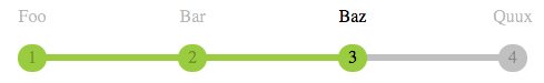
<ol class="progress" data-steps="4">
<li class="done">
<span class="name">Foo</span>
<span class="step"><span>1</span></span>
</li>
<li class="done">
<span class="name">Bar</span>
<span class="step"><span>2</span></span>
</li>
<li class="active">
<span class="name">Baz</span>
<span class="step"><span>3</span></span>
</li>
<li>
<span class="name">Quux</span>
<span class="step"><span>4</span></span>
</li>
</ol>As can be seen in the example above, there are now two list item classes to take note of: active and done. Use class="active" for the current step, use class="done" for all steps before it.
Also note the data-steps="4" in the ol tag; set this to the total number of steps to apply the correct size to all list items.
Feel free to play around with the JSFiddle. Enjoy!
Here is how to make one:
http://24ways.org/2008/checking-out-progress-meters
Here are some inspiration examples:
This is how I have achieved it using purely CSS and HTML (no JavaScript/images etc.).
It gracefully degrades in most browsers (I do need to add in a fix for lack of last-of-type in < IE9).
I had the same requirements to create a kind of step progress tracker so I created a JavaScript plugin for that purpose. Here is the JsFiddle for the demo for this step progress tracker. You can access its code on GitHub as well.
What it basically does is, it takes the json data(in a particular format described below) as input and creates the progress tracker based on that. Highlighted steps indicates the completed steps.
It's html will somewhat look like shown below with default CSS but you can customize it as per the theme of your application. There is an option to show tool-tip text for each steps as well.
Here is some code snippet for that:
//container div
<div id="tracker1" style="width: 700px">
</div>

//sample JSON data
var sampleJson1 = {
ToolTipPosition: "bottom",
data: [{ order: 1, Text: "Foo", ToolTipText: "Step1-Foo", highlighted: true },
    { order: 2, Text: "Bar", ToolTipText: "Step2-Bar", highlighted: true },
    { order: 3, Text: "Baz", ToolTipText: "Step3-Baz", highlighted: false },
    { order: 4, Text: "Quux", ToolTipText: "Step4-Quux", highlighted: false }]
};

//Invoking the plugin
$(document).ready(function () {
        $("#tracker1").progressTracker(sampleJson1);
    });
Hopefully it will be useful for somebody else as well!
This is what I did:
HTML
<div id="divProgress"></div>
<div id="divStepTitle">
    <span class="spanStep">Step 1</span> <span class="spanStep">Step 2</span> <span class="spanStep">Step 3</span>
</div>

<input type="button" id="btnPrev" name="btnPrev" value="Prev" />
<input type="button" id="btnNext" name="btnNext" value="Next" />
CSS
#divProgress
{
    width: 600px;
}

#divStepTitle
{
    width: 600px;
}

.spanStep
{
    text-align: center;
    width: 200px;
}
Javascript/jQuery
var progress = 0;

$(function({
    //set step progress bar
    $("#divProgress").progressbar();

    //event handler for prev and next button
    $("#btnPrev, #btnNext").click(function(){
        step($(this));
    });
});

function step(obj)
{
    //switch to prev/next page
    if (obj.val() == "Prev")
    {
        //set new value for progress bar
        progress -= 20;
        $("#divProgress").progressbar({ value: progress });

        //do extra step for showing previous page
    }
    else if (obj.val() == "Next")
    {
        //set new value for progress bar
        progress += 20;
        $("#divProgress").progressbar({ value: progress });

        //do extra step for showing next page
    }
}
I tweeked @Patrick Atoon answer and created a razor component to display a current status bar from an Enum. This worked really well.
Razor component page - CaseStatus.razor:
<p>Case Status Tracker</p>
<ol class="casestatus">
    @foreach (var s in statusBars)
    {
        <li class="@s.State">
            <span class="name">@s.Name</span>
            <span class="step"><span class="count"></span></span>
        </li>
    }
</ol>
<hr />

@code {
    //Enum Status Names
    private string[] status;
    //Current Status - best if parameter
    private Status currentStatus;
    //List of Names and progress states - done, active, (empty)
    private List<statusBar> statusBars { get; set; }

    protected override async Task OnInitializedAsync()
    {
        //Test current status (progress)
        currentStatus = Status.Engineering;
        statusBars = new List<statusBar>();
        status = Enum.GetNames(typeof(Status));
        var statusval = Enum.GetValues(typeof(Status)).Cast<int>().ToList();
        for(int i=0; i < status.Length; i++){
            var value = statusval[i];
            string state = "done";
            if (((int)currentStatus) == value)
            {
                state = "active";
            } else {
                if (((int)currentStatus) < value)
                {
                    state = "";
                }
            }
            statusBars.Add(new statusBar()
                {
                    Name = status[i],
                    State = state
                });
        }
    }
    public class statusBar
    {
        public string Name { get; set; }
        public string State { get; set; }
    }
    public enum Status
    {
        Request = 0,
        Submitted = 1,
        Engineering = 2,
        InApproval = 3,
        Approved = 4,
        Production = 5,
        Complete = 6
    }

}
CaseStatus.razor.css:
/* casestatus Tracker v2.1 */
.casestatus {
    counter-reset: li;
    display: flex;
    flex-wrap: nowrap;
    justify-content: space-evenly;
    width: 100%;
    list-style: none;
    list-style-image: none;
    margin: 20px 0 20px 0;
    padding: 0;
}

    .casestatus li {
        flex-grow: 1;
        text-align: center;
        position: relative;
    }

    .casestatus .name {
        display: block;
        margin-bottom: 1em;
        color: white;
        opacity: 0.3;
    }

    .casestatus .step {
        color: black;
        border: 3px solid silver;
        background-color: silver;
        border-radius: 50%;
        line-height: 2;
        width: 2em;
        height: 2em;
        display: inline-block;
    }

        .casestatus .step span.count:before {
            opacity: 0.3;
            content: counter(li);
            counter-increment: li
        }

    .casestatus .active .name,
    .casestatus .active .step span {
        opacity: 1;
    }

    .casestatus .step:before {
        content: "";
        display: block;
        background-color: silver;
        height: 0.4em;
        width: 50%;
        position: absolute;
        bottom: 0.8em;
        left: -0.76em;
    }

    .casestatus .step:after {
        content: "";
        display: block;
        background-color: silver;
        height: 0.4em;
        width: 50%;
        position: absolute;
        bottom: 0.8em;
        right: -0.76em;
    }

    .casestatus li:first-of-type .step:before {
        display: none;
    }

    .casestatus li:last-of-type .step:after {
        display: none;
    }

    .casestatus .done .step,
    .casestatus .done .step:before,
    .casestatus .done .step:after,
     .casestatus .active .step,
    .casestatus .done + .active .step:before {
        background-color: yellowgreen;
    }

    .casestatus .done .step,
    .casestatus .active .step {
        border: 3px solid yellowgreen;
    }

What I would do is use the same trick often use for hovering on buttons. Prepare an image that has 2 parts: (1) a top half which is greyed out, meaning incomplete, and (2) a bottom half which is colored in, meaning completed. Use the same image 4 times to make up the 4 steps of the progress bar, and align top for incomplete steps, and align bottom for incomplete steps.
In order to take advantage of image alignment, you'd have to use the image as the background for 4 divs, rather than using the img element.
This is the CSS for background image alignment:
div.progress-incomplete {
  background-position: top;
}
div.progress-finished {
  background-position: bottom;
}