I was using CSS-Grid to make a list of elements that had a min-width of 35px and the size would adapt if you resized the window, so that always as many elements as possible could fit into one row, and the gap on the right of the row would always be the same as it was on the left using this CSS:
article{
  display: grid;
  grid-template-columns: repeat(auto-fill, minmax(35px, 1fr));
  grid-gap: 5px;
}

div{
  height: 35px;
  background-color: lightblue;
}
You can try it here, by rescaling the window. https://jsfiddle.net/k36jy0ou/39/
But due to compability problems I now want to make the same behaviour using flexbox. I don't know flexbox really well, but I got kind of close using this CSS:
article{
  display: flex;
  flex-wrap: wrap;
}

div {
  flex-grow: 1;
  min-width: 35px;
  max-width: 40px;
  background-color: lightblue;
  height: 35px;
  margin: 5px;
}
https://jsfiddle.net/k1tmfu7o/3/
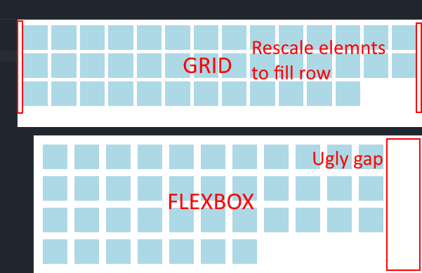
Except, that not all elements have the same size, if you do it like this.
Here is an image to explain my problem
Is there any way to do it using flexbox?
Thank you for your help.