I am a bit confused about what sort of package to use in order to plot my data which typically consists of 10 different categories (e.g. Temperatures) with 3 or 4 parallel measurements each. Here I have tried just using pandas (Trial1+2) and seaborn (Trial3).
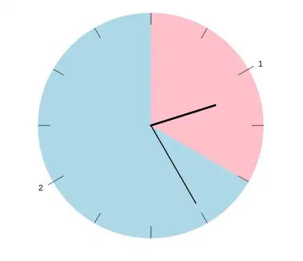
In the end, what I would like to have is a scatterplot showing the three measurements from each category, and additionally drawing an average line through all my data (see example A and B below in figure).
I know that I can place my data in a CSV file which I can import using the PANDAS package in jupyter notebook. Then I get to my problem; which I think now might be related to indexing or data types? I get a lot of error that x must equal y, or that the index 'Degrees' is not defined... I will show the most successful trials below.
I have tried several things so far using this made up dataset 'Dummydata' which is very representative for the type of things I will do with my real data.
My test CSV File:
Its a .CSV file with four columns, where the first is the temperature, then the three next columns are the first, second and third measurement from corresponding temperature (y1, y2, y3).
in[]: Dummydata.to_dict()
Out[]:
    {'Degrees': {0: 0,
      1: 10,
      2: 20,
      3: 30,
      4: 40,
      5: 50,
      6: 60,
      7: 70,
      8: 80,
      9: 90},
     'y1': {0: 20, 1: 25, 2: 34, 3: 35, 4: 45, 5: 70, 6: 46, 7: 20, 8: 10, 9: 15},
     'y2': {0: 20, 1: 24, 2: 32, 3: 36, 4: 41, 5: 77, 6: 48, 7: 23, 8: 19, 9: 16},
     'y3': {0: 18, 1: 26, 2: 36, 3: 37, 4: 42, 5: 75, 6: 46, 7: 21, 8: 15, 9: 16}}
Trial 1: trying to achieve a scatterplot
import pandas as pd
import matplotlib.pyplot as plt

Dummydata = pd.read_csv('DummyData.csv','r',delimiter=(';'), header=0)

y = ['y1','y2','y3']
x = ['Degrees']

Dummydata.plot(x,y)
This will give a nice line plot but also produce the UserWarning: Pandas doesn't allow columns to be created via a new attribute name (??). If I change the plot to Dummydata.plot.scatter(x,y) then I get the error: x and y must be the same size... So I know that the shape of my data is (10,4) because of 10 rows and 4 column, how can I redefine this to be okay for pandas?
Trial 2: same thing small adjustments
import pandas as pd
import matplotlib.pyplot as plt

#import the .csv file, and set deliminator to ; and set the header as the first line(0)
Dummydata = pd.read_csv('DummyData.csv','r',delimiter=(';'), header = 0)
x =('Degrees')
y1 =('y1')
y2 =('y2')
y3 =('y3')


Dummydata.plot([x,y3])                       #works fine for one value, but prints y1 and y2 ?? why?
    Dummydata.plot([x,y1])                       # also works, but print out y2 and y3 ??? why?                       # also works but prints out y2 and y3 ?? why?
    Dummydata.plot([x,y])                   # get error all arrays must be same length?
Dummydata.plot.scatter([x,y])                   # many error, no plot
Somehow I must tell pandas that the data shape (10,4) is okay? Not sure what im doing wrong here.
Trial 3: using seaborn and try to get a scatterplot
I simply started to make a Factorplot, where I again came to the same problem of being able to get more than one y value onto my graph. I dont think converting this to a scatter would be hard if I just know how to add more data onto one graph.
import seaborn as sns
import matplotlib.pyplot as plt

#import the .csv file using pandas
Dummydata = pd.read_csv('DummyData.csv', 'r', delimiter=(';'))

#Checking what the file looks like
#Dummydata.head(2)

x =('Degrees')
y1 =('y1')
y2 =('y2')
y3 =('y3')
y =(['y1','y2','y3'])

Factorplot =sns.factorplot(x='Degrees',y='y1',data=Dummydata)
The Factor plot works fine for one dataset, however, trying to add more y value (either defining y =(['y1','y2','y3']) before or in the plotting, I get errors like: Could not interpret input 'y'.. For instance for this input:
Factorplot =sns.factorplot(x='Degrees',y='y',data=Dummydata)
or
    Factorplot =sns.factorplot(x='Degrees',y=(['y1','y2','y3']),data=Dummydata)
#Error: cannot copy sequence with size 3 to array axis with dimension 10
What I would like to achieve is something like this:, where in (A) I would like a scatterplot with a rolling mean average - and in (B) I would like to plot the average only from each category but also showing the standard deviation, and additional draw a rolling mean across each category as following:
I dont want to write my data values in manually, I want to import then using .csv file (because the datasets can become very big).
Is there something wrong with the way I am organising my csv file?
All help appreciated.


