Is it possible to add color only to the part between the handles of thw two range inputs.
This is to show the range that the user selected. If the ends can remain uncolored and part between sliders can be blue, it will help user see what range they selected.
See snippet below.
.AgeRange {
  width: 30%;
  margin-bottom: 20px;
}
.pl2 {
padding-left: 10px;
}
.AgeNum {
  position: relative;
  display: block;
  text-align: center;
}
.AgeRangeLabel {
  margin: 10px 0;
  color:#0b867a;
}
.AgeRangeDiv {
  border: 1px solid $ee;
  background: $ff;
  padding: 3px 5px 5px 12px;
  border-radius: 4px;
}
.ranges-container {
  display: flex;
}
.ranges-container .range {
  width: 50%;
}
.ranges-container .range input[type="range"] {
  width: 100%;
}
<div class="AgeRangeDiv">
<div class="AgeRangeLabel">Age Range</div>
<div class="ranges-container">
<div class="range">
<input type="range" min="18" max="55" label="Min" value="39" class="AgeRange">
<span class="AgeNum">
<span class="text-mute">Min</span>
<span class="text-success text-bold pl2">39</span>
</span>
</div>
<div class="range">
<input type="range" min="39" max="55" label="Max" value="" class="AgeRange">
<span class="AgeNum">
<span class="text-mute">Max</span>
<span class="text-success text-bold pl2">48</span>
</span>
</div>
</div>
</div>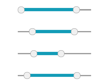