You could use some simple CSS to make bootstrap 4 work the way you are familiar with. Here is an example which uses floats to give you the result you want without placing the columns in separate containers: http://jsfiddle.net/nyx6e4bf/1/
<link rel="stylesheet" href="https://stackpath.bootstrapcdn.com/bootstrap/4.1.3/css/bootstrap.min.css" integrity="sha384-MCw98/SFnGE8fJT3GXwEOngsV7Zt27NXFoaoApmYm81iuXoPkFOJwJ8ERdknLPMO" crossorigin="anonymous">
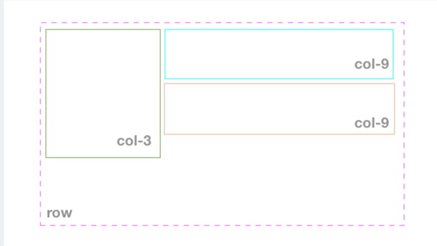
<div class="container">
<div class="row">
<div class="col-3">
<p>
Lorem Ipsum Lorem Ipsum Lorem Ipsum Lorem Ipsum Lorem Ipsum Lorem Ipsum Lorem Ipsum
</p>
</div>
<div class="col-9">
<p>
Lorem Ipsum
</p>
</div>
<div class="col-9">
<p>
Lorem Ipsum
</p>
</div>
</div>
</div>
.container .row {
display: block;
}
.row>div:nth-of-type(1) {
background-color: red;
float: left;
}
.row>div:nth-of-type(2) {
background-color: blue;
float: right;
}
.row>div:nth-of-type(3) {
background-color: green;
float: right;
}
Your CSS would have to be more specific than mine unless you wanted to change how Bootstrap worked across the entire site.
I am not sure you can actually achieve what you want without changing the CSS. Flex-box isn't really intended for to solve this issue. You could also look into grid layouts as that could potentially provide a solution.