Meet Fred. He's a table:

<table border="1" style="width: 100%;">
    <tr>
        <td>This cells has more content</td>
        <td>Less content here</td>
    </tr>
</table>
Fred's apartment has a bizarre habit of changing size, so he's learned to hide some of his content so as not to push all the other units over and shove Mrs. Whitford's living room off into oblivion:
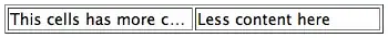
<table border="1" style="width: 100%; white-space: nowrap; table-layout: fixed;">
    <tr>
        <td style="overflow: hidden; text-overflow: ellipsis">This cells has more content</td>
        <td style="overflow: hidden; text-overflow: ellipsis">Less content here</td>
    </tr>
</table>
This works, but Fred has a nagging feeling that if his right cell (which he's nicknamed Celldito) gave up a little space, his left cell wouldn't be truncated quite as much of the time. Can you save his sanity?
In summary: How can a table's cells overflow evenly, and only when they've all given up all their whitespace?