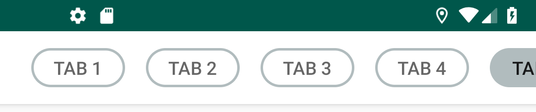
Output:
Most part is xml customization.
style.xml
<style name="ChipTabLayout" parent="Widget.Design.TabLayout">
    <item name="tabIndicatorColor">@android:color/transparent</item>
    <item name="tabBackground">@drawable/selector_tab</item>
    <item name="tabSelectedTextColor">?android:textColorPrimary</item>
</style>
Create following drawables:
- chip_outline.xml
- chip_outline_selected.xml
- selector_tab.xml
chip_outline.xml
<?xml version="1.0" encoding="utf-8"?>
<shape xmlns:android="http://schemas.android.com/apk/res/android">
    <solid android:color="#FFFFFF"/>
    <stroke
            android:width="2dp"
            android:color="#B1BCBE"/>
    <corners android:radius="20dp"/>
    <padding
            android:left="16dp"
            android:top="8dp"
            android:right="8dp"
            android:bottom="8dp"/>
</shape>
chip_outline_selected.xml
<?xml version="1.0" encoding="utf-8"?>
<shape xmlns:android="http://schemas.android.com/apk/res/android">
    <solid android:color="#B1BCBE"/>
    <stroke
            android:width="2dp"
            android:color="#B1BCBE"/>
    <corners android:radius="20dp"/>
    <padding
            android:left="0dp"
            android:top="0dp"
            android:right="0dp"
            android:bottom="0dp"/>
</shape>
selector_tab.xml
<?xml version="1.0" encoding="utf-8"?>
<selector xmlns:android="http://schemas.android.com/apk/res/android">
    <item android:drawable="@drawable/chip_outline_selected" android:state_pressed="true"/>
    <item android:drawable="@drawable/chip_outline_selected" android:state_selected="true"/>
    <item android:drawable="@drawable/chip_outline_selected" android:state_activated="true"/>
    <item android:drawable="@drawable/chip_outline" android:state_pressed="false"/>
    <item android:drawable="@drawable/chip_outline" android:state_selected="false"/>
    <item android:drawable="@drawable/chip_outline" android:state_activated="false"/>
</selector>
toolbar xml code
<com.google.android.material.appbar.AppBarLayout
        android:layout_width="match_parent"
        android:layout_height="?attr/actionBarSize">

    <androidx.appcompat.widget.Toolbar
            android:id="@+id/toolBar"
            android:layout_width="match_parent"
            android:layout_height="?attr/actionBarSize"
            app:layout_collapseMode="pin"
            app:layout_scrollFlags="scroll|enterAlways"
            app:popupTheme="@style/ThemeOverlay.AppCompat.Light"
            android:layout_marginBottom="4dp"
            android:background="@android:color/white"
            android:elevation="4dp">

        <com.google.android.material.tabs.TabLayout
                android:id="@+id/tabLayout"
                style="@style/ChipTabLayout"
                android:layout_width="match_parent"
                android:layout_height="30dp"
                app:tabIndicatorHeight="30dp"
                app:tabMode="scrollable"
                android:minWidth="80dp"
                app:tabGravity="fill"
                android:layout_gravity="center"
                app:tabIndicatorGravity="center"
                android:background="@android:color/white"
                android:minHeight="?attr/actionBarSize"/>
    </androidx.appcompat.widget.Toolbar>

</com.google.android.material.appbar.AppBarLayout>
Utils.kt
class Utils {
    companion object {
        fun dpToPx(dp: Int): Int {
            return ((dp * Resources.getSystem().displayMetrics.density).toInt());
        }

        fun pxToDp(px: Int, context: Context): Int {
            return ((px / Resources.getSystem().displayMetrics.density).toInt());
        }
    }
}
Java alternative
Add following code after tabLayout.setupWithViewPager() in your activity / fragment:
for (i in 0 until binding.toolbarHolder.tabLayout.getTabCount()) {
        val tab = (binding.toolbarHolder.tabLayout.getChildAt(0) as ViewGroup).getChildAt(i)
        val p = tab.layoutParams as ViewGroup.MarginLayoutParams
        p.setMargins(Utils.dpToPx(8), 0, Utils.dpToPx(8), 0)
        tab.requestLayout()
    }
Java alternative
Change colors as per your requirement. Happy coding!