-1

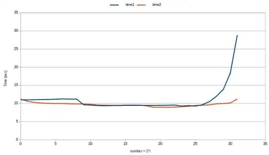
Normal probability distribution is a plot b/w x on x-axis and f(x) on y-axis. But when I plot this I am getting overlapping curves. I read different answers on this website related to normal distribution. They first plot histogram then plot(x,f). Is it compulsory to plot histogram first? Can I do that without histogram?

`mu, sigma = 0, 0.1
x = np.random.normal(mu, sigma, 200)
print(x)

f = 1/(sigma * np.sqrt(2 * np.pi)) *np.exp( - (x - mu)**2 / (2 * sigma**2) )
print(f)
plt.plot(x,f)`

enter image description here

herry
  • 155
  • 10
  • plotting order doesn't matter. Share desired image and working code which plots both – Sheldore Sep 22 '18 at 14:26
  • You are not plotting any histogram? In the figure above, there is nothing to overlap – Sheldore Sep 22 '18 at 14:28
  • Yes I am not plotting histogram. I am trying to plot normal probability distribution for the given data x. But I don't want this overlapping. I read answers on stackover flow related to normal distribution. They first plot plt.hist(x, bins) and then they plot plt.plot(bins, f). I want to know is it compulsory to plot histogram first? Secondly I want to know how to overcome overlapping in the above graph – herry Sep 22 '18 at 14:33
  • 1
    Sure, there is no need to plot anything in addition to what you have. The chaotic line stems from the data not being ordered. You may `plt.plot(np.sort(x),f[np.argsort(x)])` instead. Or you may sort your `x` before applying f, `x = np.random.normal(mu, sigma, 200).sort()` – ImportanceOfBeingErnest Sep 22 '18 at 14:34
  • 1
    Possible duplicate of [Python's Matplotlib plotting in wrong order](https://stackoverflow.com/questions/37414916/pythons-matplotlib-plotting-in-wrong-order) – Thomas Kühn Sep 22 '18 at 14:40
  • Yeah, this was also the first result I got googling, yet it doesn't show the easy numpy way of doing it. Maybe someone wants to provide a canonical answer using numpy over there, to close this? – ImportanceOfBeingErnest Sep 22 '18 at 14:42

2 Answers2

0

The x-data is simply unsorted in the first place. To highlight that, if you use just markers for plotting, you will see the overlap you see is an artifact of lines continuously connecting the discrete data points. Here ms=2 is a short form of writing markersize=2 which specifies the size of markers (points, circles in this case). In ko, k is the code for black color and o is the symbol for using markers. You can also write 'o', color='black' as an alternative. -ko means connect the circular points with black line. -go, -bo, -ro would mean green, blue and red colors, respectively.

mu, sigma = 0, 0.1
x = np.random.normal(mu, sigma, 200)
f = 1/(sigma * np.sqrt(2 * np.pi)) *np.exp( - (x - mu)**2 / (2 * sigma**2) )

plt.plot(x,f, 'ko', ms = 2)

Output

enter image description here

To rectify that, you can use sorted x while computing f as and further while plotting.

f = 1/(sigma * np.sqrt(2 * np.pi)) *np.exp( - (np.sort(x) - mu)**2 / (2 * sigma**2) )
plt.plot(np.sort(x),f, '-ko', ms = 2)

Output

enter image description here

Sheldore
  • 37,862
  • 7
  • 57
  • 71
  • can you please mention why ms=2 and what is ms? I checked in documentation there is no parameter with this name. – herry Sep 22 '18 at 14:39
  • [This is the first answer on google I get on that topic](https://stackoverflow.com/questions/37414916/pythons-matplotlib-plotting-in-wrong-order). Maybe this answer (using numpy.sort) would be better suited over there? – ImportanceOfBeingErnest Sep 22 '18 at 14:41
  • @ImportanceOfBeingErnest: Do you think answering after 2 years would be worth it? – Sheldore Sep 22 '18 at 14:43
  • @Bazingaa yes, put your same answer over there, then we can mark this one as duplicate -- makes it easier other google users later on. – Thomas Kühn Sep 22 '18 at 14:45
  • @ThomasKühn: Ok I am doing that. – Sheldore Sep 22 '18 at 14:45
  • 1
    I mean that's the whole idea of SO right? You want answers to your questions, independent on how old they are. Therefore we close questions as duplicates, such that people find the best answer(s) in one place, even when they come to the duplicate first. – ImportanceOfBeingErnest Sep 22 '18 at 14:46
0

You don't need to draw samples to plot a normal distribution. It is much better if you just use an evenly spaced sequence of numbers.

mu, sigma = 0, 0.1
x = np.linspace(-0.4, 0.4, 100)
f = 1/(sigma * np.sqrt(2 * np.pi)) *np.exp( - (x - mu)**2 / (2 * sigma**2) )
plt.plot(x, f)

enter image description here

Stop harming Monica
  • 12,141
  • 1
  • 36
  • 56