0

enter image description hereThis is driving me nuts! I've read like 10 stack overflow posts, docs, etc and I just know it's going to be something basic. I don't imagine it's relevant but this is for a chrome extension.

I've tried about a dozen variations, settling on one I read in this blog post: https://codeburst.io/common-problems-in-positioning-elements-in-css-best-practices-b03ac54dbdcb

I am able to make it work by hardcoding width percentage of the input and button fields, but I'd rather find something less hacky.

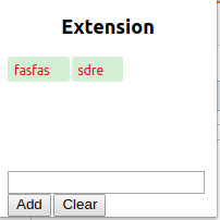
I want to render the input field and two buttons on the same line. Right now the input takes up most of a line and the two buttons render inline beneath it:

<html>

<head>
  <style>
    html {
      height: 200px;
      width: 200px;
    }
    
    #wrapper {
      display: inline;
      bottom: 0;
      position: fixed;
    }
  </style>
  <title>Please</title>
  <script src="popup.js"></script>

</head>

<body>
  <h2 id="header">
    <center>Extension</center>
  </h2>
  <div id="div1"></div>

  <div id="wrapper">
    <form class="categoryForm" autocomplete="off" style="">

      <input type="text" id="category" style="display: inline-block" />
      <button value="add" id="addButton" style="display: inline-block">
                    Add
                </button>
      <button value="clear" id="clearButton" style="display: inline-block">
                    Clear
                </button>

    </form>
  </div>

</body>

</html>
David Massey
  • 289
  • 5
  • 15

2 Answers2

0

Styling the form with flexbox as below works fine.

To prevent overflowing set the #wrapper width to 100% and the input min-width: 0;

If you don't want to set the input's width in CSS you can also use the HTML size attribute on <input type="text">. This will specify the width in characters. E.g: <input type="text" size="8">

html {
  height: 200px;
  width: 200px;
  position: relative;
}

body {
  margin: 0;
}

#header {
  text-align: center;
  
}

#wrapper {
  display: inline;
  bottom: 0;
  position: absolute;
  width: 100%;
}

.categoryForm {
  display: flex;
  align-items: center;
  width: 100%;
}

input {
  min-width: 0;
}
<html>

<head>
  <title>Please</title>
  <script src="popup.js"></script>
</head>

<body>
  <h2 id="header">Extension</h2>
  
  <div id="div1"></div>

  <div id="wrapper">
    <form class="categoryForm" autocomplete="off">
      <input type="text" id="category" />
      <button value="add" id="addButton">Add</button>
      <button value="clear" id="clearButton">Clear</button>
    </form>
  </div>

</body>

</html>
larsmagnus
  • 509
  • 2
  • 10
  • This causes the input field and two buttons to spill past the edge of the extension's window. Very good start tho I will tweak it some more and if I can get it I will give you best answer – David Massey Sep 26 '18 at 08:33
  • Alright! I've updated my answer to prevent the form from overflowing the wrapper and body. If the `#wrapper` has to be `position: fixed;`, then just set `max-width: 200px;` on `#wrapper` – does this solve it for you? :) – larsmagnus Oct 07 '18 at 04:24
-1

have you looked into using a standard css framework, a really popular one being bootstrap.

This will simplify your html and its not good practice to use styles in line with html

<div class="row"><div class="form-group col-md-3"> </div>
wills iyer
  • 1
  • 1
  • 2