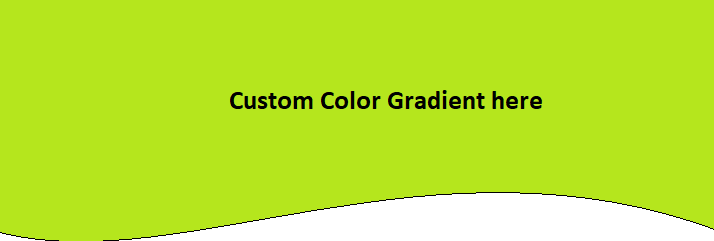
I want to replicate an image effect. On this page https://inventi.studio/en you can see some div containers with "waves". The curved effect is achieved by uploading an image as a background.
So this is what I currently have
#box {
  height: 200px;
  background-image: linear-gradient(135deg, #47b784, #009d90 26%, #00818e 50%, #25647b 74%, #36495d);
}
<div id="box">
</div>
<div id="page">
Content starts here
</div>and this is what I tried to achieve
#wave {
  position: relative;
  height: 70px;
  width: 600px;
  background: #47b784;
}

#wave:before {
  content: "";
  display: block;
  position: absolute;
  border-radius: 100% 50%;
  width: 340px;
  height: 80px;
  background-color: white;
  right: -5px;
  top: 40px;
}

#wave:after {
  content: "";
  display: block;
  position: absolute;
  border-radius: 100% 50%;
  width: 300px;
  height: 70px;
  background-color: #47b784;
  left: 0;
  top: 27px;
}
<div id="wave">
</div>
<div id="page">
content starts here
</div>but as you can see the div below the curved div gets covered. I am trying to achieve this effect with one single div container that is not overlapping other ones.
How can I achieve this with one div container and no image as a background?