The default select arrow icon is drawn by the browser. There is no API for you to tell the browser to replace the arrow icon, so you will need to restyle the select element and overlay your own arrows. You can draw your own arrows that have an identical style to your browser's arrows, but remember that the default icon will differ for other browsers and operating systems.
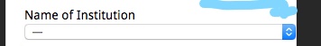
To restyle the select item using only CSS you will need to target both the select and its parent p element. The select has an ID, which is easy to target, but targeting that specific p element is not easy from just the code you've provided. However looking at the provided Wordpress site link there is a label just before the p, of the form <label for="search-box-filter_31">Name of Institution</label>. This means that the p element can be targeted using the CSS selector label[for=search-box-filter_31] + p.
You first need to ensure you have enough space for your new arrow. This is accomplished by increasing the select's width by the width of your new arrows, and adding the same amount to the parent p's right padding. One way to change the select's width is by using calc(100% + 30px). If your new arrows have the same width as the default icons you may not need to do this, but in some configurations your arrows may overlap the select's content.
Additionally the p element must shrink to fit its content. There are a few ways of doing this, but in your situation the one least likely to break formatting is setting display: table.
Finally, you can use the ::after pseudo element on p to create the desired arrows, and overlay it on the end of your select element, hiding the default arrow. In the example below I created the arrows with inline SVG, but you can use any background image that best suits your situation. Set the ::after element to have position:absolute and style it to fit exactly over the right hand side of the select. To create the blue gradient background under the arrows that you have in your image, use multiple backgrounds with the first being your arrows and the second being a CSS gradient.
Note that since the ::after element is on top of the select, clicking the arrows will not display the options. You can set pointer-events: none; to pass the clicks through but this will not work on IE.
The CSS is below, or alternatively you can see it at the codepen https://codepen.io/jla-/pen/ZqbWMj
#search-box-filter_31 {
    width: calc(100% + 30px);
}
label[for=search-box-filter_31] + p {
    position: relative;
    display: table;
    border-radius: 5px;
    padding-right: 30px;
}
label[for=search-box-filter_31] + p::after {
    content: "";
    position: absolute;
    top: 0;
    right: 0;
    height: 100%;
    width: 30px;
    border-radius: 0 5px 5px 0;
    pointer-events: none;
    background-image: url("data:image/svg+xml;utf8,<svg xmlns='http://www.w3.org/2000/svg' width='30' height='30'><polyline points='8,12,15,8,22,12' fill='none' style='stroke:white;stroke-width:2'/><polyline points='8,18,15,22,22,18' fill='none' style='stroke:white;stroke-width:2'/></svg>"),
        linear-gradient(to bottom, #a0d8ff 0%, #2591dd 100%);
    background-repeat: no-repeat;
    background-position: center center;
    background-size: cover;
}
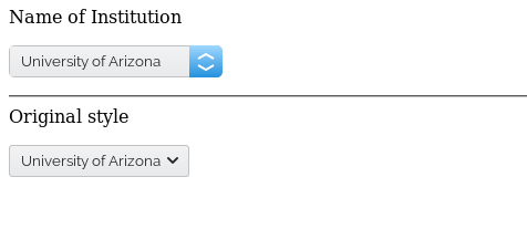
The result (followed by the default select as it appears in Firefox on Linux):
Of course, the arrows and their blue background can be styled in any other way that you wish. Please note that adding a custom style to the select arrows will make it look different to the default browser style. You can style it to fit in seamlessly in one browser, e.g. Chrome, but another browser, e.g. Firefox, will display things differently and your custom style will not match. To have a seamless appearance across all browsers and operating systems you would need to make sure all select/input elements are styled to match each other.